201 elements · 925 sections · Works with free Elementor

A Digital Declutter That Actually Changed How We Work
Two weeks with no notifications, no group chats, and one very quiet inbox — here is what we learned.
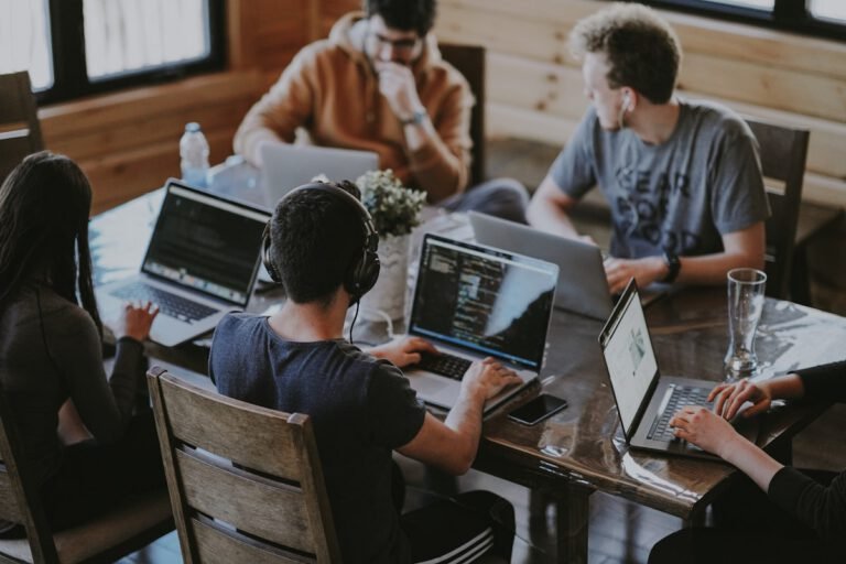
For two weeks, our small team switched off every notification that was not a customer or a colleague asking for help. No badges, no pings, no little red numbers. We expected to feel cut off. Instead, we finished more work than in any fortnight this year — and went home less tired.
This is what we changed, what surprised us, and the few habits we kept once the experiment was over. None of it needs a new app. Most of it is simply choosing when to look.
Why we tried it
We counted, for one ordinary Tuesday, how often each of us was interrupted. The average was once every six minutes. Almost none of those interruptions were urgent; they were just loud. Deep work — the kind that makes a product better — needs longer stretches than that.
We were not short of time. We were short of time in one piece.
The rules for two weeks
- Email and chat checked at set times: 9:30, 1:00 and 4:30.
- Phones face down and silent during focus blocks.
- One shared “urgent” channel that could break through — used only four times.
- No meetings before noon, so every morning had a long focus block.

What surprised us
The first two days were uncomfortable. Several of us reached for our phones out of pure habit. By the end of the first week, the urge had mostly gone, and the batched check-ins felt calm rather than frantic — there was simply more to read at once, and it took less time in total.
Customers did not notice any slower replies. Colleagues noticed that replies were longer and more considered.
What we kept
- Notification-free mornings, three days a week.
- The single urgent channel, with a clear definition of “urgent”.
- A short end-of-day note instead of a live status meeting.
If you try this with your own team, start small: one quiet morning a week is enough to feel the difference. This article is an example post for the UltraKit demo; the team and figures are illustrative.



How a Five-Person Startup Landed Its First Enterprise Client

10 UI Trends Shaping Product Design in 2026
From tactile skeuomorphism's quiet return to AI-native layouts that rearrange themselves — here is what actually mattered this year.


What We Learned Migrating 2M Users to a New Stack
Zero downtime, one very stressful Saturday, and a rollback plan we thankfully never needed to use.



Cards
 How to Present Bad News to a Board Without Losing the RoomThe slide order matters more than the words. Here is the structure we now use for every hard…Read more →
 What We Told the Team the Day We Missed Our TargetNo spin, no blame — just the numbers and the plan. Here is the all-hands script that actually…Read more →