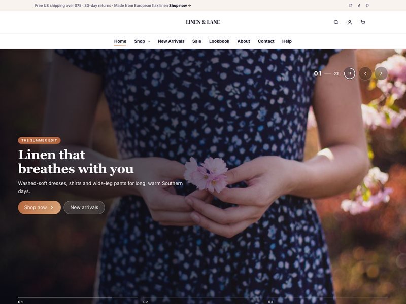
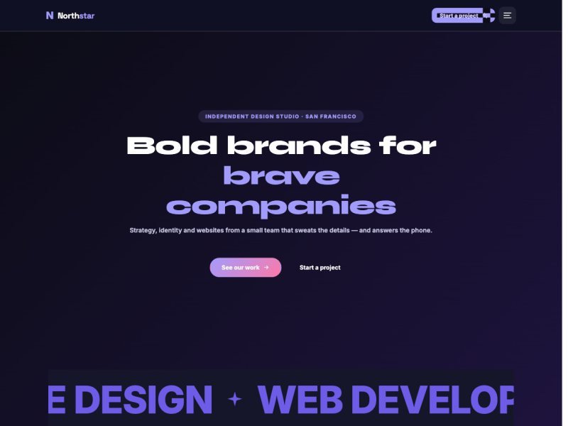
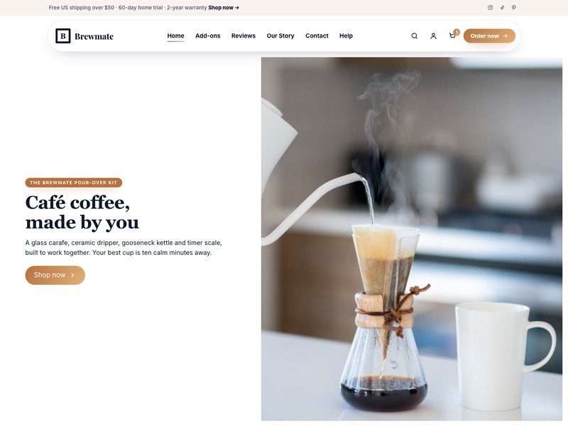
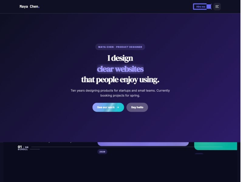
Welcome to UltraKit#
UltraKit is a WordPress theme built for the free Elementor page builder. It comes with a companion plugin, UltraKit Core, that adds 201 elements, 120 ready-made websites and 925 section designs.
What is in the download
ultrakit-theme.zip— the theme you install in WordPress.ultrakit.zip— the UltraKit Core plugin (the theme can also install it for you).- Licensing notes for the bundled libraries: GSAP 3.15 (Standard No-Charge License) and Motion 11 (MIT).
The fastest path
- Install the theme and activate it.
- Verify your purchase code on the UltraKit Setup screen.
- Install the plugins — Elementor and UltraKit Core.
- Import a ready website and replace the demo text and photos with your own.
Requirements#
UltraKit runs on any modern WordPress host.
| What | Minimum | Recommended |
|---|---|---|
| WordPress | 6.2 | Latest version |
| PHP | 7.4 | 8.1 or newer |
| Elementor | Free version | Latest version (Elementor Pro is not required) |
| PHP memory limit | 256 MB | 512 MB for importing large websites |
| Max execution time | 120 seconds | 300 seconds |
| WooCommerce | Optional | Only needed for online stores |
Purchase-code checks and ready-website downloads come from getultrakit.com. If your host blocks outgoing connections, ask them to allow it.
Install the theme#
Upload the theme zip from your ThemeForest download — not the whole download package.
- In WordPress, go to Appearance›Themes›Add New Theme›Upload Theme.
- Choose
ultrakit-theme.zipand click Install Now. - Click Activate.
- WordPress opens Appearance›UltraKit Setup for you. If it does not, open it from the menu.
You uploaded the full ThemeForest package. Unzip it first and upload only ultrakit-theme.zip.
The UltraKit Setup screen
UltraKit Setup walks you through three short steps: activate your purchase code, install the plugins, then choose a ready-made website. You can come back to it any time from Appearance›UltraKit Setup.
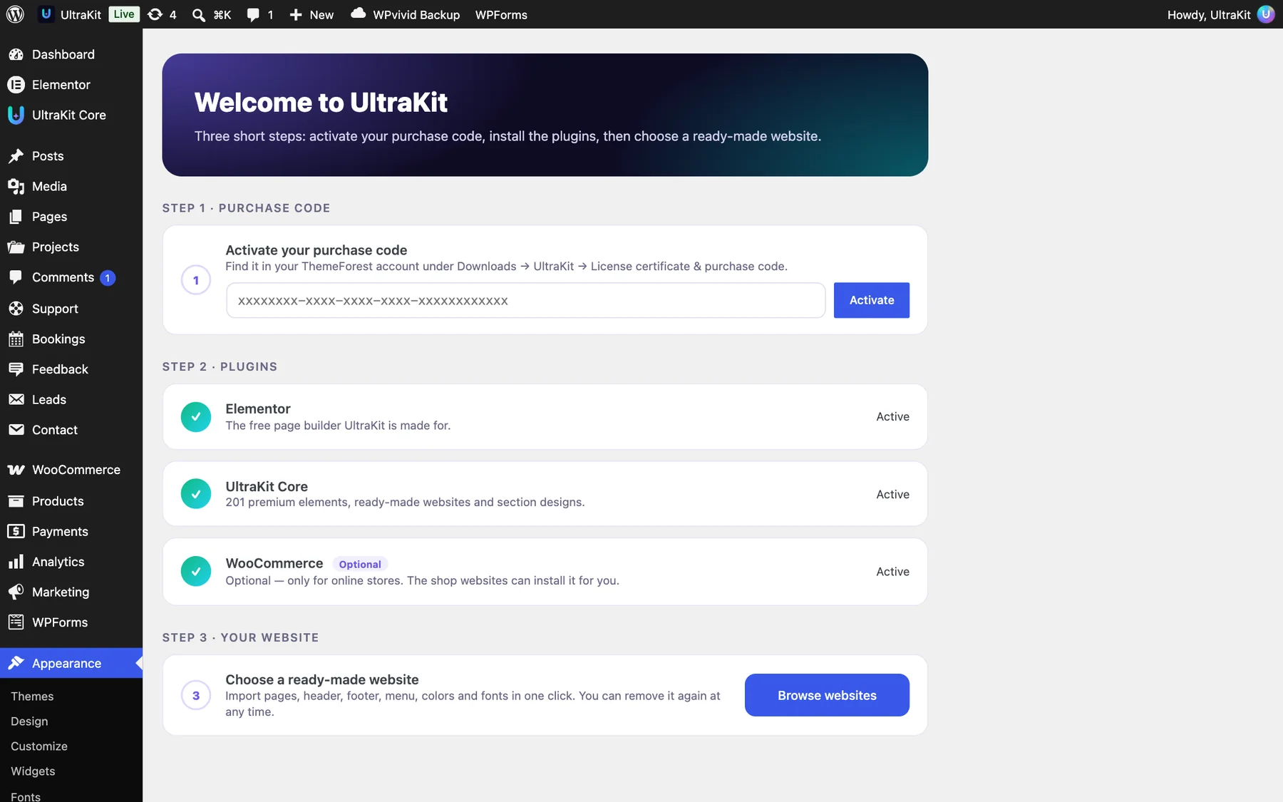
Verify your purchase code#
Your purchase code unlocks the UltraKit Core plugin download and support.
Where to find the code
- Sign in to ThemeForest and open Downloads.
- Find UltraKit and click Download → License certificate & purchase code.
- Copy the purchase code. It has 36 characters and looks like
1a2b3c4d-1a2b-1a2b-1a2b-1a2b3c4d5e6f.
Activate it
You can enter the code in either of two places:
- Appearance›UltraKit Setup → Step 1 · Purchase code → Activate
- UltraKit Core›Dashboard → License box → Verify & activate
When it works you will see “Your license is active. Thank you for choosing UltraKit!” The License box then shows your masked code, the license type and how long support lasts.
Move the license to another website
- On the old website, open UltraKit Core›Dashboard → License.
- Click Deactivate on this site. You will see “The license was removed from this site.”
- Enter the same code on the new website.
If verification fails
| Message | What to do |
|---|---|
| “That does not look like an Envato purchase code.” | Copy the code again — it must be 36 characters with dashes, no spaces. |
| “We could not reach the license server.” | Your server cannot connect to getultrakit.com. Try again in a few minutes or ask your host to allow outgoing connections. |
| “This purchase code could not be verified.” | The code is wrong, refunded or already active on another domain. Deactivate it there first. |
| “The license server sent an unexpected answer.” | A temporary problem — try again later. If it continues, open a support ticket. |
A Regular or Extended ThemeForest license covers one end product. Buy one license for every client website.
Where the License box is

Install the plugins#
UltraKit needs two free plugins. The theme installs them for you.
| Plugin | Required? | Why |
|---|---|---|
| Elementor | Required | The free page builder UltraKit is made for. |
| UltraKit Core | Required | All elements, ready websites, the Section Library and the built-in features. |
| WooCommerce | Optional | Only for online stores. The shop websites can install it for you during import. |
- Open Appearance›UltraKit Setup → Step 2 · Plugins.
- Click Install, then Activate, for each plugin. UltraKit Core shows Locked until your purchase code is verified.
- You can also use Appearance›Install Plugins, which lists the same plugins.
Go to Plugins›Add New Plugin›Upload Plugin, choose ultrakit.zip from your ThemeForest download and activate it.
Find your way around#
Everything UltraKit adds to WordPress lives in one colorful UltraKit Core menu, grouped by job.
The menu is split into groups — Start, Build, Forms, Newsletter, Popups, Paywall, Reviews, Podcast, Sermons, Ads, Envato Sales and Site. Click a group header to fold or unfold it; WordPress remembers your choice. Badges show what needs you, such as unread form entries.
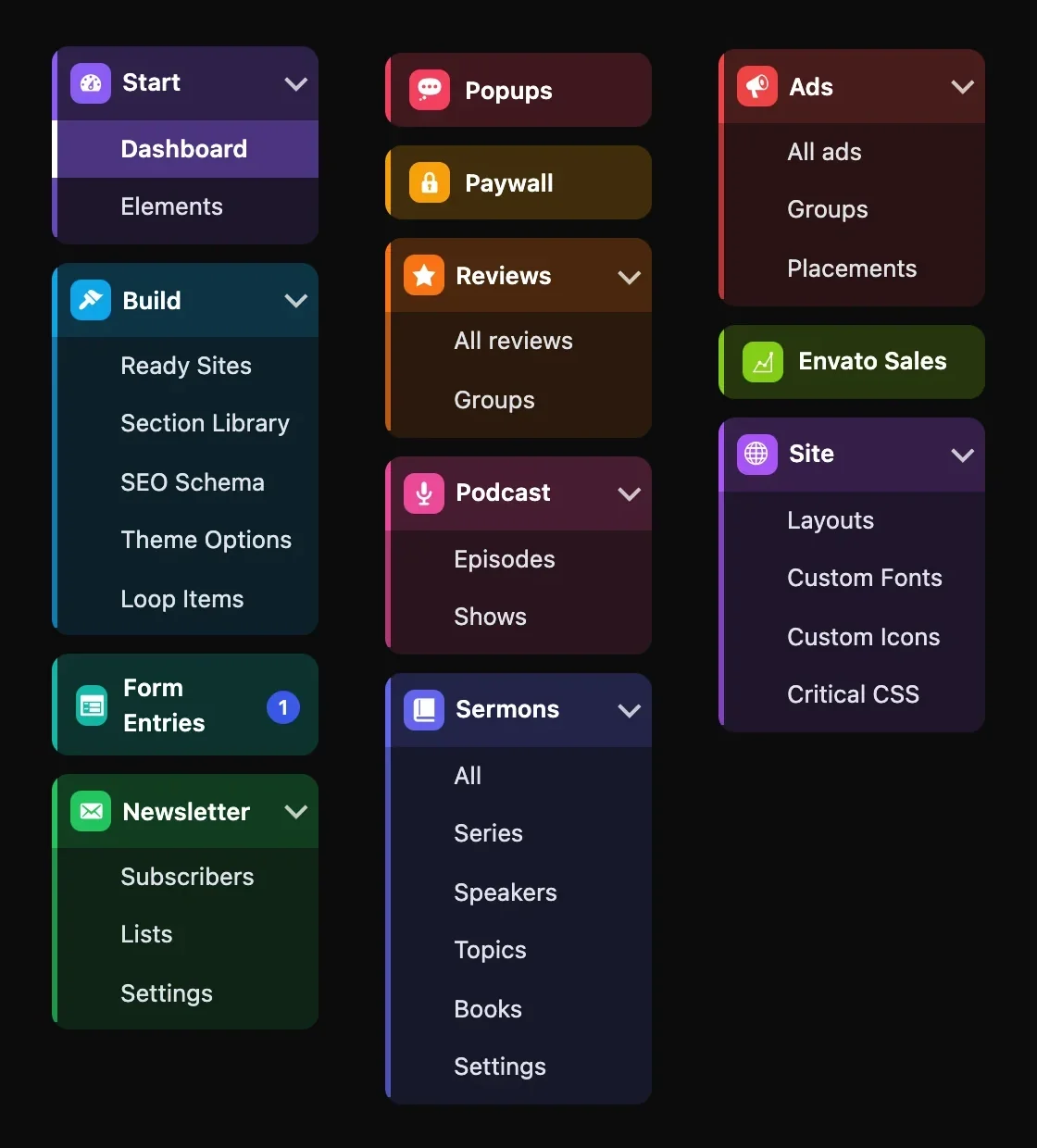
| Group | Screens | Read more |
|---|---|---|
| Start | Dashboard, Elements | Dashboard, Elements |
| Build | Ready Sites, Section Library, SEO Schema, Theme Options, Loop Items | Ready Sites, Theme Options |
| Forms | Form Entries | Form Entries |
| Newsletter | Subscribers, Lists, Settings | Newsletter |
| Popups · Paywall | Popups, Paywall | Popups, Paywall |
| Reviews · Podcast · Sermons | Content you collect or publish | Reviews, Podcast, Sermons |
| Ads · Envato Sales | Ad Manager, live Envato numbers | Ads, Envato |
| Site | Layouts, Custom Fonts, Custom Icons, Critical CSS | Layouts, Fonts & icons |
Elsewhere in the WordPress menu
- Appearance — UltraKit Setup, Header Builder, Footer Builder and Product Page Builder.
- Projects, Bookings, Feedback and Leads — their own top-level items, shown when the elements that use them are switched on.
- Posts›Series, Products›Size Guides and Products›Waitlist.
Screens for optional features only appear when the element that needs them is active in UltraKit Core›Elements — and WooCommerce screens only when WooCommerce is installed.
The UltraKit Core dashboard#
Your home screen: versions, live counts, a link to every Theme Options tab, your license and help.
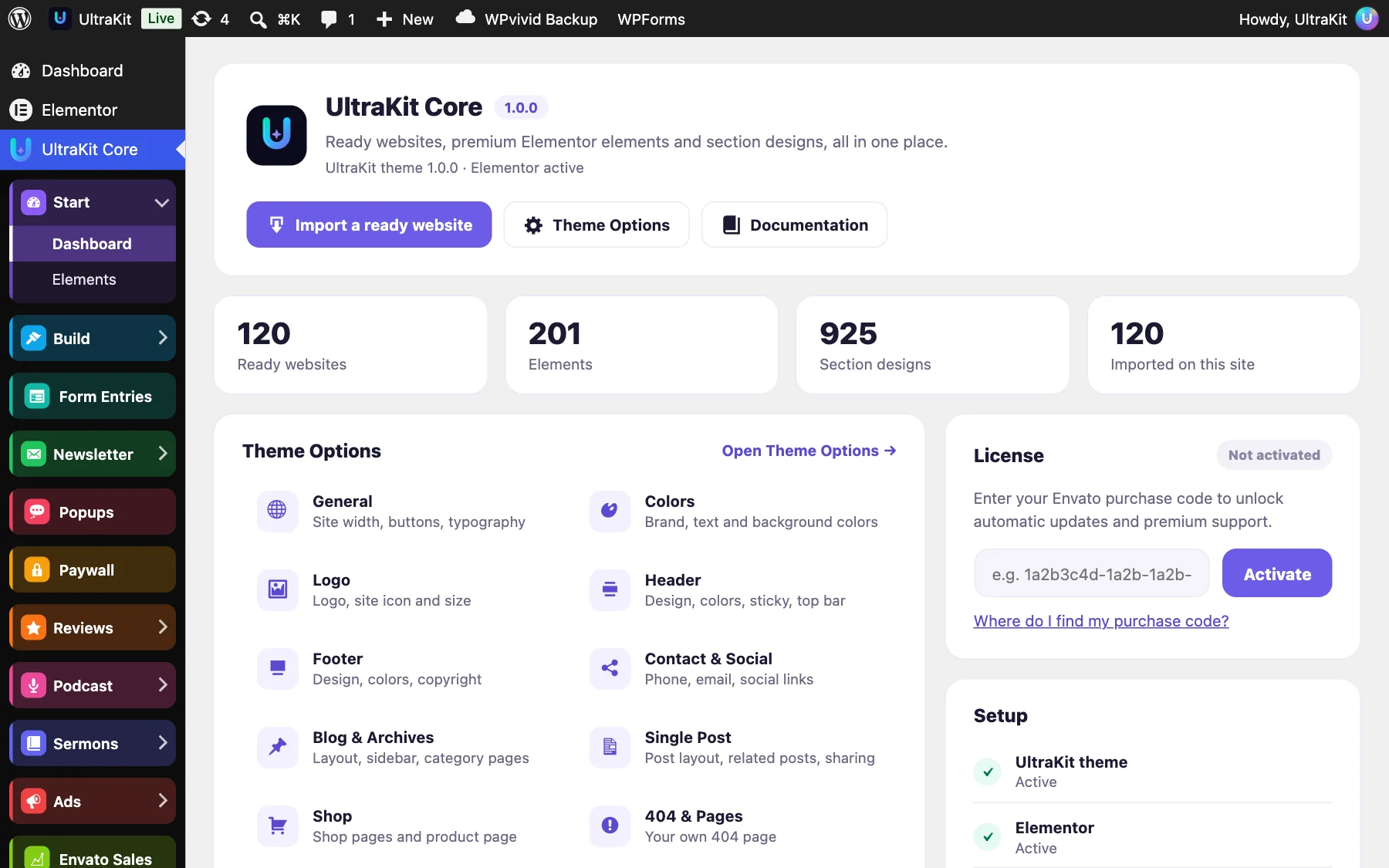
- Header — the UltraKit Core and theme versions, plus Import a ready website, Theme Options and Documentation.
- At a glance — the number of ready websites, elements and section designs, and how many websites are imported on this site.
- Theme Options — one link for each tab (General, Colors, Logo, Header, Footer, Contact & Social, Blog & Archives, Single Post, Shop, 404 & Pages, Custom CSS, Maintenance, Performance, Fonts, White Label, Animations, Import / Export) and the Header Builder, Footer Builder and Product Page Builder. With another theme active, a short note offers to activate the UltraKit theme instead.
- Build — Ready Sites, Section Library, Elements, Layouts, Loop Items, Popups, Forms and Newsletter.
- License — activate your purchase code, or deactivate it before you move to a new domain.
- Setup — a live check of the UltraKit theme, Elementor, your license, an imported website and WooCommerce (optional).
- Help — Documentation, Support and the Changelog.
Automatic updates and premium support. Every element works before you activate. See Verify your purchase code and Updating UltraKit.
Import a ready website#
Every ready website is a complete site — home and inner pages, header, footer, menus, colors and fonts.
- Open UltraKit Core›Ready Sites.
- Search (try “dental”, “bakery” or “shop”) or pick one of the seven groups (Shop & eCommerce, News & Blogs, Business & Services, Portfolio & Creative, Food & Lifestyle, Freelancers, Religious). Each website has a number such as
#01so you can find it again. - Click Live demo to explore it first.
- Click the gear button to check the Import options (below).
- Click Import site. Pages, images and menus arrive in about a minute.
- Click View site, then replace the demo text and photos with your own in Elementor.
Import options
| Option | What it does |
|---|---|
| Use its home page as my front page | Sets the imported home page as your front page and assigns its header, footer, post and archive designs. |
| Apply its colors & fonts to Site Settings | Writes the website’s colors and fonts into Elementor Site Settings (Primary, Secondary, Text and Accent). |
| Install & activate WooCommerce (free) | Shown only for shop websites when WooCommerce is missing. |
What gets imported
- All pages of the website, with their Elementor designs
- Header, footer, single-post and archive templates
- Menus (the main menu is assigned when your Primary location is empty)
- Images, audio, video and PDF files used by the demo
- Demo content where the website has it: posts with authors, categories and comments, projects, sermons and ads
- Demo WooCommerce products — only into an empty store
- A Privacy Policy and a Terms of Service page for the footer links (written as a starting template you edit)
Importing works on any site, but a new WordPress install gives the cleanest result. You can always remove an import later.
The Ready Sites screen
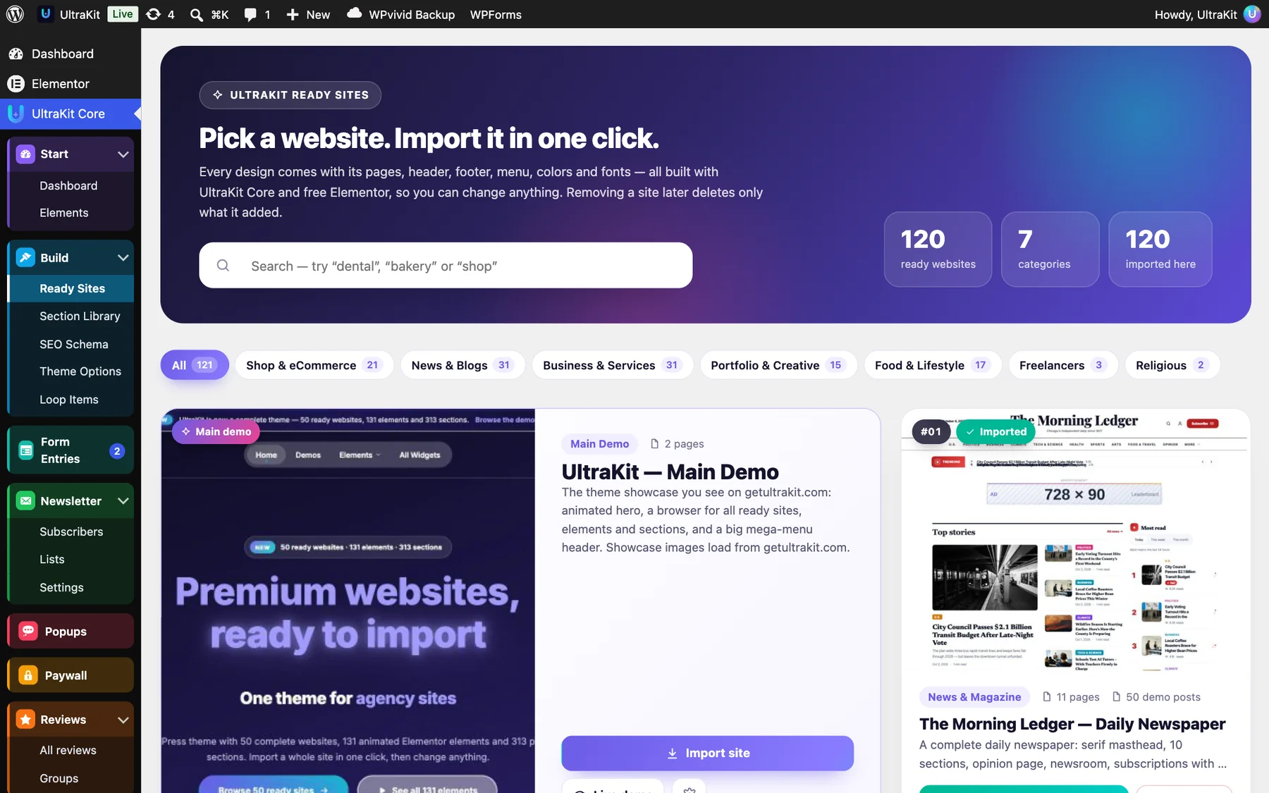
The pills under the search box filter the websites into seven groups: Shop & eCommerce, News & Blogs, Business & Services, Portfolio & Creative, Food & Lifestyle, Freelancers and Religious. Each pill shows how many websites it holds. The counters at the top show the number of websites, categories and how many are imported on this site; imported cards wear an Imported tag.
Import a single page#
Take just one page — a pricing page, a shop page, an about page — from any of the ready websites, without changing the rest of your site.
- Open UltraKit Core›Ready Sites and click Import a page on any website card. In the Section Library, Import a whole page opens the same window with a website picker.
- Pick the page. Choose Draft or Publish, and optionally Also use this website’s colors and fonts on this page or Set as front page.
- Click Import. When it is done, use Edit with Elementor or View page.


- Only the images that page uses are downloaded; images you already have are reused.
- Your header, footer, menus, global colors and front page stay as they are.
- Products, categories and posts the page shows are matched to your own content. If a demo category does not exist, the grid shows your latest products or posts.
- Shop pages install WooCommerce for you if it is missing.
Pages imported this way are listed under Pages you imported on their own on the Ready Sites screen. Removing one deletes the page and the images nothing else uses. Removing a whole website never deletes these pages.
Remove or switch a website#
Changed your mind? Removing a website deletes everything it added and restores what you had before.
- Open UltraKit Core›Ready Sites. Imported websites show an Imported tag.
- Click Remove and confirm.
- Its pages, templates, menu, images and demo content are deleted. Your previous home page and site colors are restored.
Remove deletes the imported pages, including any changes you made to them. Copy content you want to keep first.
The same website cannot be imported twice. To start over, remove it and import it again.
Import troubleshooting#
Most import problems come from the server, not from UltraKit.
| Message or symptom | Fix |
|---|---|
| “The starter site could not be downloaded…” | Your server cannot reach getultrakit.com. Ask your host to allow outgoing HTTPS connections, then try again. |
| “The downloaded starter site was incomplete or changed on the way…” | The download was cut off. Try again; on slow hosts raise max_execution_time to 300. |
| “WooCommerce could not be installed.” | Install WooCommerce from Plugins›Add New Plugin, then import again. |
| The import stops halfway | Raise PHP memory to 512 MB and the execution time to 300 seconds, remove the half-imported site, then import again. |
| Pages look unstyled after import | Open Elementor›Tools → Regenerate Files & Data, then clear any caching plugin. |
A brand-new WooCommerce starts in Coming soon mode, which hides products from visitors. When UltraKit installs WooCommerce for a ready website it switches the store to live. If you installed WooCommerce yourself, open WooCommerce›Settings›Site visibility and choose Live.
Theme Options overview#
One screen for the whole theme — colors, fonts, header, footer, blog, posts, shop, speed and more — with a live preview of your real site.
Open UltraKit Core›Theme Options. Without UltraKit Core the same screen is at Appearance›Theme Options, and Appearance›Customize leads here too. Settings are saved as normal theme settings, so they also work in a child theme.

- Pick a tab on the left.
- Change a setting. The preview on the right updates before you save — only you see it.
- Switch the preview between desktop, tablet and phone, choose which page it shows (home, blog, a category, a post, a tag, an author, a date archive, search results or the 404 page) or open it in a new tab.
- Click Save changes. The button stays gray until something changed, and the screen warns you before you leave with unsaved changes.
Find any setting
Type in the search box at the top — “share”, “sidebar”, “logo”, “boxed”. Only the matching settings stay visible, and every tab shows how many hits it has.

All tabs
| Tab | What you set there | Details |
|---|---|---|
| General | Content width, corners, full-width or boxed site, button shape and fill, “Back to top”, preloader, font pairings and fonts | General |
| Colors, Logo | Palettes, color presets, accents, text and background; logo, site icon, white logo and logo size | Colors & logo |
| Header, Footer, Contact & Social | Which header and footer design, styles, colors, top bar, buttons, copyright, contact details and social links | Header, footer & contact |
| Blog & Archives | 16 post list layouts, cards, pagination, page headers, per page type, Elementor designs | Blog & Archives |
| Single Post | 20 post designs, layout, header style, parts, related posts, share buttons | Single Post |
| 404 & Pages, Custom CSS | Your own 404 page and site-wide CSS | 404 & CSS |
| Shop | Shop features, Shop boost, columns, sidebar, product page (with WooCommerce) | Shop |
| Maintenance, Fonts, White Label | Coming soon and maintenance mode, local Google Fonts, your own brand in the dashboard | Site mode, fonts & white label |
| Performance | Speed switches and Critical CSS | Speed & performance |
| Animations | GSAP scroll animations, micro-interactions, page transitions | Animations |
| Import / Export | Back up, copy or reset your settings | Import, export & reset |
Theme Options style the theme’s own pages (blog, posts, archives, search, 404, shop) and fill in the parts every design shares — logo, contact details, colors. Pages you design in Elementor keep the styles you give them there. New options start at the theme’s original look, so nothing changes until you pick something.
General: layout, buttons & typography#
The basics every page shares — width, corners, site layout, buttons, “Back to top”, the preloader and fonts.

| Section | Settings | Where you see it |
|---|---|---|
| Layout | Content width (960–1600 px), Corner roundness (0–32 px), Site layout: Full width or Boxed, with Box width and the Background around the box (empty = soft gray). | Every page. Boxed places the whole site in a centered box on a colored background. |
| Buttons | Button shape: Pill, Rounded or Square. Button fill: Two colors, Solid or Outline. | The theme’s own buttons — blog, search, comments, shop. Elementor buttons keep their own style. |
| Back to top & preloader | “Back to top” button on or off, its style (Dark circle, Rounded square, Accent, With “Top”) and position (right, center, left). Preloader: Off, Ring, Thin bar or Dots. | The button appears after scrolling. The preloader is short and soft, never blocks clicks and always disappears by itself. |
| Typography | Font pairings (Clean, Startup, Geometric, Friendly, Editorial, Magazine, Classic, Fastest, Ready site), Body font, Heading font, Body text size (14–20 px). | “Elementor” / “Ready site” follows the fonts of your imported website. Headings without their own font use the heading font. |

Fonts uploaded in UltraKit Core›Custom Fonts appear in both font lists. See Custom fonts & icons.
Colors & logo#
Brand colors in one click, and the logo every header and footer uses.
Colors

- Quick palettes set both accent colors in one click.
- Full color presets (Paper, Ocean, Forest, Plum, Coral, Graphite, Ready site) set the accents, heading and text colors and the page background together. Press Save changes to keep one.
- Accent colors buttons, links and highlights; Accent 2 is the second color of gradients. Elementor’s global colors from an imported website take priority.
- Headings, Body text and Page background — leave empty to follow Elementor.
Logo

- Main logo — shown in the header and footer of every page, the theme’s own and the ready websites’ headers. A page can still use its own logo in the box under the page editor.
- Site icon — the square browser-tab and phone icon, at least 512 × 512 px.
- Logo for dark backgrounds — an optional white version for dark or transparent headers and dark footers.
- Logo height and Logo width — 0 keeps the design’s size; set both to fit the logo inside that box.
Header, footer & contact tabs#
Choose which header and footer every page uses, restyle them, and fill in your contact details once.
Header tab

- Header design — any saved Elementor template; Edit with Elementor ↗ opens it. Importing a ready website as your main site fills this in. Empty uses the Header Builder header (when it is on) or the theme’s own header.
- Style (Light, Dark, Frosted glass, Soft tint, Brand gradient), Sticky header (always visible, hide on scroll down and show on scroll up, or not sticky) and Transparent over the hero. “Keep the design” leaves the template as designed.
- Colors — background, menu & text, button & highlight and the button’s second color.
- Parts — show or hide the top bar, its announcement text, the search and cart buttons, and the main button’s text and link.
Footer tab

- Footer design — any saved Elementor template; empty uses the Footer Builder footer (when it is on) or the theme’s footer.
- Style (Dark, Black, Light, Soft tint, Brand gradient, Frosted glass) and whether the call-to-action band and the newsletter form show.
- Colors and Text: a short about text and the Copyright line —
{year}and{site}are filled in for you.
Contact & Social tab

Phone, Email, Address and Opening hours replace the example details in every header top bar and footer, including the ready websites. Social links (Facebook, Instagram, X and more) feed every social icon row. The Dynamic Content tags can print them anywhere.
Blog & Archives tab#
How the blog page, categories, tags, authors, dates and search results look.
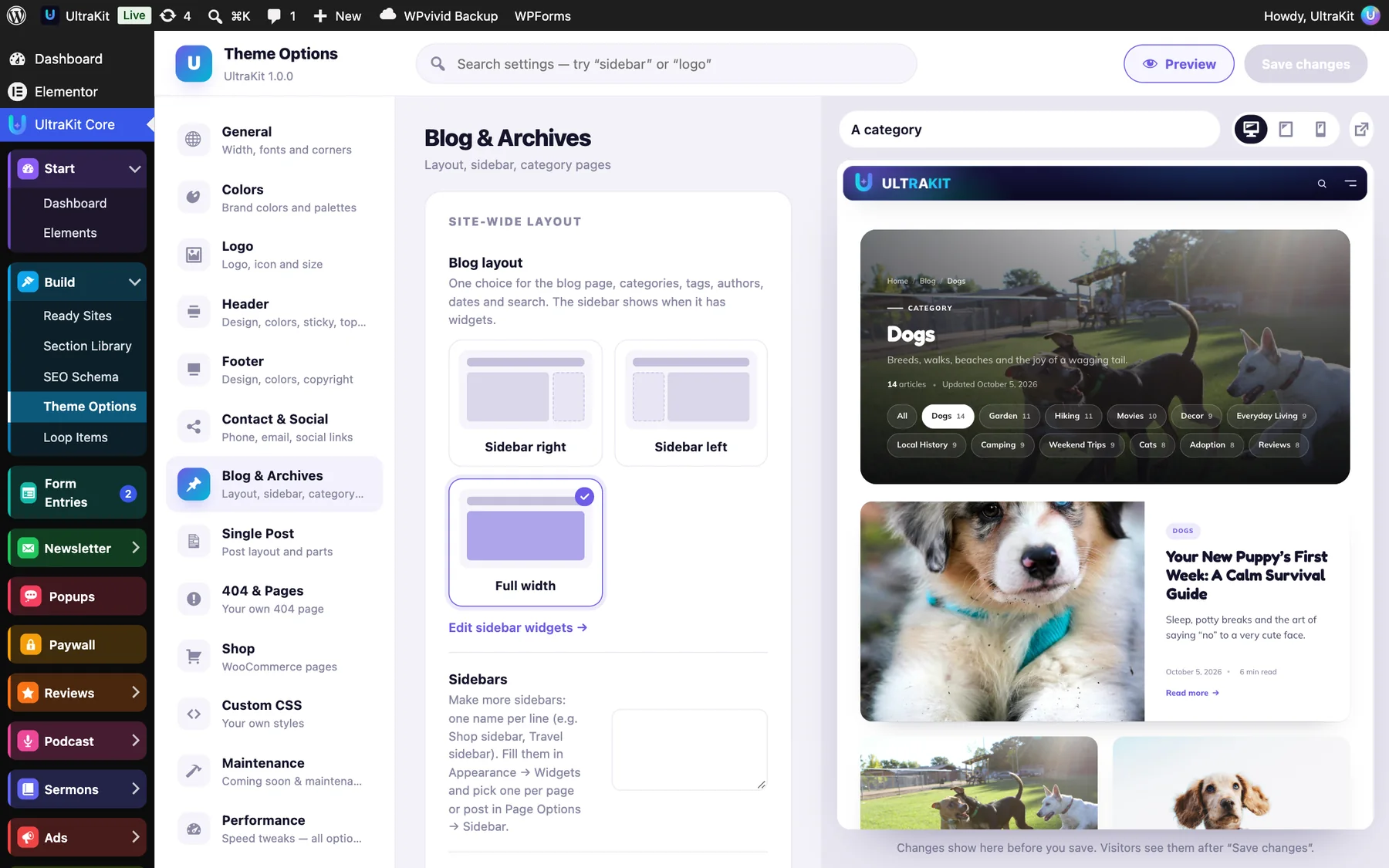
| Section | What it does |
|---|---|
| Site-wide layout | Blog layout: sidebar right, left or full width (the sidebar shows when it has widgets). Sidebars: make more sidebars, one name per line, fill them in Appearance›Widgets and pick one per page in Page Options. Sidebar on Elementor designs too. |
| Post list | 16 layouts, columns, newest story wide, image shape, card style, spacing and excerpt length — see Blog layouts. |
| Post details | Category, date, author, reading time and comment count on or off; “Read more” as a link, button, arrow or hidden, with your own text. |
| Pagination | Page numbers, Newer / Older, a Load more button or Infinite scroll — no plugin needed. |
| Page header | Nine header designs plus breadcrumb, description, post count and related topics. |
| Per page type | A separate post list, sidebar and page header for the blog page, categories, tags, authors, search and dates. |
| Blog page | The blog page heading and intro text. |
| Elementor designs | Blog & archive design and Search results design — a template with the UltraKit Archive Posts element replaces the theme’s own pages. |
One category, its own layout
Edit a category in Posts›Categories to give it its own Post list layout, Columns, Sidebar and Header image (used by the “Category image” page header). “Same as the blog” follows Theme Options.

Blog layouts & archive options#
Sixteen ways to lay out the blog, category, tag, author, date and search pages — each one can differ per page type and per category.
Open UltraKit Core›Theme Options›Blog & Archives and pick a Layout under Post list. The live preview on the right opens a category page so you see the change at once. These layouts style the theme’s own blog pages; when an Elementor design is chosen under Elementor designs, that design is used instead.

| Layout | What it looks like |
|---|---|
| Card grid | The original cards, with the newest story wide above the grid (optional). 2, 3 or 4 columns. |
| List | Cards with the photo on the left. |
| Zig-zag | Large photo and text side by side, switching sides on every post. |
| Masonry | Cards keep their own height and stack into columns. |
| Magazine | One big story with four small ones beside it, then a grid. |
| Hero first | The newest story full width with the title on the photo, then a grid. |
| Two featured | Two large stories side by side, then a grid. |
| Overlay cards | Title, category and date on the photo. |
| Bento grid | A mix of large, wide and small tiles. |
| Classic big image | One post per row: a wide photo, then a centered title and excerpt. |
| Compact cards | Small square photo and title, two per row. |
| Timeline | Dates on a vertical line, with a small photo on the right. |
| Newspaper | Serif headlines in columns divided by thin rules, with a lead story on top. |
| Headlines | Numbered headlines in two columns. |
| Minimal text | Date and title only. |
| Photo tiles | Square photos; the title shows on hover (always on phones). |
Posts without a featured image never leave a gap: text layouts simply skip the photo and photo layouts show a soft tile with the first letter of the title.
Card controls
- Columns — 2, 3 or 4 on wide screens; tablets and phones use fewer.
- Image shape — the design’s own, 16:9, 4:3, 1:1, 3:4 or the original shape.
- Card style — the design’s own, flat, border, soft shadow or glass.
- Space between posts and Excerpt length.
- Post details — switch the category, date, author, reading time and comment count on or off, and show “Read more” as a link, a button, an arrow or not at all (with your own text).
Pagination
Choose Page numbers, Newer / Older, a Load more button or Infinite scroll. Load more and infinite scroll add the next page under the list without leaving it — no plugin needed. Without JavaScript the button simply opens the next page. Infinite scroll loads up to five pages by itself, then shows the button so your footer stays reachable.
Page header
Nine designs for the top of these pages: Photo cover, Newspaper, Lead story, Photo mosaic, Minimal, Simple, Centered, Category image and Dark band. Switches turn the breadcrumb, the description, the post count and the related topics on or off. Category image uses the image you choose on the category (below), otherwise the newest post’s photo.

A different layout per page type
Under Per page type, the blog page, categories, tags, authors, search results and date archives each get their own Post list, Sidebar and Page header. “Same as the blog” uses the choices above.

A different layout for one category
- Go to Posts›Categories and edit a category.
- Pick its Post list layout, Columns and Sidebar, and optionally a Header image.
- Click Update. “Same as the blog” keeps Theme Options.
Single posts
In the Single Post tab: the Wide image header style (title, then a full-width photo), Reading time next to the date, a Table of contents built from the post’s headings, Related posts (0–6, as cards, a list or text only — same category first), the Previous / next style (boxes, with photos, minimal) and Share buttons — plain links to X, Facebook, LinkedIn, Pinterest, Reddit, WhatsApp, email and “Copy link”, with no tracking scripts. Put them before or after the post (or both), as pills, outlines or icons, plus an optional floating bar beside the post on wide screens. Each post can still show or hide related posts, share buttons and the table of contents in Post Options → Post parts.
Single post designs
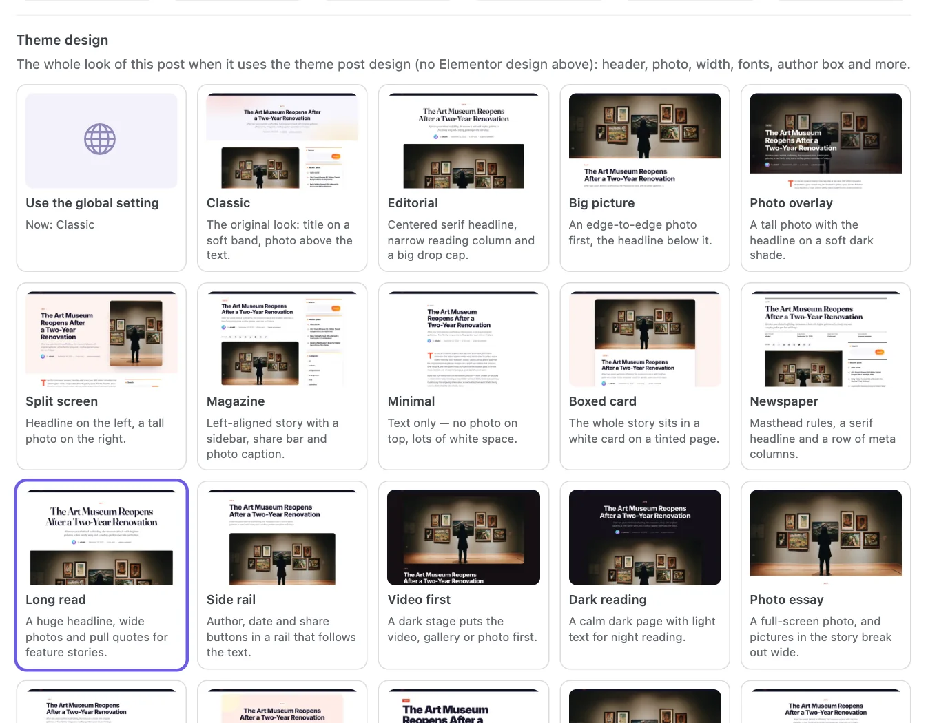
Pick a complete look for your blog posts in UltraKit Core›Theme Options›Single Post›Design. There are 20 designs, each shown as a real screenshot: Classic (the original look), Editorial, Big picture, Photo overlay, Split screen, Magazine, Minimal, Boxed card, Newspaper, Long read, Side rail, Video first, Dark reading, Photo essay, Developer, Lifestyle, Bold, Parallax, Framed photo and Side by side. A design sets the header, the photo, the reading width, the fonts, where the date and author sit and the author box, and it always uses your accent colors.
- Click a design card. The live preview on the right shows it on a real post.
- The design also fills in its recommended Post layout, Related posts, Share buttons and Previous / next options below — change any of them if you like.
- Click Save changes.

A different design for one post
- Edit the post and open Post Options → Layout under the editor (in the block editor, open the Meta Boxes panel at the bottom).
- Under Theme design, pick a design, or Use the global setting to follow Theme Options.
- Click Update.
An Elementor single post design (Theme Options, a Layouts rule, a ready website or Elementor Pro) always comes first. Then the post’s own theme design, then the design in Theme Options. A post that chose its own Header style stays on Classic with that header unless you pick a theme design for it. Posts without a featured image, password-protected posts, galleries, wide and full-width blocks, comments and right-to-left languages all work in every design; Parallax moves only for visitors who have not asked their device to reduce motion.
Every new option starts at the theme’s original look, so existing sites and imported ready websites stay exactly as they were.
Single Post tab#
The look of every blog post — a complete design, the layout, the parts around the article, related posts and share buttons.

Single post designs
The Design box offers 20 complete looks for your posts, each shown as a picture: header, photo, reading width, fonts, author box and more. Picking one also fills in its recommended layout, related posts, share and previous / next options below — change any of them afterwards. Every post can still pick its own design in Post Options → Layout → Theme design.
When a post uses an Elementor single post design — chosen in the Layout box of this tab, in UltraKit Core›Layouts or by an imported ready website — that design is shown instead. Set it to “— Theme post design —” to use the theme designs.
Layout
- Post layout — same as the blog, sidebar right, sidebar left, full width or centered.
- Post header style — Classic, Title on photo, Split, Minimal, Magazine or Wide image.
- An Elementor single post design: a design from the bundled library (classic, overlay, magazine, long read…) or any post design you saved.

Parts, related posts & share buttons
| Setting | What it does |
|---|---|
| Featured image, Author box | Show the photo at the top and the author box under the post. |
| Previous / next post links | On or off, styled as Boxes, With photos or Minimal. |
| Reading time | “5 min read” next to the date. |
| Table of contents | Built from the post’s headings, shown after the first paragraph on posts with at least two headings. |
| Related posts | 0–6 posts from the same category first, as Cards, List or Text only. 0 hides them. |
| Share buttons | Plain links to X, Facebook, LinkedIn, Pinterest, Reddit, WhatsApp, email and “Copy link” — no tracking scripts. Style: Pills, Outline or Icons only. Where: after the post, before it or both, plus an optional floating bar beside the post on wide screens. |
The reading progress bar lives in the Animations tab. Each post can hide or show related posts, share buttons and the table of contents in Post Options → Post parts.
404 page & Custom CSS#
Show your own page for broken links, and add your own styles to every page.

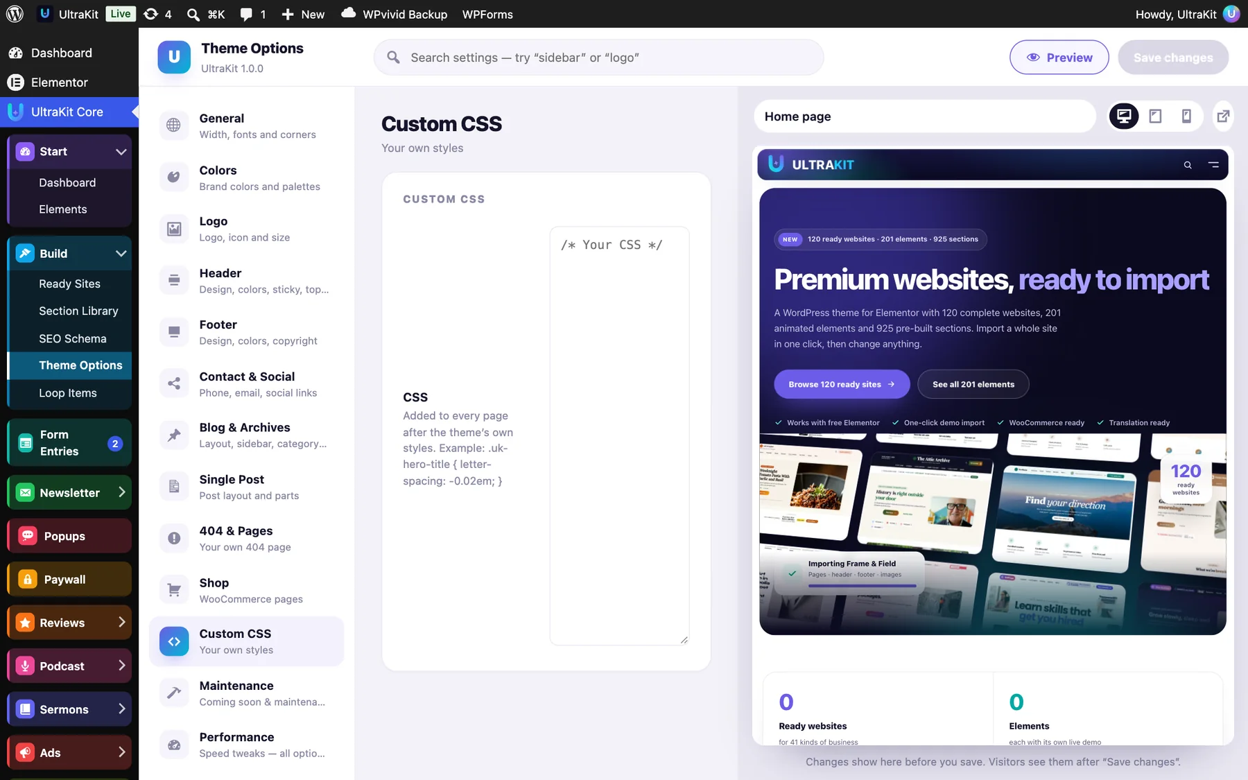
- Design a page with Elementor — a friendly message, a search box, links to popular pages.
- Pick it in UltraKit Core›Theme Options›404 & Pages → Page to show. Empty keeps the built-in 404 page.
- Save. The preview’s 404 page view shows the result.
Custom CSS is added to every page after the theme’s own styles — the same CSS WordPress keeps under Appearance›Customize›Additional CSS. Example:
.uk-hero-title { letter-spacing: -0.02em; }Shop tab#
WooCommerce settings in one place. The tab appears when WooCommerce is active.

| Section | What it holds | Details |
|---|---|---|
| Shop features | AJAX filters, rich product cards, swatches, sticky add-to-cart bar, size guides, mobile bottom bar | Shop features |
| Shop boost | Bought together, back-in-stock alerts, product video, catalog mode, estimated delivery, pre-orders | Shop boost |
| Shop | Products per row (2–5), products per page, shop sidebar (none, left, right) | Add filters to the “Shop sidebar” in Appearance›Widgets |
| Product page | Gallery side, sticky summary, description & reviews as tabs, accordion or all open, number of related products | Replaced by the Product Page Builder when it is on |
Product hearts save items in the visitor’s browser. Create a page with the shortcode [ultrakit_wishlist] to list them.
Site mode, fonts & white label#
Coming-soon and maintenance screens, privacy-friendly fonts and your own brand in the dashboard.
Maintenance tab

- Choose the Site mode: Live, Coming soon or Maintenance.
- Either pick a page you designed under Use a page, or fill in the built-in screen: Headline, Message, a Launch date for a countdown (format
YYYY-MM-DD HH:MM, empty hides it) and a Background image (empty = a soft gradient in your brand colors). - Save. Logged-in editors always see the real site, so you can keep working.
Maintenance mode answers with “503 — come back later” and a retry time, so Google keeps your rankings. Both screens tell search engines not to index them.
Fonts tab

Load Google Fonts from your own server downloads the fonts once and serves them from your site — faster and GDPR-friendly, because no visitor data goes to Google. Elementor’s fonts are included. Links on this tab open Custom Fonts, Custom Icons and Layouts.
White Label tab

For client sites: the Theme name, Author, Author link, Description and Theme screenshot (1200 × 900 px) shown in Appearance›Themes, and the Plugin name shown in Plugins and as the dashboard menu name. Empty fields keep “UltraKit” and “UltraKit Core”.
Animations tab#
Soft motion for the theme’s own pages — scroll animations, micro-interactions and page transitions.

| Setting | What it does |
|---|---|
| Animate blog, post and 404 pages | Headings rise line by line, cards drift in as you scroll, featured images unveil. Elementor pages keep their own animations. |
| Reading progress bar on posts | A thin accent-colored line at the top of every post. |
| Animation pace | Higher is slower and softer. |
| Magnetic buttons | Buttons lean a few pixels toward the mouse and spring back (desktop only). |
| Springy post cards | Blog cards tilt gently toward the mouse and lift on hover. |
| Progress ring on “Back to top” | The button fills a ring as you read. |
| Between pages | None, Soft fade or Color curtain. External links, new tabs and downloads are never delayed. |
For animations inside Elementor pages, see Animations & smooth scrolling. Visitors who asked their device to reduce motion never see them.
Import, export & reset#
Back up your settings, copy your look to another site, or start over.

| Box | What happens |
|---|---|
| Export | Download settings saves every Theme Options setting as a small .json file. Chosen templates, pages and images are left out, because their IDs differ between sites. |
| Import | Drop a .json file downloaded from an UltraKit site (or click to choose one). Any other file shows “This is not an UltraKit settings file.” |
| Reset | Reset all theme options puts every option back to its default after you confirm. Your logo, site icon and Custom CSS are kept; pages, posts, menus and Elementor designs are never touched. |
Download your settings first if you might want them back.
Blog, posts & 404#
The theme styles your blog without any extra plugin.
- Create a page called “Blog” and choose it as the Posts page in Settings›Reading.
- Open UltraKit Core›Theme Options›Blog & Archives to pick the sidebar, page header, grid or list and the number of columns.
- Use the Single Post tab for the post layout, featured image, author box and previous/next links.
Each post also has a Post design box in the editor sidebar, so a single post can use a different design. To use your own 404 page, choose it under 404 & Pages → Page to show.
Author profiles
Under Users›Profile you will find UltraKit author profile: profile photo, cover picture, job title, desk or beat, location, topics, accent color, badges and social links. The author box and the Authors Grid element use them.
Page Options#
Change the layout of one page or post without touching the rest of the site.
Under the editor of every page and post there is a Page Options panel with tabs: Layout, Header, Title bar, Sidebar, Footer, Style, Post parts, Media and Extras. Hide the header or the title bar, make the header transparent, pick another footer, change the sidebar or the colors for that page only.
Leave an option empty and the page follows Theme Options.
Block editor (Gutenberg)#
Prefer writing posts with the WordPress block editor? It looks just like your site.
The block editor uses the theme’s fonts, colors and reading width from Theme Options, so what you write looks the same after you publish. Elementor pages are not affected.
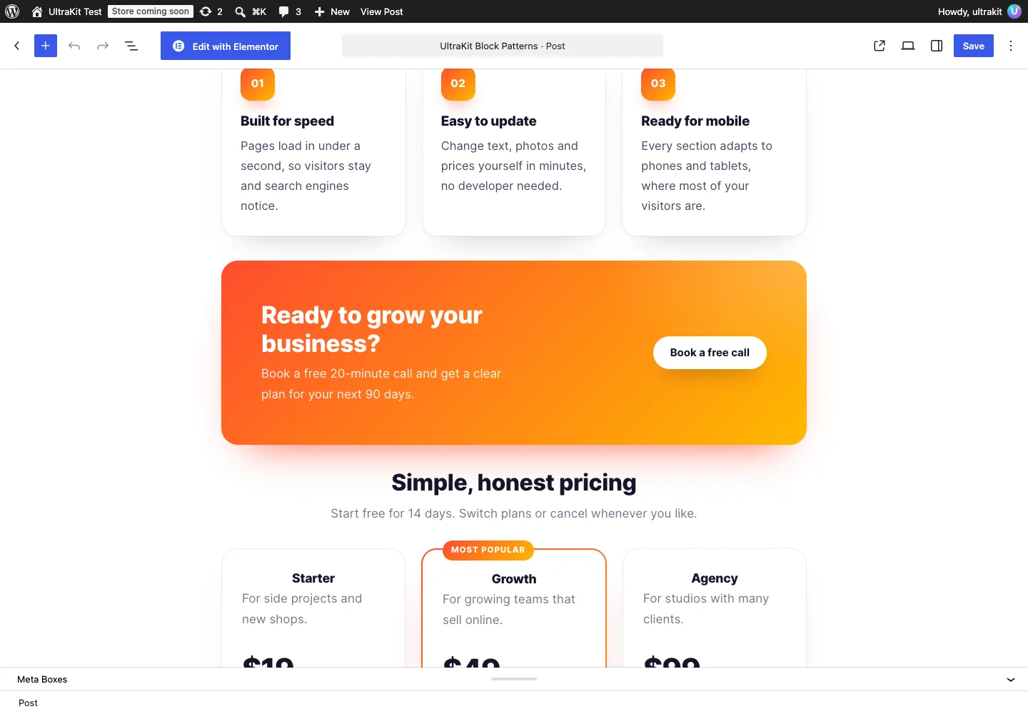
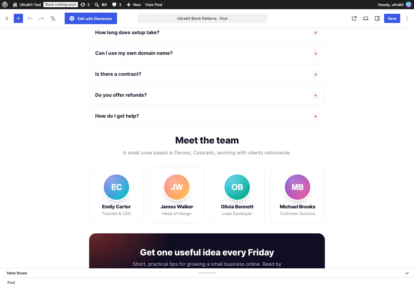
| What | Where |
|---|---|
| Block patterns | 11 ready layouts in the UltraKit category of the pattern inserter: hero, features, call to action, pricing, testimonial, FAQ, team, newsletter, post intro, stats and tip. |
| Block styles | Gradient and soft-outline buttons, rounded or shadowed images, accent-bar quotes, card groups, gradient separators and check-mark lists. |
| Colors & sizes | A palette built from your accent colors, four gradients and five font sizes. |
| Post formats | Aside, gallery, link, image, quote, video, audio, status and chat — each with its own badge and styling. |
Header Builder#
Build a header by dragging elements into rows — without Elementor.
Open Appearance›Header Builder. The header has a top bar, a main row and a bottom row, each with left, center and right zones, plus an off-canvas panel. Desktop and mobile have their own layouts.
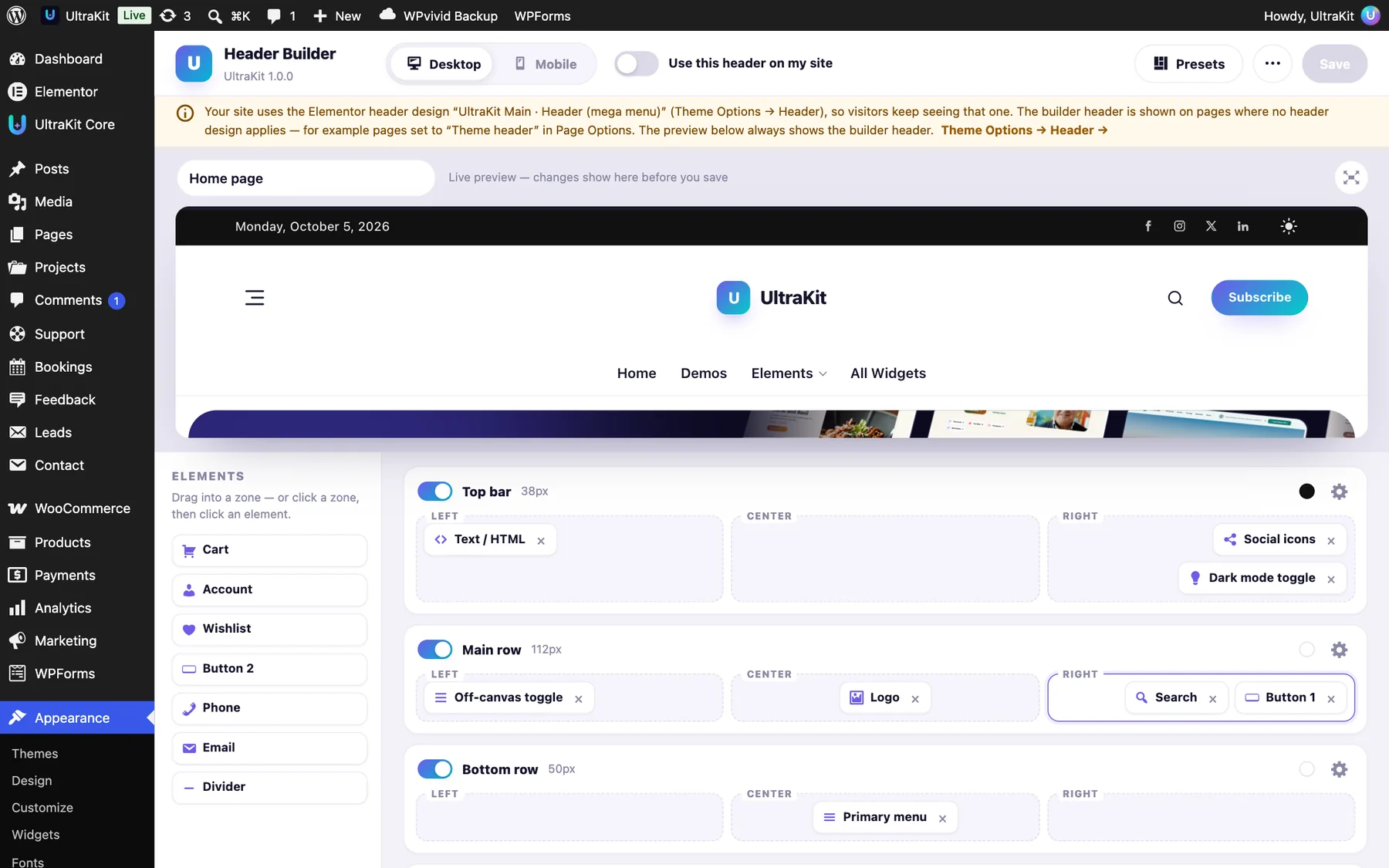
- Drag elements (logo, menu, search, cart, account, wishlist, buttons, social icons, dark mode toggle, HTML…) into a zone, or click a zone and pick one.
- Click the gear on a row for its height, colors, sticky and transparent settings.
- Switch to Mobile and arrange the phone header.
- Turn on Use this header on my site and save.
An Elementor header design (Theme Options → Header or a Layouts rule) is used first. The builder header shows on pages without one.
Start from a preset
Click Presets for 24 ready headers in ten categories (Business, Shop, News, Blog, Agency, SaaS, Hospitality, Services, Minimal, Dark), with a search box. A preset sets the desktop and mobile layouts; your logo, menus and contact details stay yours.

A different header on one page
Every page and post has a Header tab in its Page Options box, below the editor (in the block editor, open the Meta Boxes panel at the bottom). Pick where this page’s header comes from:
- Site default — whatever the rest of the site shows.
- Header Builder — the header saved in Appearance›Header Builder, even when the builder is off for the whole site.
- Builder preset — one of the 24 presets, with the same category chips as the Presets window (Business, Shop, News, Blog, Agency, SaaS, Hospitality, Services, Minimal, Dark). Layout and colors come from the preset; your logo, menus and contact details come from your Header Builder.
- Custom for this page — click Design this page’s header to open the full drag-and-drop Header Builder in a full-screen window — desktop and mobile layouts, the off-canvas panel and every element setting — start from your site header or a preset, and save. The design is kept with this page only; Reset to site header removes it.
- Elementor template, Theme header or No header (for landing pages).

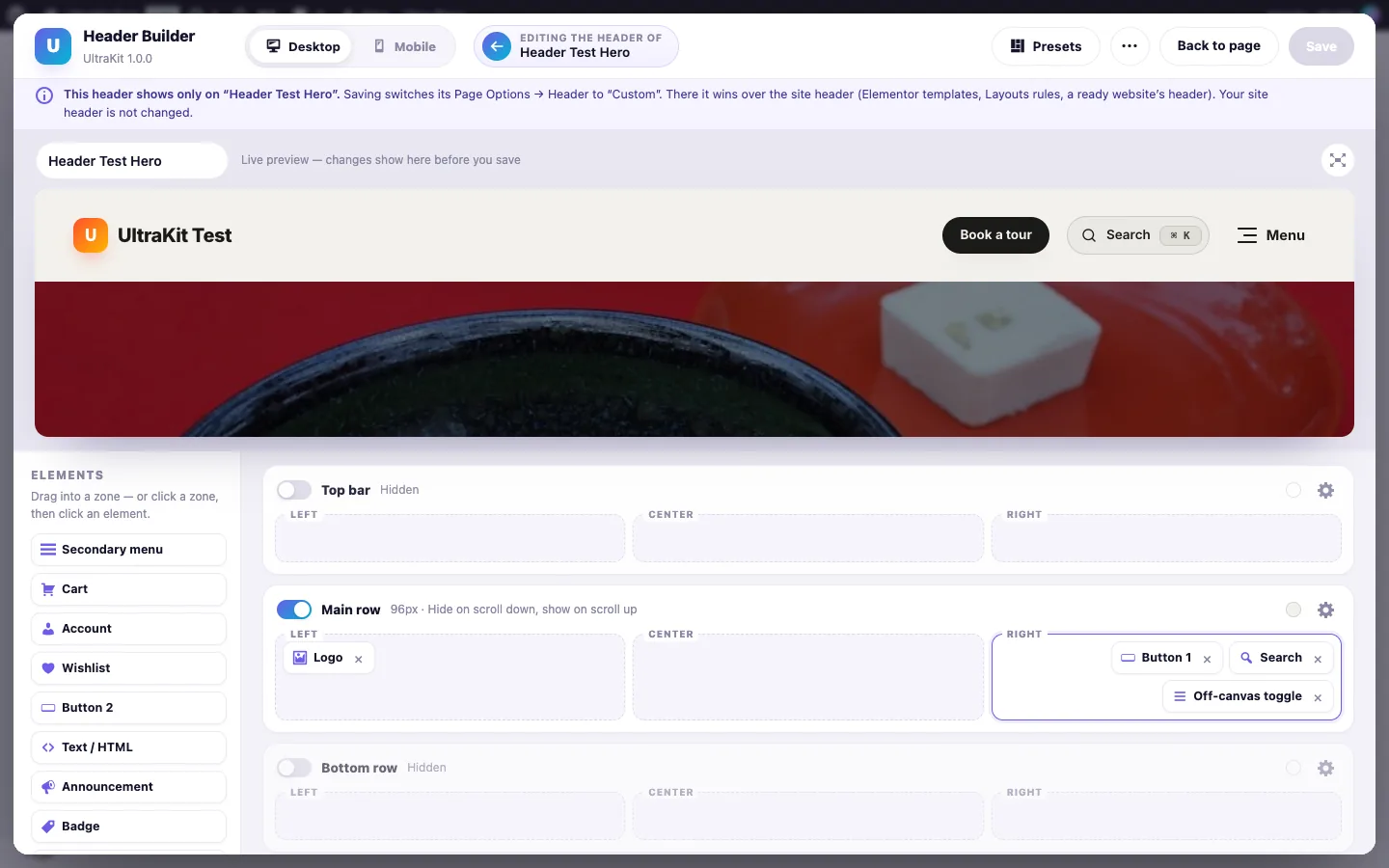
Quick tweaks change any builder header on that page: a Dark or Light skin, hide the top bar and announcement, the search, the cart or the buttons. The older controls on the same tab work with builder headers too: Transparent header floats the main row over the page’s first section (with white or dark text), Sticky header sets how the main row follows the page, Menu fills the Primary menu element, and the page logo replaces the site logo.

A builder header chosen on the page always wins on that page — even over an Elementor header template, a Layouts rule or a ready website’s own header. Leave it on Site default and nothing changes. Pages that use the Elementor Canvas template draw their own header inside the page, so the theme header is not used there.
Anyone who may edit the page — authors included — can design that page’s header. Only administrators can change the site-wide header in Appearance›Header Builder.
Footer Builder#
Build a footer by dragging elements into bands and columns — without Elementor.
Open Appearance›Footer Builder. The footer has four bands: a top band for a call to action, newsletter or contact cards (one or two columns), the main row with one to six columns, a brand band for a giant wordmark and the bottom bar with left, center and right zones. The live preview shows your real site on desktop, tablet or phone.


- Click Presets and pick a starting point — filter by category or search (Classic Columns, Corporate Contact, Market Shop, Daily Masthead, Minimal Center, Agency Wordmark, Launchpad SaaS, Bistro Hours, Aurora CTA, Glass Horizon, Quiet Journal, Let’s Talk). Each card names the Header Builder preset it pairs with.
- Drag elements into a column, or click a column and then an element. Click the width button of a band (for example 4 · 2 · 2 · 4) to change the number and widths of the columns.
- Click an element for its settings. Click the gear of a band for its background (color, gradient, image with overlay or frosted glass), skin, text and link colors, spacing, divider line, full width and column alignment. Footer settings holds the footer background, content width, phone alignment, accordions and the soft reveal.
- Turn on Use this footer on my site and save.
| Element | What it shows |
|---|---|
| Logo, About text | Your logo (the light logo on dark bands) or the site title with the tagline, and a short text — empty uses Theme Options → Footer. |
| Link columns 1–4, Custom links 1–2 | A title and links from the Footer menu, a menu you choose, your pages, post categories or product categories — or your own “Label | link” lines. On phones they fold into accordions. |
| Contact info, Social icons | Address, phone, email and hours (empty fields use Theme Options → Contact & Social) as lines or cards; social links in six looks. |
| Newsletter | Sign-ups go to UltraKit → Subscribers with the confirmation email of UltraKit Core. |
| Big call to action | Small line, heading (medium, large or huge), text, a button and a second link. |
| Recent posts, Image gallery | Your latest posts with pictures and dates; an Instagram-style grid of chosen images (or your latest featured images) with a profile link. |
| Payment icons, Trust badges, App badges, Status line | Generic payment method icons with “Secure checkout”, shipping and returns badges, two app download badges and a colored status dot. |
| Copyright, Legal links, Language / currency, Back to top | Use {year} and {site} in the copyright; {privacy} links your Privacy Policy page. |
| Giant wordmark, Text / HTML, Spacer / divider | Your name across the full width (solid, gradient, outline or fading), free text, and space or a line. |
An Elementor footer is used first: Elementor Pro’s Theme Builder, the design in Theme Options → Footer, a Layouts rule, a ready website’s own footer or Page Options → Footer. The builder footer shows on pages without one; when it is off, the theme’s simple footer shows. The Footer Builder screen lists what applies on your site.
A different footer on one page
Every page and post has a Footer tab in its Page Options box, below the editor (in the block editor, open the Meta Boxes panel at the bottom). Pick where this page’s footer comes from:
- Site default — whatever the rest of the site shows.
- Footer Builder — the footer saved in Appearance›Footer Builder, even when the builder is off for the whole site.
- Builder preset — one of the 12 presets. Colors and layout come from the preset; your logo, menus and contact details come from your Footer Builder.
- Custom for this page — click Design this page’s footer to open the full drag-and-drop Footer Builder in a full-screen window, start from your site footer or a preset, and save. The design is kept with this page only; Reset to site footer removes it.
- Elementor template, Theme footer or No footer (for landing pages).


Quick tweaks change any builder footer on that page: a Dark or Light skin, hide the top band, hide the wordmark band, hide the newsletter, and turn the reveal animation on or off.

A footer chosen on the page always wins on that page — even over an Elementor footer template, a Layouts rule or a ready website’s own footer. Leave it on Site default and nothing changes.
Product Page Builder#
Lay out the product page and the shop pages by drag and drop — no Elementor needed.
Open Appearance›Product Page Builder. It works like the Header Builder: settings on the left, a live preview of a real product or shop page on the right (desktop, tablet and phone), and nothing changes for visitors until you save.
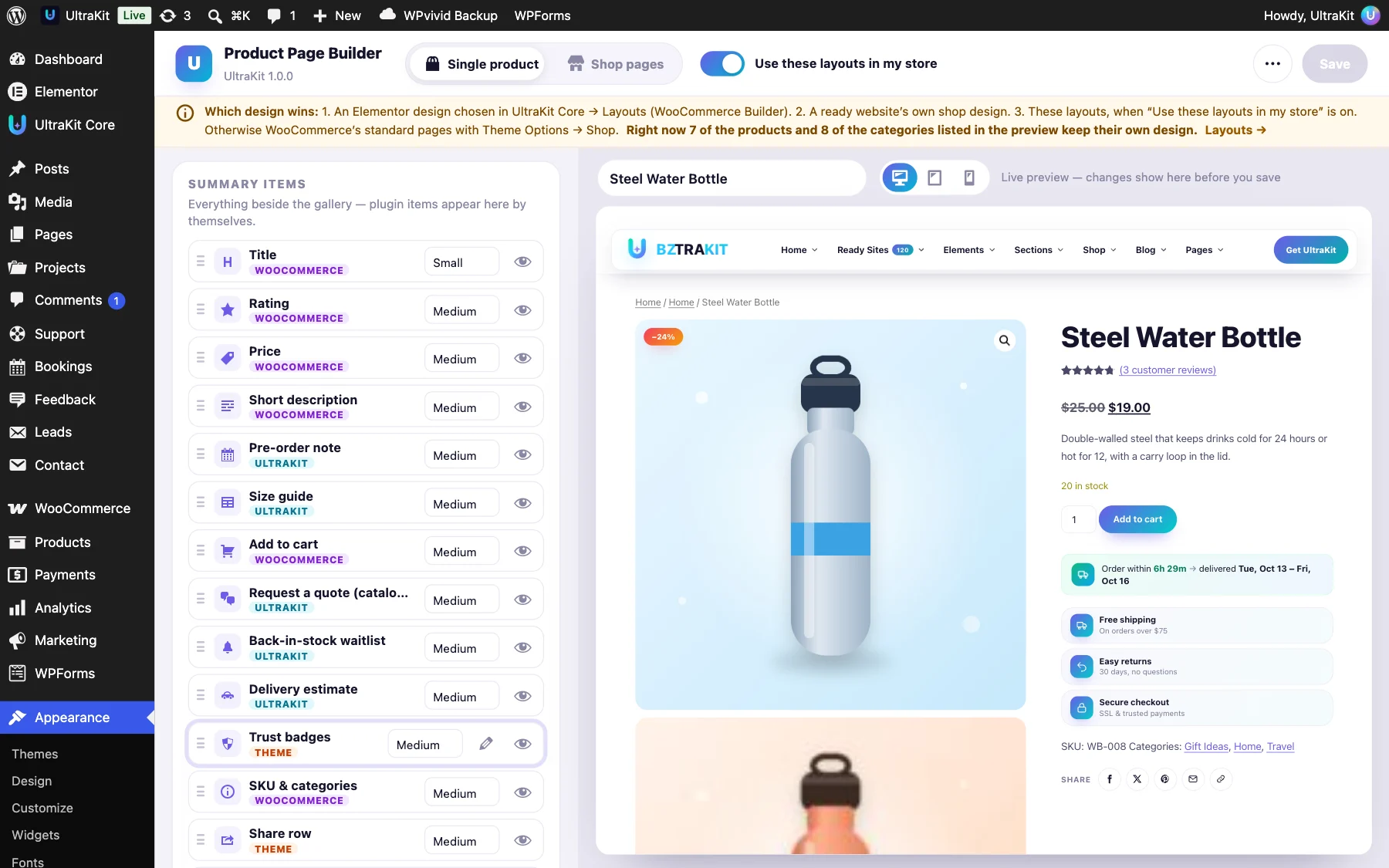
- On the Single product tab pick a layout: Classic, Gallery right, Wide gallery, Sticky summary, Split 60 / 40 or Centered minimal.
- Choose the gallery style (thumbs below, thumbs left, grid or slider with dots), zoom, lightbox and gallery width.
- Drag the summary items into order, hide the ones you don’t need with the eye and set the space below each one. Items added by plugins (size guide, back-in-stock waitlist, delivery estimate, pre-order note…) appear in the list by themselves. Edit the three Trust badges with the pencil.
- Arrange the sections below the summary: description & reviews (tabs, accordion or stacked), bought together, upsells, related products and Recently viewed — then the extras: breadcrumbs, sale badge, sticky add-to-cart bar and section background.
- Switch to Shop pages for products per row on desktop, tablet and phone, products per page, the sidebar (left, right, none or a filters drawer), toolbar, card style, a category banner and pagination (numbers, load more or infinite scroll).
- Turn on Use these layouts in my store and save.


Category layouts
Under Category layouts, give the products of a category another layout — for example Wide gallery for furniture and Centered minimal for jewelry. The first matching row wins.
- Recently viewed is remembered in the shopper’s browser (a cookie), so no plugin is needed.
- Everything runs on WooCommerce’s own hooks, so swatches, the size guide, the sticky bar and other plugins keep working.
- Export, import or reset the settings from the ⋯ menu.
1. An Elementor design picked in UltraKit Core›Layouts (WooCommerce Builder). 2. A ready website’s own shop design — its products and categories keep their look. 3. The Product Page Builder, when it is on. When it is off, WooCommerce’s standard pages use Theme Options›Shop as before.
WooCommerce Builder#
Design the single product page and the shop pages yourself, with free Elementor.
- Go to Templates›Saved Templates›Add New and create a Section (or open one of the ready designs).
- In the template’s settings (the gear icon), set UltraKit · Preview product so the editor shows a real product.
- Build the page with the product elements: Product Title, Images, Price, Add to Cart, Rating, Short Description, Content, Meta, Stock, Tabs, Additional Info, Related, Upsells, Breadcrumbs, Bought Together, Delivery Estimate and Woo Notices. For shop pages use Archive Title and Archive Products.
- Open UltraKit Core›Layouts, add a rule with the part Single product or Shop & product archives, pick your template and where it applies — all products, products in categories, specific products, category or tag archives, or the shop page.


- Add to Cart uses WooCommerce’s own form, so variation swatches, the size guide and the sticky add-to-cart bar keep working.
- Archive Products runs the real shop query, so AJAX filters, sorting and the rich product cards work as usual.
- Three product designs and one shop design are ready to use or copy.
A Layouts rule always wins. Without one, a ready website’s own product design is used, and otherwise WooCommerce’s standard page.
Loop Builder (custom cards)#
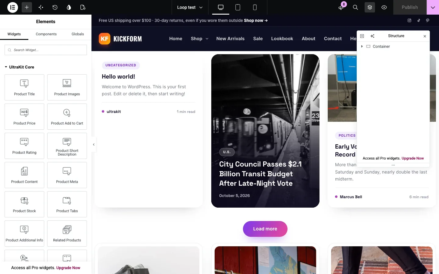
Design your own post or product card in Elementor and use it in grids, masonry, lists and carousels.
- Open UltraKit Core›Loop Items and click Template gallery — or Add New to start empty.
- Under Preview with, pick the kind of content and a sample item, so the editor shows real data.
- Design the card with any widgets and the UltraKit dynamic tags (title, image, excerpt, date, price, sale badge, rating, add-to-cart link…). WooCommerce Builder widgets work inside product cards too.
- Add the UltraKit · Loop Grid element to a page and choose your card.

| Loop Grid setting | Choices |
|---|---|
| Query | Posts, pages, products or any content type, terms, on-sale / featured / in-stock products, include or exclude, order, offset — or the current archive. |
| Layout | Grid, masonry, carousel or list, with columns per device. An alternate card can appear every Nth item. |
| Pagination | Numbers (without reloading), Load more or infinite scroll. |

The Loop Items screen
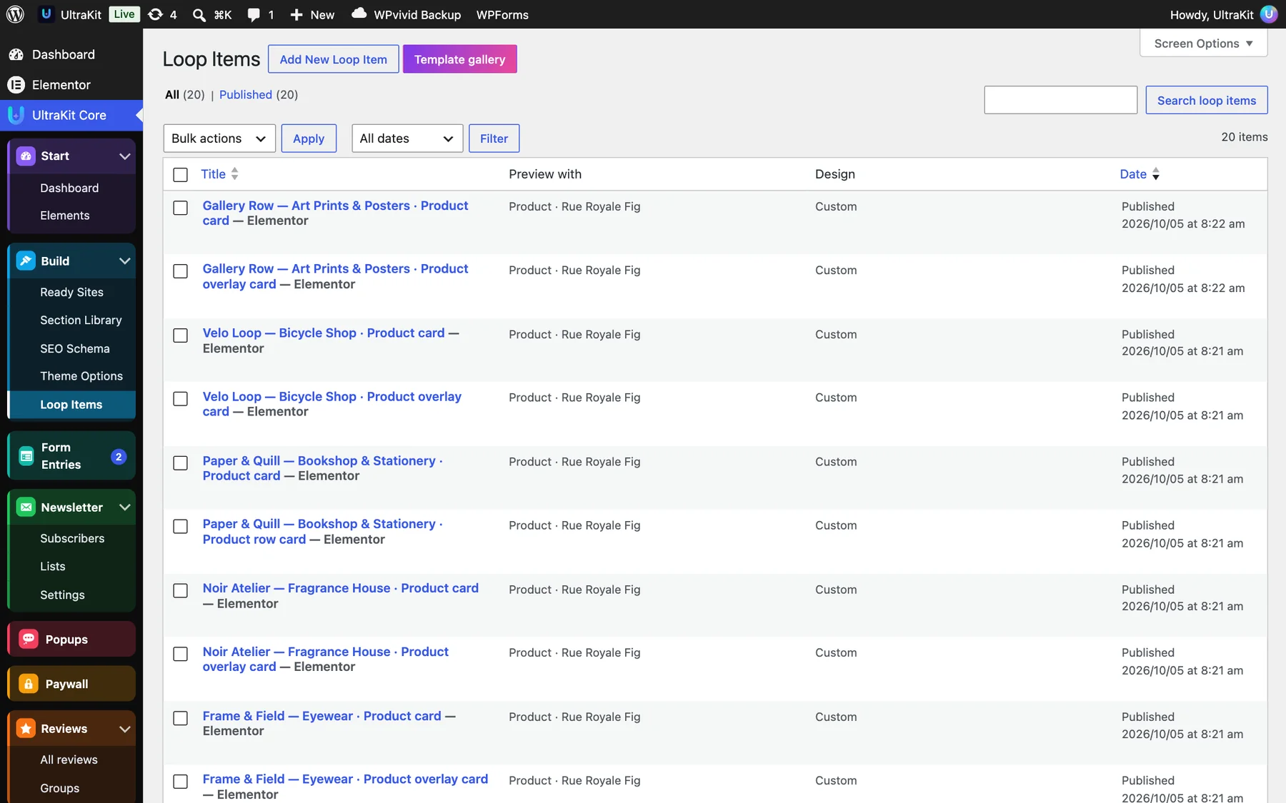
- Preview with shows which content the card is designed for (for example Product · Rue Royale Fig).
- Edit a card any time — every Loop Grid that uses it updates.
- The element in Elementor is called UltraKit · Loop Grid; search for “loop”.
Layouts: show designs by rules#
Choose which header, footer, post design, archive design, product page and shop page show on each part of your site.

- Open UltraKit Core›Layouts and click Add rule.
- Pick the Part: Header, Footer, Post design, Archive design — and with WooCommerce, Single product or Shop & product archives.
- Pick the Design: a saved Elementor template, Theme default, or None (hide).
- Pick Where it applies. Some choices ask for categories or IDs.
- Click Save layouts.
| Where | Choices |
|---|---|
| Site-wide | Entire site, Front page, Blog page, All pages, All posts, All archives, Author pages, Search results, 404 page |
| Picked content | Posts in categories…, Category archives…, Specific pages / posts… (IDs, e.g. 12, 48) |
| WooCommerce | Shop & product categories, Shop page only, All products, Products in categories…, Specific products…, Product category archives…, Product tag archives |
Which rule wins
The most specific rule wins: chosen IDs beat categories, categories beat “all posts”, and “Entire site” comes last. A page’s own Page Options beat every rule. With no rules, your Theme Options choices are used everywhere.
Header “Shop header” on Shop & product categories; Post design “Long read” on Posts in categories → Features; Single product “Immersive Gallery” on Products in categories → Furniture.
For product and shop pages built in Elementor, see WooCommerce Builder.
Popup Builder#
Sign-up offers, exit-intent coupons, slide-ins, bars and drawers — designed in Elementor, shown by rules.
- Open UltraKit Core›Popups and click Template gallery — or Add New Popup to start empty.
- Design the content with Elementor. The editor shows the popup at its real size on a dimmed page.
- In Popup Settings choose the layout and look, the triggers, where and to whom it shows, and how often.
- Publish. The list shows views, conversions and the conversion rate of every popup.

| Setting | Choices |
|---|---|
| Layout | Centered modal, slide-ins in any corner, top or bottom bar, full screen, side drawers. |
| Triggers | On page load (with a delay), on scroll, exit intent, after inactivity, on click of any element, after a number of page views. |
| Conditions | Pages, posts, shop pages, visitors or members, devices, cart contents, URL text, referrer and a date range. |
| Frequency | Every page view, once per session, once every few days, or stop after it was closed a few times — and never again after a sign-up. Remembered in the visitor’s browser. |


Open a popup from a button or link with #ultrakit-popup-123 or the shortcode [ultrakit_popup_button id="123" text="Get 10% off"]. Only pages with a matching popup load its files.

Use the elements#
All 201 elements live in one Elementor category called “UltraKit Core”, at the top of the panel.
- Edit any page with Elementor.
- In the left panel, open the UltraKit Core category or search for an element by name.
- Drag it onto the page. The Content tab holds layouts and text; the Style tab holds colors, fonts and spacing.
- Click Update to publish.
Open the elements showcase or the Widgets page. Each element has its own demo page with all of its styles.
What is included
Turn elements on or off#
Hide elements you never use to keep the Elementor panel short.
- Open UltraKit Core›Elements.
- Search or filter by All, Active or Inactive.
- Use the toggles, or Enable All / Disable All.
- Click Save Changes.
Pages that already use a disabled element will no longer show it. Turn it back on to bring it back — nothing is deleted.
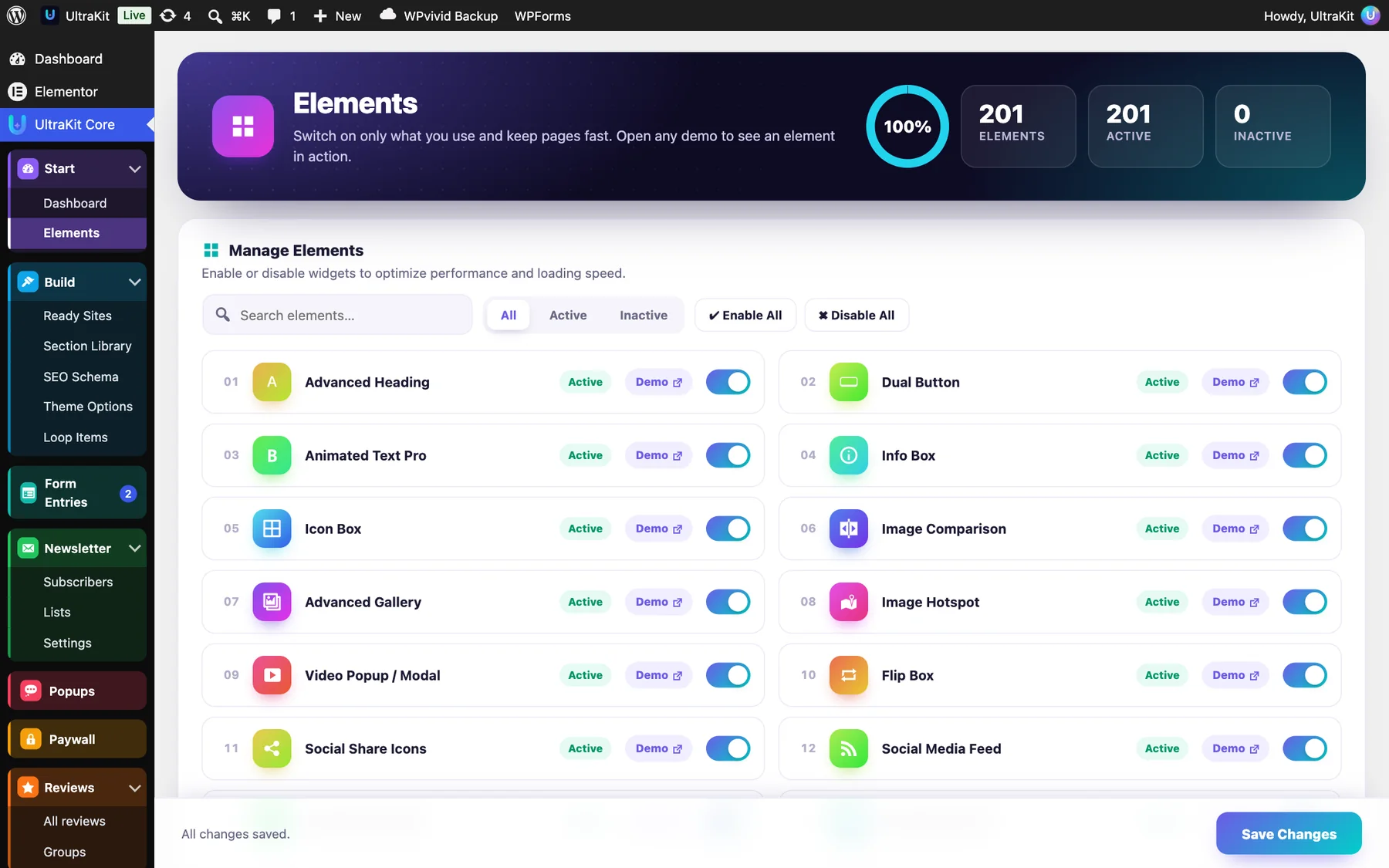
The ring at the top shows how many elements are active. Each row has a Demo link to that element’s live demo page.
Section Library#
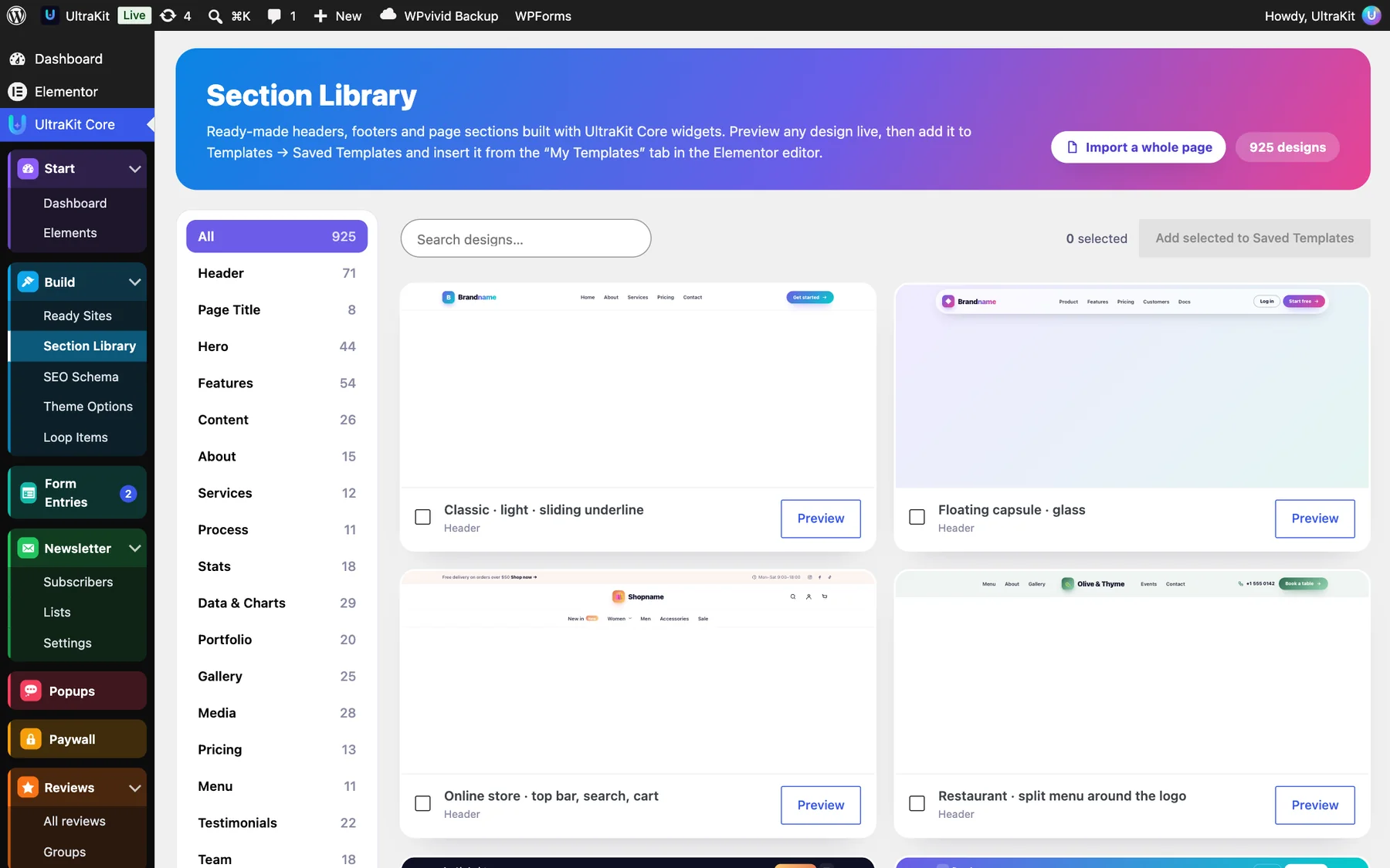
925 ready-made sections — heroes, pricing, testimonials, team, booking, footers and more.
- Open UltraKit Core›Section Library.
- Filter by category or search the designs. Click Preview to see one on desktop, tablet and phone.
- Select the designs you like and click Add selected to Saved Templates.
- In the Elementor editor, click the folder icon (Add Template), open My Templates and insert the section.
- Change the text, images and colors like any other section.
To clean up, use Remove all added library designs on the Section Library screen. Sections already inserted into pages stay where they are.
Display conditions#
Show or hide any widget, section, column or container based on simple rules — no Elementor Pro needed.
- Select the element in Elementor and open the Advanced tab.
- Open UltraKit Display Conditions and switch on Use display conditions.
- Choose Show it or Hide it when the rules match, and whether All or Any one rule must match.
- Add your rules.
| Rule group | Rules |
|---|---|
| Visitor | Logged in, user role, first or returning visit, browser language |
| Date & time | Date range, day of the week, time of day |
| Page | Page type, specific pages, post category |
| Traffic | URL parameter, came from a website |
| Device | Phone or desktop, operating system, browser |
| WooCommerce | Cart contents, customer |
Show a “Free shipping over $50” bar only to visitors whose cart is not empty, and hide a promo after its end date.
Animations & smooth scrolling#
UltraKit includes GSAP and Motion, so pages can move smoothly without extra plugins.
Theme animations
In UltraKit Core›Theme Options›Animations you can turn on scroll animations for blog, post and 404 pages, a reading progress bar, magnetic buttons, springy post cards, a progress ring on “Back to top” and soft page transitions. Animation pace makes everything slower or faster.
Animation elements
- Motion Effects — add it once to a header or footer template to animate the menu, headings and images across the site. It also offers smooth wheel scrolling, gliding
#sectionlinks and side dots for one-page sites. - GSAP Scroll Scenes — eight ready scroll scenes; drop in your words and photos.
- Scrollytelling, Text Reveal on Scroll, Parallax Layers, Horizontal Scroll Showcase and more.
Every animation is skipped for visitors who turned on “reduce motion” on their device, and content never stays hidden if a script fails.
Dynamic content#
Fill text, links and images from the post, the author, the site or custom fields — no Elementor Pro needed.
In any Elementor text, link or image field, click the dynamic icon and choose a tag from the UltraKit group: post title, excerpt, date, categories, tags, author name and bio, comments count, reading time, archive title, site title and tagline, today’s date, current year, the phone, email, address and opening hours from Theme Options, the logged-in user’s name, a custom field (ACF too) or a URL parameter.
Outside Elementor the shortcode does the same:
[ultrakit_dynamic field="reading_time"]
[ultrakit_dynamic field="meta" key="price_note"]
© [ultrakit_dynamic field="year"] [ultrakit_dynamic field="site_title"]Form Builder & Form Entries#
Contact, quote, application and multi-step forms built in Elementor — every message saved in WordPress and emailed to you.
Build a form
- Add the Form Builder element to a page.
- Under Fields, give the form a name (it groups the entries) and add fields. 20 field types: text, email, phone, number, website, long text, dropdown, choose one (pills), choose several, picture cards, date, time, star rating, slider, file upload, consent checkbox, hidden value, price total, heading / text and — New step — for multi-step forms.
- Set each field’s label, placeholder, help text, Required and width (full, half, third). Use Show only if field (ID) to show a field only when another answer is, is not, contains, is filled in or is empty.
- Under After sending, choose the thank-you message or a page to go to, Save entries, Email me each message (send to, subject), an Auto-reply to the visitor and an optional Webhook URL.
- Publish. Turn off Preview mode when you are done testing — in preview mode nothing is saved or emailed.

Read the entries

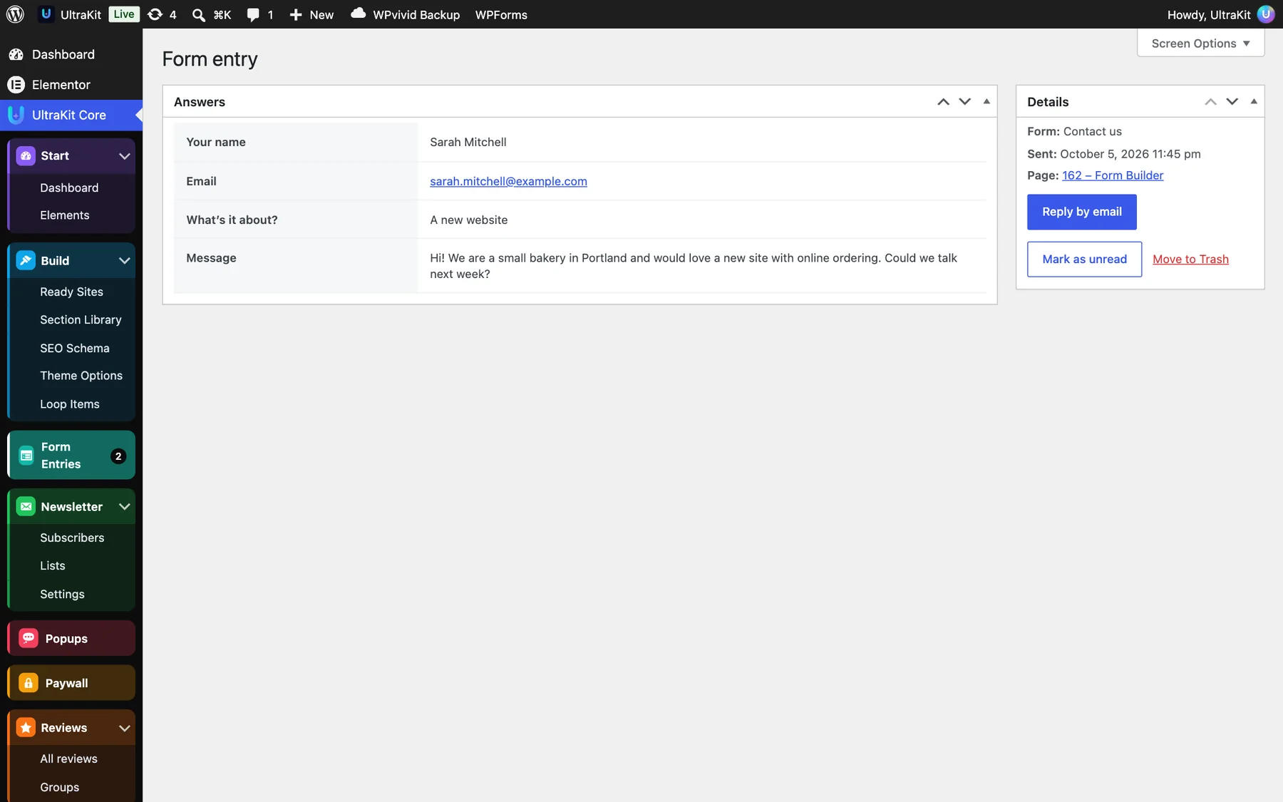
- The menu badge counts unread entries. Opening an entry marks it read; Mark as unread sets it back.
- Filter by form with All forms, and use Export CSV for one form or all of them — one column per field.
- Each entry shows all answers, the form, when it was sent and the page, with a Reply by email button.
The server checks every answer again (required fields, email and number rules, allowed options, hidden conditional fields, price totals). Spam is stopped with a hidden field, a minimum fill time and a sign-up limit per network — all of them work with page caching. Uploads are type- and size-checked and stored with random names.
Newsletter#
Grow an email list on your own site — no third-party service, no monthly fee.
Where sign-ups come from
- The Newsletter element (9 layouts, including popup, bar and slide-in versions) on any page.
- The Newsletter element of the Footer Builder.
- The Paywall email wall, when “Add emails from the paywall to UltraKit Newsletter subscribers” is ticked.

- Create your topics in UltraKit Core›Newsletter›Lists — for example “Morning Briefing” and “Weekend Reads”.
- Add the Newsletter element. Under Form, choose Add to lists (or let visitors pick their topics), an optional first-name field, a consent checkbox and a Form name that shows in Subscribers.
- Under After signing up, optionally give a free download, set the thank-you text or a page to go to, and hide the form for people who already subscribed.
- Open UltraKit Core›Newsletter›Settings and check the emails (below).
- Turn off Preview mode (don’t save) on the element and publish.
Subscribers
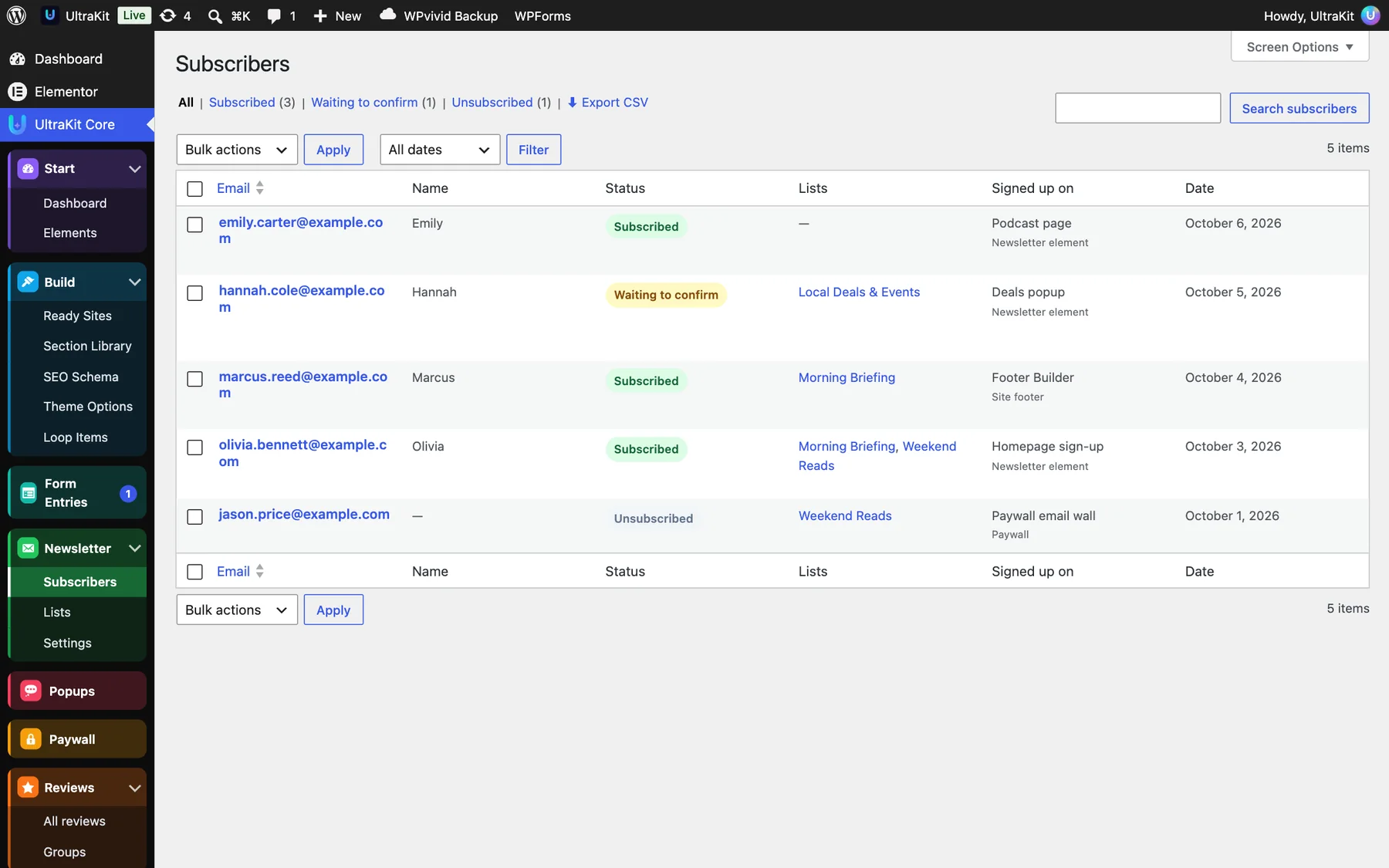
Every subscriber shows the email, name, status (Subscribed, Waiting to confirm, Unsubscribed), lists, where they signed up and the date. Filter by status at the top, use Mark subscribed or Unsubscribe under a row, and Export CSV for a status or everyone. UltraKit also records the consent text each person agreed to.
Settings

| Setting | What it does |
|---|---|
| Counters & export | Subscribed, waiting and unsubscribed totals, and Export subscribed (CSV). |
| Double opt-in | New subscribers confirm by email first (recommended). The confirmation email has a one-click link; every email has a one-click unsubscribe. |
| Send emails as | Sender name and address — use one on your own domain, ideally with an SMTP plugin. |
| Confirmation & welcome email | Subject and text with tags: {name} {site} {email} {confirm_button} {confirm_link}, and {gift} for the free download. |
| After confirming | The built-in “You’re subscribed!” page or a page you choose. |
| Notify me, Webhook | Get an email when someone confirms; send each confirmed subscriber as JSON to Zapier, Make or your own CRM. |
| Import subscribers | Paste one per line: email, name, optionally into a list. They are added as subscribed without a confirmation email — only import people who agreed. |

UltraKit collects and manages the list. To send campaigns, export the CSV or connect the webhook to your email service.
Leads & feedback#
Emails and ideas from pop-ups, call-to-action boxes and the roadmap, and ratings from the feedback form.
Leads
The Leads menu collects what these elements send: Modal Popup Box, Notification Bar, Call to Action, PDF Viewer downloads, service-area checks, tour dates, the changelog and the Public Roadmap (ideas). Catalog-mode quote requests from Shop boost arrive here too. Each lead shows the email or idea, the source and the page, and you get an email for each new lead.

Feedback
The Client Feedback Form element asks for a rating — stars, emoji, NPS 0–10 or thumbs — plus optional choices, a note and contact details. Answers appear under Feedback with the rating and email columns.

Leads and Feedback are top-level items in the WordPress menu. They appear when at least one element that uses them is switched on.
Bookings#
Take real appointments — services, staff, opening hours and free slots — with the Booking / Appointment Form element.

- Add the Booking / Appointment Form element to a page.
- Add your services (name, length, price) and, if you like, staff with the services they offer and their days off.
- Set opening hours, a break, Closed Dates, Minimum Notice, Bookable Up To (days ahead) and Capacity per Time (with staff, capacity is per person).
- Choose I Approve Each Booking Myself if you want requests instead of instant bookings, where notifications go, and whether the customer gets a confirmation email.
- Turn off Demo Mode — in demo mode nothing is saved or sent — and publish.

- Booked times disappear from the form, so a slot is never sold twice. Forms with the same Calendar ID share their booked slots.
- Every booking gets a reference like
UK-3F7K2A. You get an email with a link to the list; the customer gets a confirmation (or “request received”). - To approve a request, open it and click Publish. To cancel, move it to the trash — the slot opens again.
Paywall & premium posts#
Lock your best articles for members, email subscribers or chosen roles — the locked text never reaches the browser.
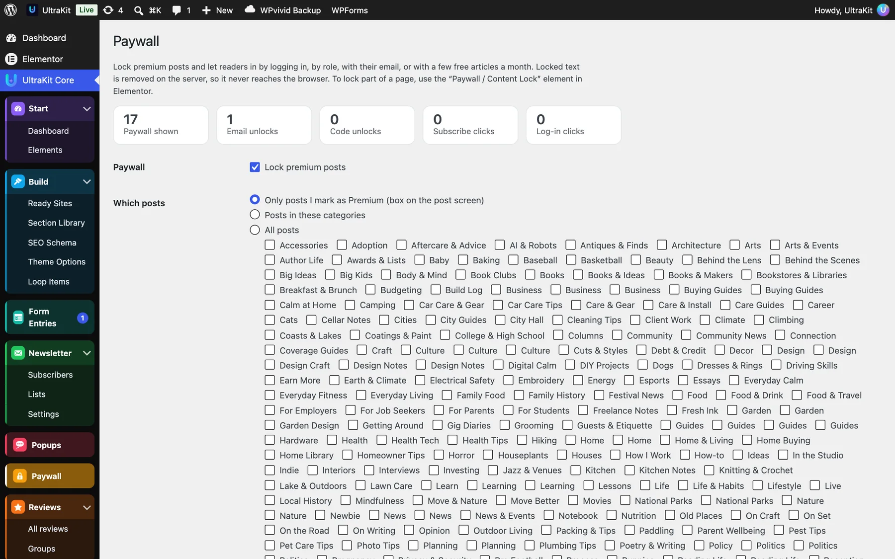
- Open UltraKit Core›Paywall and tick Lock premium posts.
- Which posts: only posts you mark as Premium, posts in chosen categories, or all posts.
- Who can read: anyone logged in, anyone who leaves their email (a free registration wall), or only chosen roles. Editors and admins always see everything; membership plugins that give paying members a role work with “Only these roles”.
- Optionally allow free articles per month and show readers how many they have left, and add paywall emails to your Newsletter.
- Pick a Box design — Card, Split with plans, Magazine, Email wall, Glass, Banner, Minimal, Bottom sheet, Light, Dark or Newspaper — the number of teaser paragraphs, the texts, plans and your Subscribe page.
- Save. On any post, the Paywall box in the editor sidebar can follow the site rule, lock it (Premium) or keep it Always free.

The counters show how often the paywall was seen and how many readers unlocked by email or code, or clicked to subscribe or log in. To lock part of a page instead, use the Paywall / Content Lock element. With SEO Schema on, locked posts are marked for Google as paywalled content.
Reviews#
Collect reviews on your own site, approve them, reply, and show them on a Reviews Wall.

- Optional: create Groups in UltraKit Core›Reviews›Groups to keep reviews for different locations, products or services apart.
- Add the Reviews Wall element. Choose the source (your UltraKit reviews, WooCommerce product reviews or reviews you type in), the groups, the lowest rating to show and the layout.
- Turn on Let visitors write a review to show the form: ask for an email (kept private), a consent checkbox, Publish without my approval (optionally only from a minimum rating) and Email me new reviews.
- New reviews arrive as Pending. Open one, add Your reply (public) if you like, and click Publish to approve it.


Each review can carry a Verified customer or Featured badge, a reviewer photo, a photo in the review and where it came from, with a link to the original. The wall shows a live average, the number of reviews and a 5-to-1 star breakdown.
Only copy reviews you have the right to use, and link to the original.
Podcast#
Publish episodes with a player, chapters and transcripts, and give every show an Apple Podcasts and Spotify-ready RSS feed.
- Create a show in UltraKit Core›Podcast›Shows — cover (square, 3000 × 3000 for Apple), tagline, host, category and “listen on” links.
- Add an episode in UltraKit Core›Podcast›Episodes. Write the show notes in the editor; the featured image is the episode cover (empty uses the show cover).
- Fill in Episode details: the audio file or an audio URL, episode and season number, type (full episode, trailer, bonus), explicit, length (0 reads it from the file), guests, chapters (
12:30 Title) and the transcript. - Add the Podcast Episodes element to a page, or use the archive at
/podcast/.


Submit your show’s feed to podcast apps:
/feed/podcast/?show=your-show-slugPlays are real: one per listener per episode every 12 hours.
Sermons#
A message library for churches, mosques, synagogues and any teaching community.

- Open UltraKit Core›Sermons›Settings and choose what you call them: Sermons, Messages, Khutbahs, Talks or Teachings. The menu and the element’s default words follow.
- Add Series, Speakers, Topics and Books (scripture) — or create them while you add a message.
- Add a message: the service or occasion, audio (file or URL), video (YouTube, Vimeo or .mp4), notes or a PDF handout, length, key points and discussion questions for small groups.
- Add the Sermon Library element to a page, or use the archive at
/sermons/.


Series without a picture get typographic artwork drawn for them automatically. Visitors can filter by series, speaker, topic and scripture, and search.
Projects (portfolio)#
A portfolio and case-study system with a premium project page — no Elementor needed for each project.
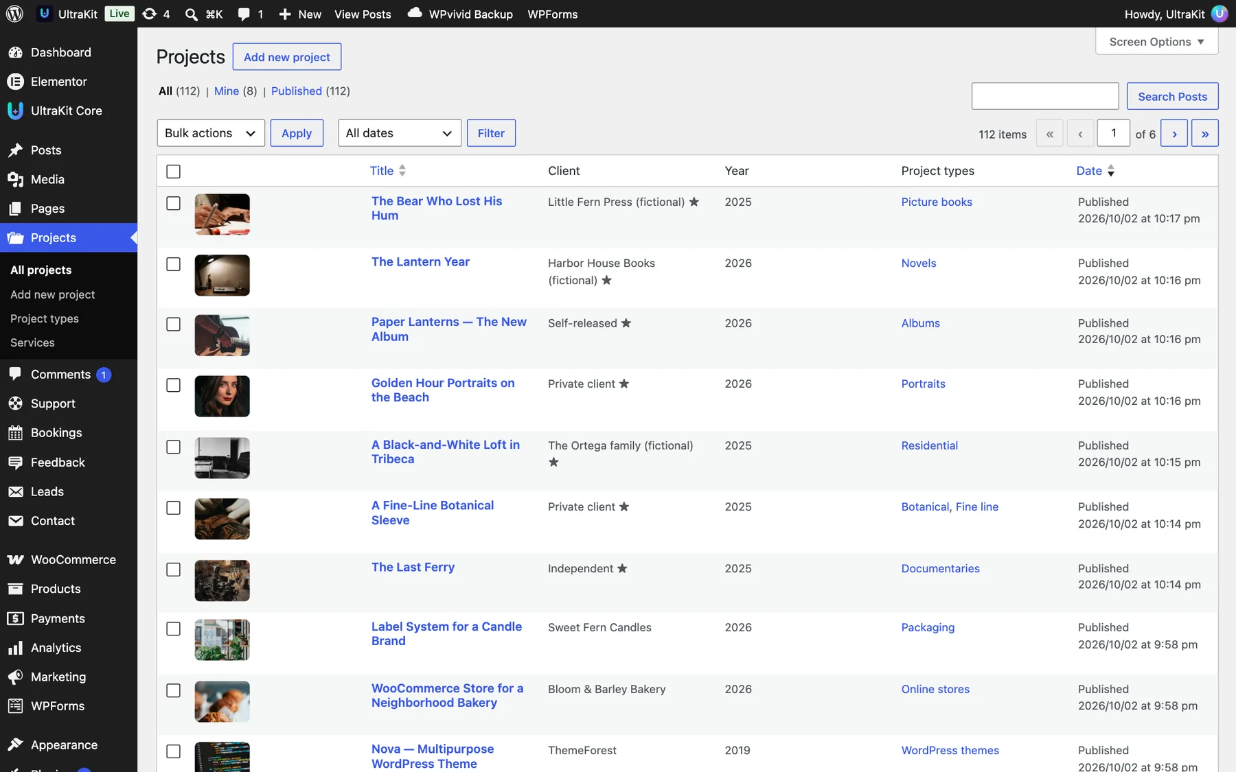
- Go to Projects›Add new project.
- Write the story in the editor; the Excerpt becomes the “Overview”. Set a featured image.
- Fill in Project details: tagline, client, year, your role, location, timeline, live site, accent color, the top of the page (big title with wide cover, title beside the image, or title only), Featured project, a gallery (drag to reorder), results (
Label | Valueper line) and a client quote. - Add Project types and Services in the side boxes, then publish.
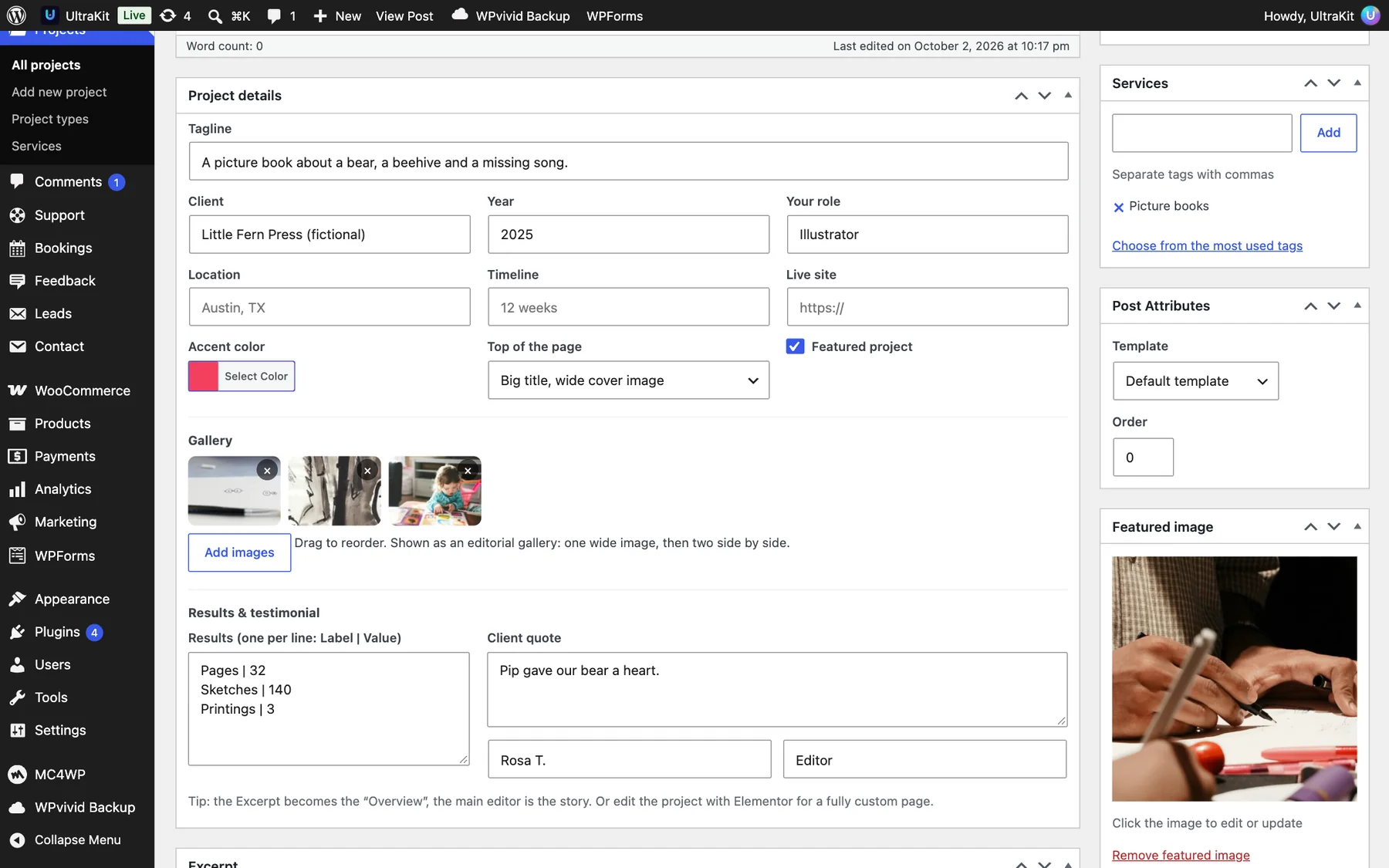
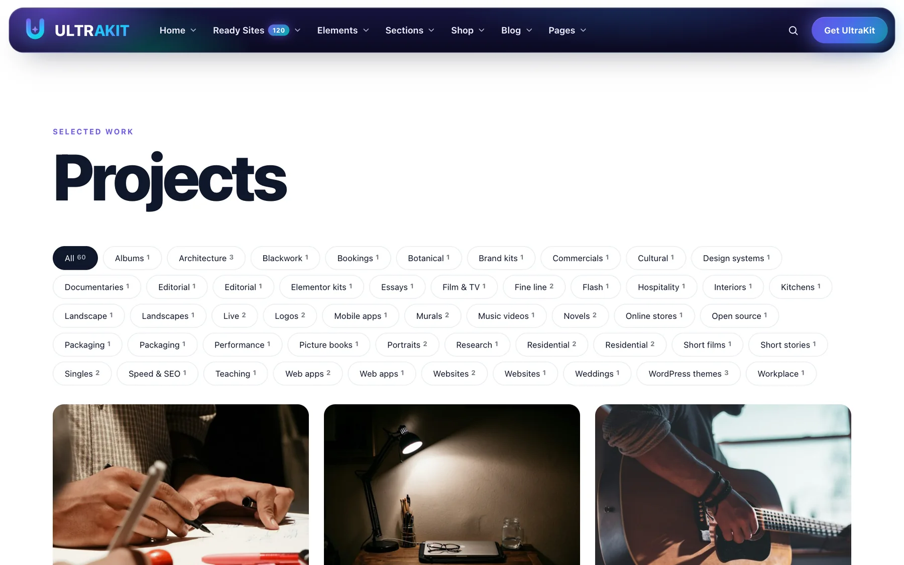
Every project gets a ready page — hero, overview, story, results, an editorial gallery with lightbox, testimonial and next project. The filterable archive is at /projects/. On any page, use the Projects and Project Details elements, or edit a project with Elementor for a fully custom page.
Ad Manager#
Sell or show ads on a news or blog site — designed banners, images, sponsored cards or ad network code, with real view and click counts.
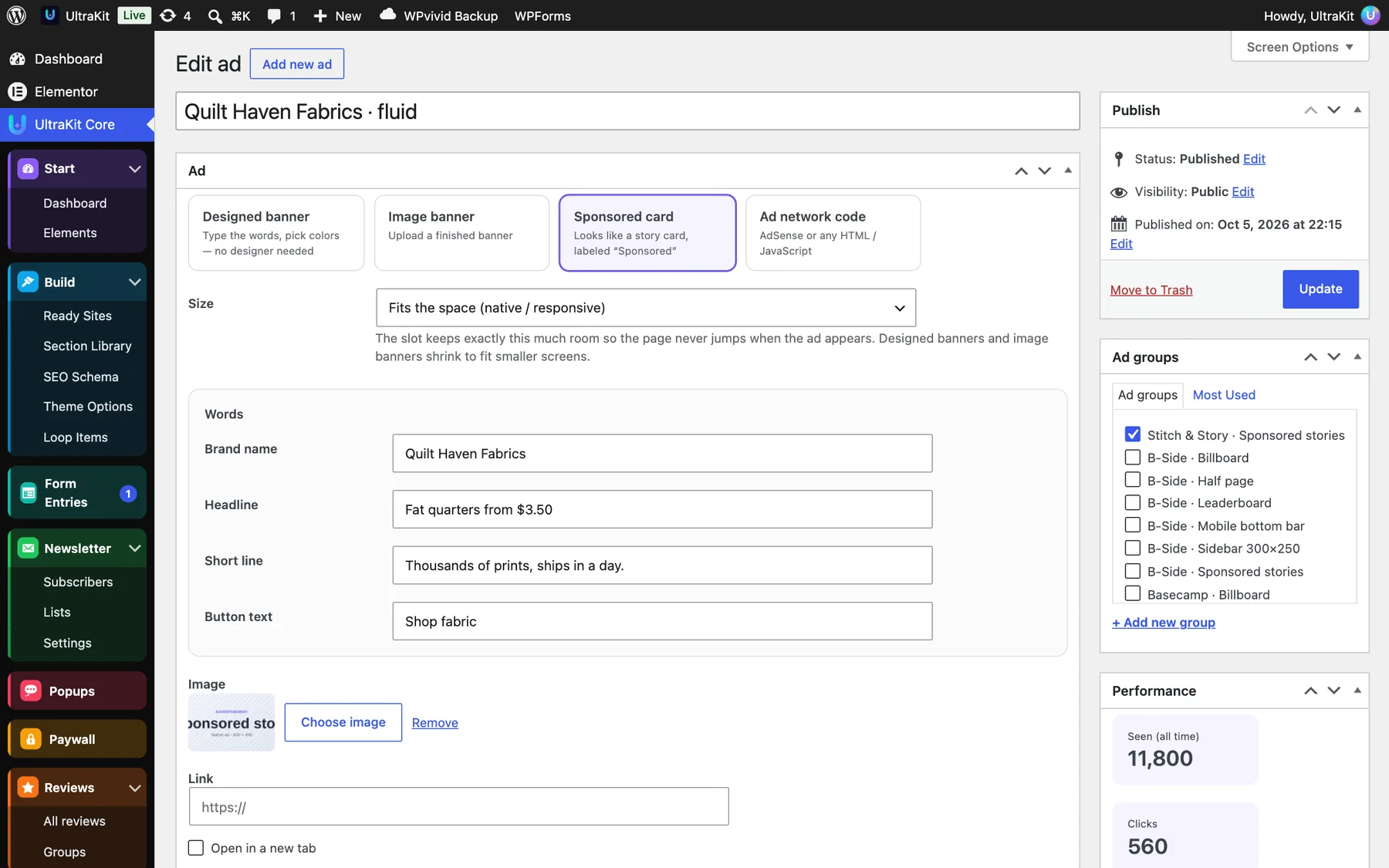
- Open UltraKit Core›Ads›All ads and click Add new ad.
- Choose the type: Designed banner (type the words, pick colors), Image banner, Sponsored card (looks like a story card, labeled “Sponsored”) or Ad network code (AdSense or any HTML / JavaScript — administrators only).
- Pick the Size. The slot keeps exactly that space, so the page never jumps.
- Add the link, the devices (desktop, tablet, phone), the run dates, the Share in its group (1–10) and the label above it. Put it in an Ad group.
- Publish. Set an ad to Draft to pause it.

Placements

- Inside the story — after paragraph N, then every N paragraphs, at most N ads, only in stories with at least N paragraphs. Ads never land inside a quote, list, table or caption.
- Before the story, After the story and a Sticky bottom bar (phones only or all screens; readers can close it for the rest of their visit).
- Limit ads to categories, exclude stories by ID (or tick “No automatic ads” on the story), set the label text and hide ads for logged-in members.
- Add your
ads.txtlines, and see views, clicks and click rate for the last 30 days.

Place an ad anywhere else with the Ad Slot element or the shortcode:
[ultrakit_ad]Ad code loads only when the slot scrolls near the screen, and links get rel="sponsored" as search engines ask.
Envato live sales & freelancer profile#
Show your ThemeForest or CodeCanyon sales, earnings and buyer comments live on your site or an office TV.

- Open build.envato.com/create-token and sign in with your author account.
- Tick: View and search Envato sites, View your Envato Account username, View your items’ sales history, View your account financial history and View your account profile details. Create the token and copy it.
- Paste it in UltraKit Core›Envato Sales. It is stored encrypted and never shown again.
- Optional: the item IDs to follow (empty follows all items on the chosen marketplace), when “today” starts, earnings or sale prices, the refresh interval and privacy.
- Click Test connection & refresh, then add the Envato Live Sales or Freelancer Profile element to a page.

| Privacy switch | Effect |
|---|---|
| Visitors may see money | Today, this month and sale prices. |
| Visitors may see the buyer’s country | Never the city. |
| Show buyer comments | The latest item comments. |
| Only admins can see the element | Turns the element into a private dashboard. |
Both elements show clearly labeled sample numbers until a token is saved, so you can design the page first. Buyer names and emails are never shown — Envato does not share them.
SEO Schema#
Structured data that tells Google what each page is, so posts can appear as rich results and in Top Stories.
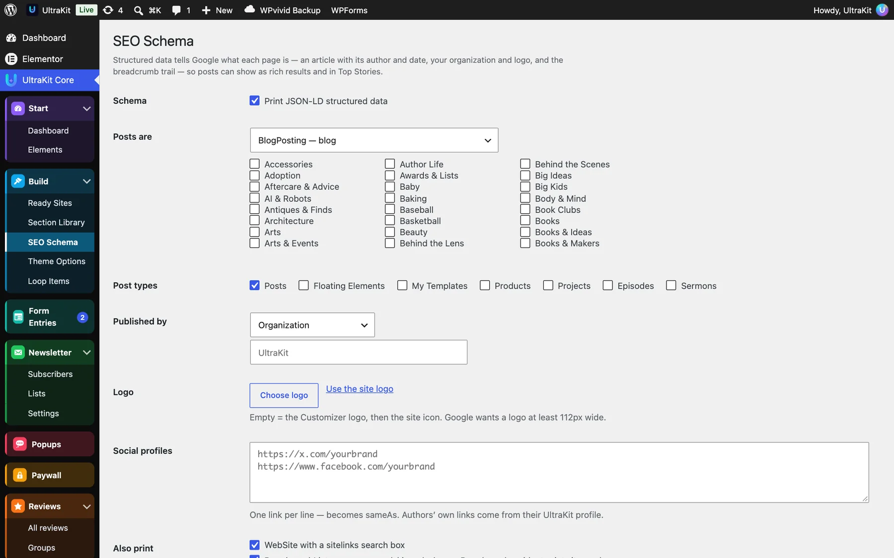
- Open UltraKit Core›SEO Schema and tick Print JSON-LD structured data.
- Posts are: NewsArticle (news site or magazine), BlogPosting (blog), Article (general), or NewsArticle in chosen categories and BlogPosting elsewhere. Tick the post types it applies to.
- Published by: Organization, News media organization, Local business or Person — with the name, Logo (empty uses the site logo, then the site icon; at least 112 px wide) and Social profiles, one link per line.
- Under Also print, keep the WebSite search box and the BreadcrumbList.
- Save, then use Open in Google’s Rich Results Test for your latest post.
Posts include the author (with the links from their UltraKit author profile), images, dates, section and keywords. Paywalled posts are marked as not free, with the locked part, as Google asks.
When Yoast, Rank Math, AIOSEO, SEOPress or The SEO Framework is active, UltraKit stays quiet and says so on this screen, so you never get two conflicting graphs.
News & blog tools#
Tools built for magazines, newspapers and blogs.
- Trending posts — UltraKit counts views without cookies and adds a sortable Views column under Posts. The Trending Posts element lists your most-read stories.
- Post series — group posts into a series (below).
- Live blog, Reader poll (real votes), Web stories, Read next and News top bar elements.
- Public roadmap — visitors vote on ideas; suggestions arrive in Leads.
- Structured data for Google: see SEO Schema.
Post series

- Create a series in Posts›Series with a description.
- On each post, pick the series and the part number in the Series box.
- Under Show on posts automatically, choose what shows above the article (series box) and below it (previous / next bar), the look (Light, Dark, Newspaper, Soft color) and after how many parts long lists fold.
Readers see the series, their place in it and parts that are still coming. For series landing pages, use the Post Series element.
Custom fonts & icons#
Use your brand fonts and your own SVG icons everywhere.


Add a font
- Open UltraKit Core›Custom Fonts.
- Type a name, e.g. “Brand Sans”.
- Add one file per weight and style (.woff2 is best, .woff works too) and pick the weight and Normal or Italic.
- Click Add font. It appears in Theme Options and in every Elementor font list, loaded from your own site.
Add icons
- Open UltraKit Core›Custom Icons.
- Choose one or more
.svgfiles and click Upload. The file name becomes the icon name. - Pick them in any UltraKit element that has an icon — Icon Box, Info Box, Counters, Features and more.
Every SVG is cleaned on upload, so scripts or unsafe code inside a file never reach your site.
Dark mode, accessibility & more#
Small elements that make the whole site better.
- Dark Mode Toggle — visitors switch to dark mode; their choice is remembered without a flash on the next page.
- Accessibility Toolbar — text size, contrast and reading tools.
- Cookie Consent, Language Switcher, Preloader, Page Scroll Progress, Custom Scrollbar and Interactive Cursor.
- Prayer Times — daily prayer times for any city, with a countdown to the next prayer.
Put site-wide elements like Dark Mode, the Preloader or Motion Effects in your header or footer template so they work on every page.
Build an online store#
Twelve ready shop websites, AJAX everywhere and the store features the big WooCommerce themes charge extra for.

- Open UltraKit Core›Ready Sites and pick the Shop & eCommerce group.
- Import a shop. It installs WooCommerce if needed and brings its own categories, products with photos, colors and sizes, reviews, sale prices and size guides.
- Open UltraKit Core›Theme Options›Shop to switch the shop features on or off.
WooCommerce elements
- Product Grid, Product Carousel (3D ring, center focus and stack modes) and Product Category Grid
- Quick View, Mini Cart and Add to Cart Button
- Product Comparison, WooCommerce Search and Product Rating
- Sales Notification (shows real recent orders)
- UltraKit · Product Filters (a WordPress widget for the Shop sidebar)
When several ready shops live on one site, product elements on a shop’s pages show only that shop’s products, and the filters list only its colors, sizes and prices.
Product images, zoom, lightbox and gallery slider are switched on, and related products show three per row. Display conditions can also react to the cart and the customer.
Shop features#
AJAX filters, swatches, rich product cards, Quick View, sticky add to cart, size guides, a phone bottom bar and a live header cart.
Everything here lives in UltraKit Core›Theme Options›Shop → Shop features. Each switch is independent, and all of them are on after you import a shop.
AJAX product filters
Price slider, color dots, size buttons, rating, “In stock only” and “On sale” — the products, result count, sorting and pages update without reloading, and the address bar keeps the filters so a filtered page can be shared. Chips above the grid show what is active; Clear all resets them.
- Go to Appearance›Widgets and add UltraKit · Product Filters to the Shop sidebar.
- Choose which filters to show and their order in the widget.
- Save. On phones the filters open in a drawer from a Filters button.


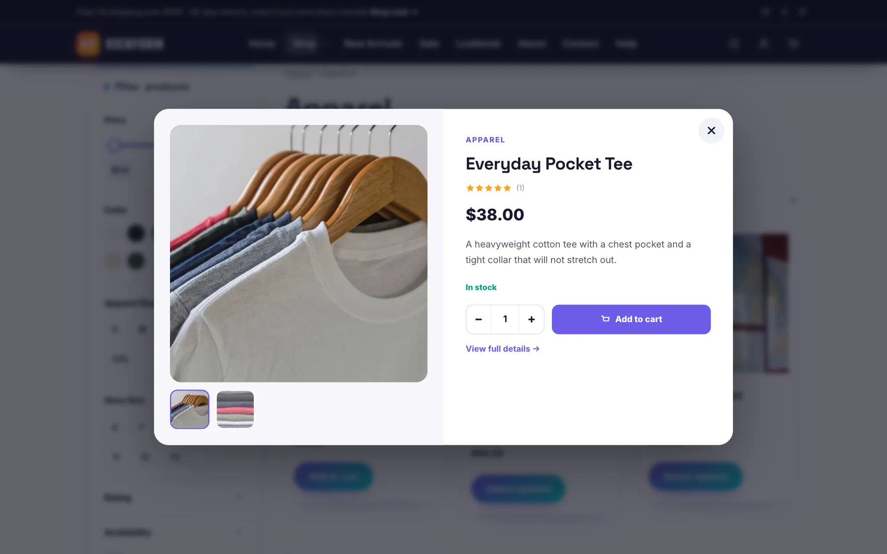
Rich product cards & Quick View
Shop cards show a second photo on hover, a wishlist heart, a Quick View eye, the product’s color dots and “−20%” or “New” badges. Quick View opens the product in a popup with its gallery, options and an add-to-cart button.

Variation swatches
Color, image and button swatches replace the dropdowns on product pages. Set a color or image for each term in Products›Attributes›Configure terms, and choose the swatch type per attribute.

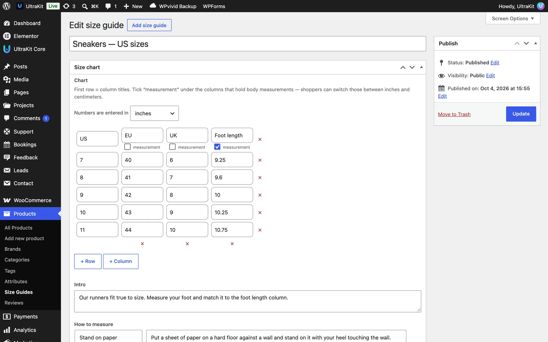
Size guides
Make reusable charts in Products›Size Guides — a table, intro text and “how to measure” tips. Shoppers can switch between inches and centimeters. Assign a guide to a product category or pick one on the product itself.

Sticky “Add to cart” bar
Once the main button scrolls out of view, a slim bar with the photo, price, quantity and button slides in at the bottom of the product page.

Header cart & mobile bottom bar
The cart icon in any UltraKit header opens a mini cart on hover (tap on phones): change quantities, remove items and see the subtotal without leaving the page. The Mobile bottom bar adds Shop, Search, Wishlist, Account and Cart buttons on phones — on shop pages, the whole site or off.


Store header
The Site Header element has a Store layout with a category search box that shows live results, a departments menu, wishlist and cart total.

Wishlist
Hearts save products in the visitor’s browser, so no account is needed. Put [ultrakit_wishlist] on any page to list them; the header and the bottom bar show the count.
Shop boost#
Bought together, back-in-stock waitlist, product videos, catalog mode, delivery dates and pre-orders.
Turn each one on in UltraKit Core›Theme Options›Shop → Shop boost. Per-product settings are in the product’s Shop boost tab under Product data.

| Feature | What it does |
|---|---|
| Frequently bought together | Pick 2–4 products (or use upsells / cross-sells). Shoppers tick what they want and add all at once; an optional bundle discount applies only when every item is in the cart. Shortcode: [ultrakit_bought_together]. |
| Back-in-stock waitlist | A “Notify me” form on sold-out products and sizes. When stock returns, everyone gets a WooCommerce email. Sign-ups are in Products›Waitlist with CSV export. |
| Product video | A YouTube, Vimeo or MP4 video as the first or last gallery slide. |
| Catalog mode | Hide prices and the cart for guests, everyone or chosen categories, and show a “Request a quote” form instead. Requests are saved as leads and emailed to you. |
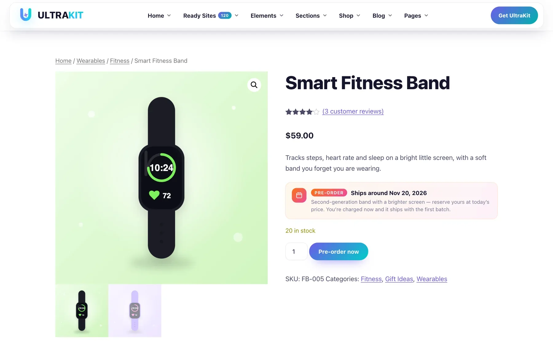
| Estimated delivery | “Order within 3h 12m → delivered Thu, Oct 9 – Mon, Oct 13”, from processing days, shipping days, a daily cut-off, weekends and holidays. Shortcode: [ultrakit_delivery_estimate]. |
| Pre-order | A pre-order button with an availability date; the date shows in the cart, checkout and emails, and the pre-order ends by itself. |


The Waitlist screen
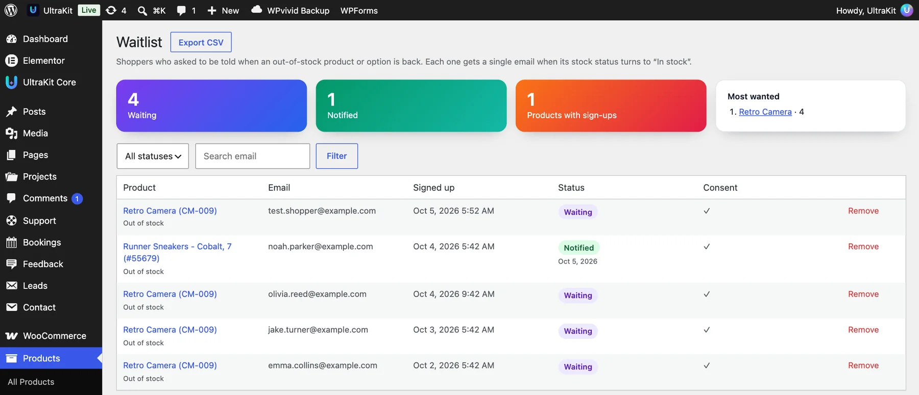
Products›Waitlist shows how many shoppers are waiting, how many were notified, how many products have sign-ups and the most wanted products. Filter by status, search an email, remove a sign-up, or Export CSV. Each shopper gets a single email when the product’s stock status turns to “In stock”; edit that email in WooCommerce›Settings›Emails›Back in stock.
One-page checkout#
Sell a single product from one page: choose the option, pick a bundle and pay — without a cart step.
Two ready websites (Brewmate Coffee and CloudNest Blanket) use it. Add it to any page with the shortcode:
[ultrakit_onepage_checkout product="123" bundles="1,2:10,3:15" title="Choose your kit"]| Option | What it does |
|---|---|
product | The product ID (simple or variable). |
bundles | Quantity choices; 2:10 means “2 items, 10% off”. |
title | Heading above the options. |
button | Text on the order button. |

Payment methods, shipping, taxes and coupons are WooCommerce’s own, so every payment gateway keeps working.
Speed & performance#
UltraKit loads only what each page uses, and has its own speed switches.
For every page, UltraKit Core loads only the stylesheets of the elements on that page, minified and cached in wp-content/uploads/ultrakit-cache. Scripts for heavy features (GSAP, Motion, charts) load only on pages that use them.
Speed switches
Open UltraKit Core›Theme Options›Performance.
| Switch | What it does |
|---|---|
| Combine CSS files | Neighboring stylesheets are joined into one cached file per page — far fewer requests on phones. |
| Critical CSS | Pages you generate it for paint their first screen from inline styles while the rest loads in the background. |
| Plugin scripts only where needed | Contact Form 7 and WooCommerce files load only on pages that use them (forms, shop, cart, checkout, account). |
| Defer UltraKit scripts | Pages show sooner; scripts run right after. |
| Remove emoji / embeds / jQuery Migrate, no admin icons for visitors | Skip WordPress files most sites never need. |
| Turn off XML-RPC, Heartbeat | Less background work on the server. |
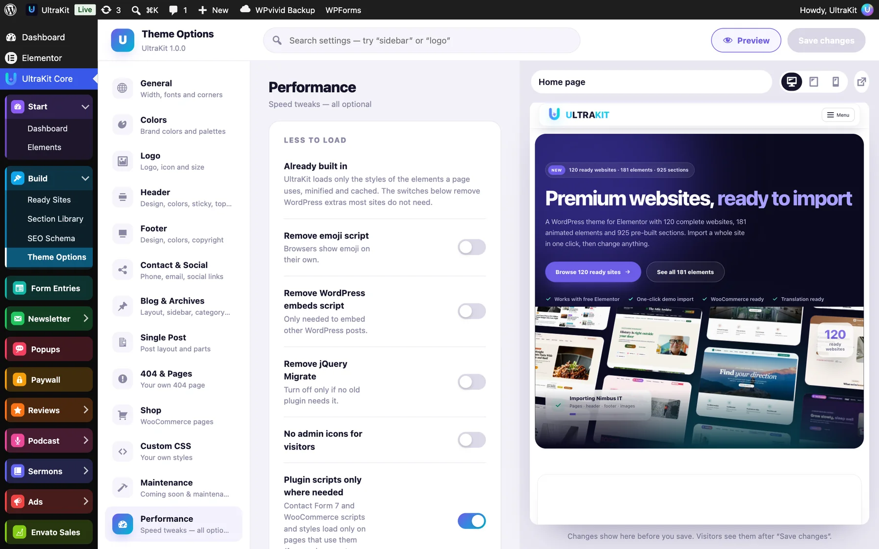
Critical CSS
- Turn on Critical CSS in Theme Options → Performance.
- Open UltraKit Core›Critical CSS. The front page, blog, shop and a few posts are listed; add more by ID.
- Click Generate for all pages. Each page opens in a hidden frame at desktop and phone width and the styles of its first screen are saved.
- Generate again after you redesign a page.
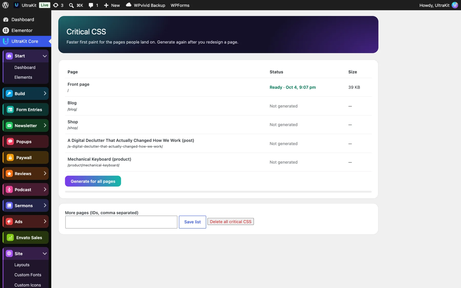
Add ?ukcss=all to the page address to load every stylesheet. If that fixes it, tick Load every element stylesheet on every page under UltraKit Core›Elements → Speed, and let us know which element it was.
Caching plugins
If you use a caching plugin (for example WP Rocket or LiteSpeed Cache), clear its cache after you change a header, footer or Theme Options so visitors see the new version. Turn off that plugin’s own “combine CSS” if you use UltraKit’s.
Translation#
The theme and the plugin are translation ready.
| Part | Text domain | Template file |
|---|---|---|
| Theme | ultrakit-theme | languages/ultrakit-theme.pot |
| UltraKit Core | ultrakit | languages/ultrakit.pot |
Translate the theme and plugin with a tool such as Loco Translate or Poedit. Text you type into Elementor elements is translated like any other page content.
Multilingual sites (WPML & Polylang)
The theme and UltraKit Core ship a wpml-config.xml, so WPML’s String Translation and Translation Editor find the texts of every UltraKit element, the Theme Options texts (top bar, footer, copyright) and the popups, size guides and other UltraKit content types. The Language Switcher element shows WPML or Polylang languages, or uses Google Translate on single-language sites.
Right-to-left languages (RTL)
UltraKit supports Arabic, Hebrew, Persian, Urdu and other right-to-left languages. Choose the language in Settings›General›Site Language and the whole site mirrors itself: the header, menus, footer, blog, every UltraKit element and the ready websites.
- Layouts, sidebars, arrows, sliders and animations switch sides automatically — there is nothing to set up.
- UltraKit keeps a mirrored copy of its stylesheets in
wp-content/uploads/ultrakit-cache/rtland refreshes it whenever a file changes. - Logos and brand names written in Latin letters stay left-to-right.
In your own UltraKit-style CSS, write /*rtl:ignore*/ right before a declaration to keep it exactly as written on RTL sites.
Child theme & custom code#
Your Theme Options are stored as theme settings, so they keep working in a child theme.
For small CSS changes, use Appearance›Customize›Additional CSS. For PHP changes, create a child theme folder ultrakit-child with this style.css:
/*
Theme Name: UltraKit Child
Template: ultrakit-theme
Version: 1.0.0
*/
…and this functions.php:
<?php
add_action( 'wp_enqueue_scripts', function () {
	wp_enqueue_style( 'ultrakit-child', get_stylesheet_uri(), [], '1.0.0' );
}, 20 );Use UltraKit Core›Theme Options›Import / Export → Download settings, then import the .json file on the other site.
Updating UltraKit#
The theme and UltraKit Core update themselves from getultrakit.com — just like plugins from WordPress.org.
One-click updates
- Verify your purchase code once. Updates are linked to it.
- When a new version is out, it appears in Dashboard›Updates, on the Themes screen and on the Plugins screen. WordPress checks twice a day; click Check again to look right away.
- Click Update Themes / Update Plugins. Use View details to read what changed, or open the changelog.
Automatic updates
Prefer not to think about it? On Appearance›Themes (open UltraKit) and on the Plugins screen, click Enable auto-updates. WordPress then installs new UltraKit versions in the background.
You will see this when the purchase code is not verified on this site, or was moved to another domain. Activate it under UltraKit Core›Dashboard → License and the update button appears.
Update by hand
You can always update manually too: download the latest package from your ThemeForest Downloads page, then upload ultrakit-theme.zip in Appearance›Themes›Add New Theme›Upload Theme and ultrakit.zip in Plugins›Add New Plugin›Upload Plugin, choosing Replace current with uploaded each time.
Pages, templates, Theme Options and imported websites are stored in your database, so updating the theme or plugin does not change them. Keep the theme and UltraKit Core on the latest versions together, and clear your cache after updating.
Frequently asked questions#
Quick answers to what buyers ask most.
Do I need Elementor Pro?
No. UltraKit is built for the free Elementor. Its header, footer, display conditions and mega menu work without Pro. If you do use Elementor Pro’s Theme Builder, its header and footer take priority.
Can I use UltraKit on client websites?
Yes — one ThemeForest license covers one website. Buy a license for each client site. Choose the Extended license if visitors pay to use the site you build.
Can I mix sections from different demos?
Yes. All 925 sections are in the Section Library, so you can add any of them to any page and restyle them with your colors.
Will importing a website delete my content?
No. An import only adds pages, templates, menus and media. Removing an import deletes only what that import added and restores your previous home page and colors.
Are the demo photos included?
Demo images are included so the websites look complete. Replace them with your own photos before you launch.
Is UltraKit translation ready? Does it support RTL?
Yes to both. See Translation and right-to-left languages.
A page looks broken after an update
Clear your caching plugin and browser cache, then open Elementor›Tools → Regenerate Files & Data.
Get support#
Every purchase includes 6 months of support from our team. You can extend it on ThemeForest.
- Verify your purchase code — support is linked to it.
- Search these docs first (press / to jump to the search box).
- Open a ticket in the Support Center with your site address, what you did, what you expected and a screenshot.
Help with installing and setting up UltraKit, questions about its features, and fixing bugs. Custom design or development work is not included.