

Color grading is where a film finds its mood. I still remember the first time I sat beside a professional colorist and watched a flat, gray image turn into something that felt like a memory. Nothing in the frame had changed. The actors were the same, the camera move was the same, the cut was the same. But suddenly the scene felt warm and a little sad, exactly the way it had felt on the page. The same footage can feel nostalgic, tense or joyful with a few careful changes. That afternoon taught me to respect the grade as part of the storytelling, not just the finishing touch.
In this post, I want to share how I think about color on my own projects: commercials, music videos, documentaries and short films. I am a director, not a professional colorist, and I always work with one on finished films. But understanding the basics has made me better at planning shoots, talking with my collaborators and protecting the mood of a film from the first day of prep to the final export.
Start with balance
Fix exposure and white balance before anything creative. This is the step that beginners skip most often, because it is not exciting. But a creative look built on top of unbalanced footage will always fight you. Skin tones drift, shadows look muddy and shots that should match don’t.
The first pass is called correction, and its goal is neutrality. Each shot is adjusted so that whites look white, blacks look black and skin looks natural. Shots within the same scene are matched to each other, so the audience never notices that one angle was filmed at noon and another an hour later when the clouds came in. Only when the whole film feels consistent does the colorist move on to the look.
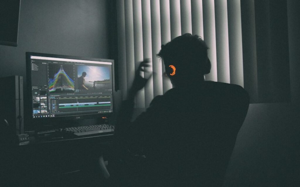
What correction usually involves
- Exposure. Setting overall brightness so the important details are visible.
- Contrast. Defining how deep the shadows and how bright the highlights should be.
- White balance. Removing unwanted color casts from light sources.
- Skin tones. Making sure faces look healthy and natural across shots.
- Shot matching. Making every angle in a scene feel like it belongs together.
Then tell a story
Warm, soft tones for memories; cooler, contrasty ones for tension. That is the simplest version of the language of color, and it works because audiences have learned it from decades of films. Warmth feels safe, nostalgic and intimate. Coolness feels distant, clinical or uneasy. High contrast feels sharp and dramatic. Low contrast feels gentle and dreamy.
Color is emotion you can see.
Theo Grant, director
On a recent fictional short about two brothers returning to their late father’s farm in Nebraska, we used color to separate past and present. The present-day scenes were graded slightly cool, with muted greens and a soft gray sky. The flashbacks were warm, with golden highlights and gentler contrast. We never used titles to tell the audience when they were in the past. The color did it for us, and test viewers understood immediately.
Choosing a palette early
The best grades start long before the edit. During prep, I build a small mood board with reference frames and talk with the cinematographer, production designer and costume designer about our palette. If we know the film will feel cool and restrained, we avoid bright red props and saturated wardrobe. If it will feel warm and nostalgic, we lean into wood, amber lamps and soft fabrics. A colorist can push a look a long way, but it is always easier when the frame already contains the right colors.

Restraint is a skill
One of the most common mistakes I see in young filmmakers’ work is an overcooked grade: skin that looks orange, skies that look radioactive and shadows crushed so deep that faces disappear. It is understandable. Grading tools are powerful and fun, and it is tempting to push every slider. But the strongest grades are often the ones the audience never notices consciously. They simply feel right.
A good test is to watch the graded film on an ordinary television or laptop, not just the calibrated monitor in the suite. If faces look strange or details vanish, the grade is probably too heavy. Another test: show a scene to someone who has never seen it and ask how it makes them feel. If their answer matches your intention, the grade is working. If they comment on the color itself, it may be getting in the way.
Key takeaway: the grade should serve the story and the faces. If the audience notices the color before the emotion, pull it back.
Working with a colorist
I always bring in a professional colorist for finished work, and the collaboration is one of my favorite parts of post-production. Here is how I prepare to make our sessions productive:
- Send a locked cut, so we are not grading scenes that might change.
- Share the mood board and two or three reference frames for each key scene.
- Describe the feeling, not the technical settings: “lonely but hopeful” rather than “lower saturation”.
- Agree on the delivery formats early, since streaming, broadcast and cinema need different versions.
- Schedule a final review on fresh eyes, never at the end of a long day.
Describing feelings rather than settings gives the colorist room to bring their expertise. They often find solutions I would never have thought of, like slightly lifting the shadows in a sad scene to make it feel softer instead of darker, or adding a faint green tint to a hospital corridor to make it subtly uncomfortable.

Color across different projects
The way I approach the grade changes with the type of work. In commercials, color often follows the brand, and products must look accurate and appealing. In music videos, we have far more freedom to experiment with bold looks that match the song. In documentaries, I lean toward natural, honest color that respects the real people on screen. In short films, color becomes part of the character arcs, shifting gently as the story moves from beginning to end.
Music videos deserve a special note, because they are where I learned the most about color. On a recent fictional video for a folk singer from Asheville, we graded the verses in soft, faded tones, almost like an old family photo album, and let the color slowly bloom as the chorus arrived. By the final chorus, the greens of the mountains and the warm orange of a bonfire were rich and full. Nobody in the audience will ever think about that progression consciously, but they feel the song open up, and the color is part of the reason.
Documentaries ask for the opposite instinct. When real people trust you with their stories, I believe the grade should stay close to what the eye saw that day. We still balance, match and gently shape every shot, but I avoid heavy stylized looks that might make a real kitchen or a real hospital feel like a set. Honesty is part of the contract with the audience, and color either supports that honesty or quietly undermines it.
Finding the mood
Color grading is not a magic fix. It cannot rescue a scene that lacks emotion, and it cannot replace careful lighting on set. But when everything else is in place, the grade is where the film’s mood comes into focus. Start with balance, then tell a story with warmth, coolness and contrast, and know when to stop. When you get it right, nobody will talk about the color. They will just remember how the film made them feel.

Theo Grant
Theo has visited more than 300 houses for the magazine and still gets excited about a good window seat.






2 Comments
Sharing this with my friends.
Saved this one for later. Really useful.