
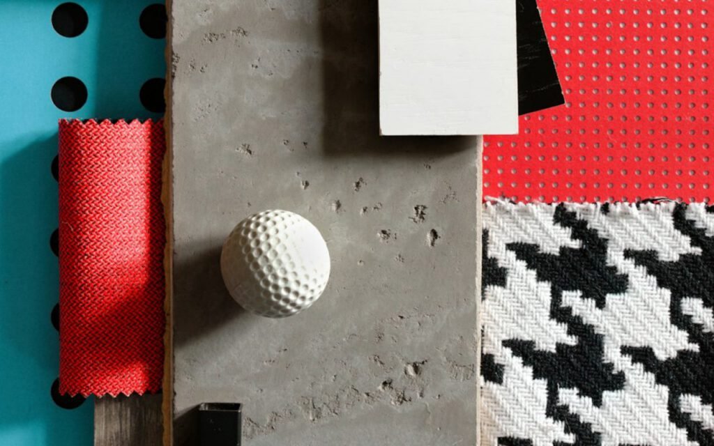

Nadia Rowe
Nadia designs quiet rooms with honest materials.
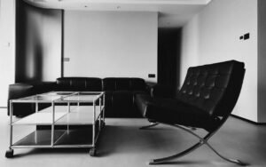
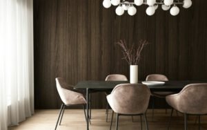
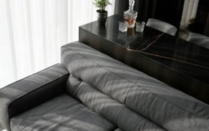
Every project starts with a physical mood board on my studio table. Before I draw a floor plan, before I open a single furniture catalog, I clear a four-foot stretch of oak, lay down a sheet of heavy gray card and start pulling samples. Clients are sometimes surprised by how old-fashioned it is. But samples you can touch tell you more than a hundred screenshots. A photo of a velvet sofa cannot tell you how the nap catches the light at 4 p.m. A swatch on the table can.
Here is exactly how I build a board, from the first conversation to the moment the client picks it up in both hands and says, quietly, “Yes. That.”
Before the board: listening
A mood board is only as good as the brief behind it. Before I touch a sample, I spend an hour with the client in the room we are designing, usually with coffee and a notebook. I ask about how they actually live: where they drop their keys, which chair they always sit in, whether they eat dinner at the table or on the sofa. I ask what they love in other people’s homes, in hotels, in restaurants.
I also ask them to send me five images that make them feel something, and to tell me what they dislike. The dislikes are often more useful than the likes. “I hate anything shiny” or “I grew up with dark wood everywhere” narrows the field faster than any inspiration folder.
- How should the room feel at 7 a.m. and at 10 p.m.?
- What has to stay, like an heirloom chair, a piano or a rug?
- Who uses the room, including kids, pets and frequent guests?
- What is the honest budget range?
Three anchors
One fabric, one stone or tile, one wood finish. That is the core of every board I make. These three anchors cover the main surfaces in almost any room: what you sit on, what you walk or cook on, and what holds everything up. If those three agree with each other, nearly everything else falls into place.
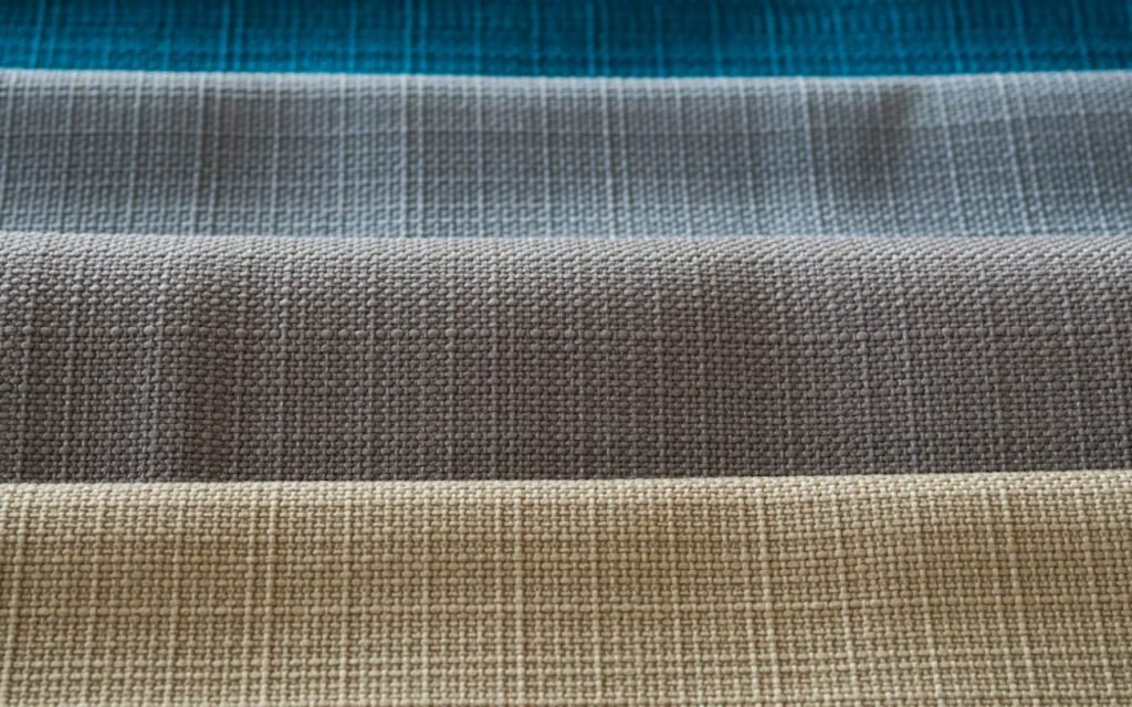
The fabric
I usually start with fabric, because it carries the most emotion. A nubby wool says something different from a crisp linen or a soft velvet. I pull eight or ten options from my sample library, lay them out and then start removing. The goal is one hero fabric, usually for the largest upholstered piece, plus perhaps two supporting textures.
The stone or tile
Next comes something hard and cool. In a kitchen or bath it might be a slab of honed marble or a handmade tile. In a living room, it might be a limestone hearth, a terrazzo side table or simply a ceramic lamp base. I place it right next to the fabric and look at the two together in daylight. If they fight, one of them has to go.
The wood
Finally, the wood. I keep finish samples of white oak, walnut, ash and a few stained and painted options. Wood is the material that grounds a room, and the undertone matters enormously. A red-leaning cherry and a cool, gray-washed oak will make the same fabric look completely different.
If you can’t touch it, you can’t judge it.
Nadia
One wild card
A color or pattern that scares the client a little. It usually stays. This is my favorite part of the process, and I warn every client about it in advance. Once the three anchors are settled, I add one sample that pushes the room past “nice” and into “memorable.”
Sometimes it is a bold stripe for a single chair. Sometimes it is a deep oxblood leather, a hand-painted wallpaper, a ribbed glass or a chartreuse velvet pillow. In a recent Boston townhouse project, it was a swatch of mustard mohair that the client called “alarming” at first sight. Three weeks later, she asked if we could use it on two chairs instead of one.
The wild card works because the anchors are calm. A room with four bold choices feels chaotic; a room with three quiet choices and one surprise feels confident.
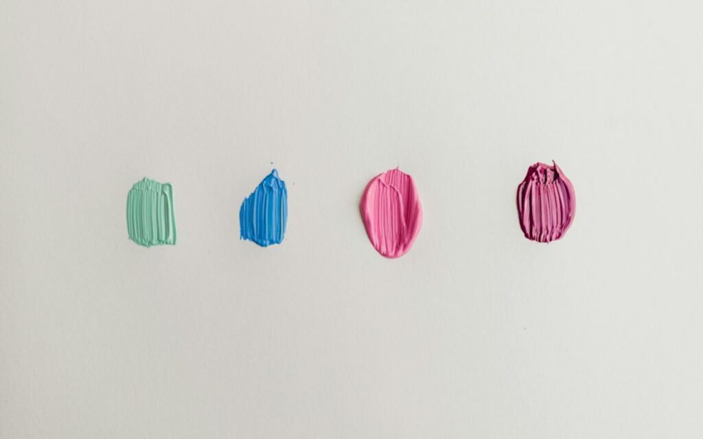
Building the board, step by step
Once I know my anchors and my wild card, the physical board comes together quickly. Here is my order of work:
- Lay the base. A sheet of neutral gray card, so no background color skews the samples.
- Place the anchors by proportion. The fabric that will cover the most area gets the largest piece of board. The accent gets a sliver.
- Add the wild card somewhere slightly off-center, where it catches the eye without taking over.
- Add metals and hardware. A brushed brass knob, a blackened steel strip, a nickel hinge.
- Add paint last. I paint card samples by hand and match them to what is already on the board, never the other way around.
- Photograph it in three lights: morning sun, overcast afternoon and lamplight. The board has to work in all three.
I do not glue anything down until the client has seen it. Samples get moved, swapped and occasionally thrown across the room in frustration. That is all part of it.
Why I still prefer paper and fabric
Digital boards are useful, and I make them too, mostly to share with contractors and to track product codes. But a screen flattens everything. It shows color, poorly, and it shows nothing about weight, temperature, drape or how a material reflects light. A physical board lets a client pick up a tile and feel how cold it is, or rub a fabric between two fingers and decide whether a dog will ruin it in a month.
There is also something about the ritual. Clients lean over the table, rearrange swatches and argue gently with each other. They start to own the decisions. By the time we order anything, nobody is guessing.
When a board fails
Not every first board works, and that is fine. Sometimes the client looks at it and feels nothing, which is its own kind of answer. When that happens, I ask them to pick up the one sample they would keep if everything else disappeared. Usually there is one. We start the next board from that single piece, and the second attempt is almost always faster and more honest than the first.
Other times the board is too safe. Every sample is lovely, and together they are forgettable. That is when I go back to the client’s dislikes list and the five images they sent me, looking for the feeling we missed. A board should make you lean in. If it only makes you nod politely, it is not finished yet.
Once a board is approved, it stays on a shelf in my studio for the life of the project. Whenever a new decision comes up, like a lampshade, a cabinet pull or a throw pillow, we hold the candidate up next to the board. If it belongs, it is obvious. If it does not, it is obvious too.
Key takeaway: Start with one fabric, one stone and one wood that agree with each other. Then add a single brave choice. Judge everything in person and in more than one light.
Try it at home
You do not need a design studio to make a good mood board. Most fabric stores will give or sell small swatches, tile showrooms often lend samples, and home improvement stores sell paint sample pots for a few dollars. Collect your three anchors, add a wild card and look at them together for a week. Move them around the room. Live with them.
If they still make you happy on day seven, you are ready to start ordering. And if you want a second pair of eyes, my studio is always happy to sit down at the table with you and start pulling samples together.
Nadia Rowe
Nadia designs quiet rooms with honest materials.


Start the conversation