 Nadia Rowe7 min read
Clients often fear a black-and-white room will feel cold. It doesn’t have to. I hear the same worry at almost every first meeting: they love the calm of a monochrome photo, but they picture a gallery, or a dentist’s waiting room, rather than a place to curl up with a book on a Sunday afternoon. The trick is texture: wool, linen, leather and wood grain. When color steps back, touch steps forward, and a room built on texture can feel as warm as any room full of rust and ochre.
This is how I approach a black-and-white living room, using a recent project in a Chicago two-flat as the example. The clients, a couple with a large dog and a larger record collection, wanted quiet. They also wanted a room their friends would never want to leave.
Why monochrome rooms go cold
It helps to understand what makes a pale or graphic room feel chilly in the first place. Usually it is not the palette itself. It is a combination of hard, smooth surfaces and flat, overhead light. Picture a white lacquered cabinet, a glass coffee table, a gray microfiber sofa and a ceiling fixture blasting light straight down. Every surface reflects the same way, so the eye has nothing to rest on.
Warmth, in a room without color, comes from variation. Matte against glossy, nubby against smooth, light against shadow. Once you start thinking of white as a whole family of surfaces rather than a single paint chip, the room stops feeling empty.
- Hard surfaces bounce light and can make a room echo, both visually and acoustically.
- Soft surfaces absorb light and sound, and they invite the hand.
- Natural materials age, which gives a room a lived-in quality that no new finish can fake.
Layer the textures
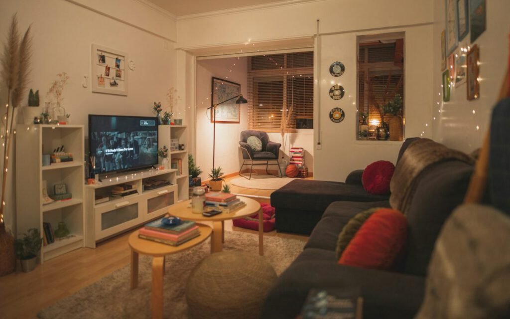
A boucle chair, a linen curtain and a wool rug read as warm even in pure white. In the Chicago living room, we started with a deep, low sofa in an off-white wool blend, then pulled a boucle armchair up beside the window. The two whites are slightly different, one creamy and one closer to chalk, and that difference is part of the charm.
Underfoot we laid a hand-knotted wool rug with a subtle high-low pile, so the pattern only appears when light rakes across it in the late afternoon. At the windows, unlined linen curtains in natural white soften the daylight and move a little when the radiator kicks on. On the sofa, a heap of throws: a black mohair, a gray waffle cotton and a chunky ivory knit.
My texture checklist
Before I sign off on a monochrome living room, I walk through it and make sure it has at least one of each:
- Something nubby, like boucle, terry or a looped wool.
- Something woven and slightly irregular, like linen or raw silk.
- Something with a sheen, like leather, polished plaster or brass.
- Something rough, like stone, unglazed ceramic or raw plaster.
- Something with grain, like wood, rattan or cane.
If one is missing, the room usually tells me. It feels a beat too flat, or a beat too polished, and adding that missing texture is often enough to fix it.
Monochrome isn’t empty. It’s edited.
Nadia
One natural material
A single walnut table or oak floor keeps the room grounded. Without some brown in the room, black and white can float, almost like a drawing. A natural material brings the space back down to earth and gives the eye an anchor.
In Chicago, the original oak floors were in rough shape, and the clients had considered painting them white. We refinished them instead with a clear matte sealer that let the grain show. Then we brought in a round walnut coffee table, chosen partly because its curves soften the strong lines of the sofa and partly because a dog can circle it without catching a corner.
I try not to use too many woods together in a monochrome room. One dominant wood, with perhaps a second in a small dose, looks intentional. Five different woods start to look like an estate sale.
Light is the real color
In a black-and-white room, lighting does the job that paint usually does. It sets the mood. I always plan at least three layers:
- Ambient light from dimmable ceiling fixtures or a soft wall wash, so the room is never dark.
- Task light where people actually read, play records or work on a laptop.
- Accent light, like a picture light over art or a small lamp on a shelf, for glow and depth.
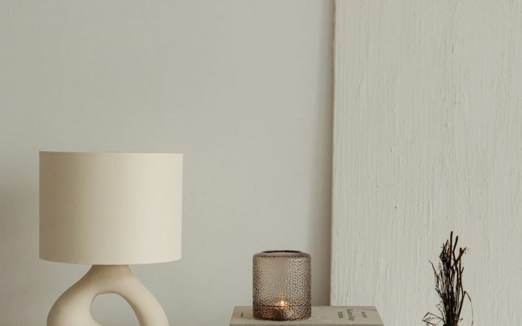
Choose warm bulbs, around 2700 Kelvin, for living spaces. Cooler bulbs make white walls look blue and black furniture look harsh. And put everything on dimmers if you possibly can. A white room at 30 percent brightness, with two lamps glowing, is one of the coziest places I know.
Shadows count too
I love a room with a little shadow in it. Black accents, a charcoal ceramic vase, a dark picture frame, the black spine of a record shelf, give the eye somewhere to land and make the whites read brighter by contrast. In the Chicago room, we painted the inside of the built-in shelves a soft black so the record sleeves seem to glow against it.
Paint that feels warm
Not all whites are created equal. A stark, blue-based white can feel clinical in a room that faces north. I usually reach for whites with a hint of warmth, a touch of yellow or red in the base, and I always test large swatches on more than one wall. Look at them in the morning, at midday and at night under your lamps before you decide.
For black, the same rule applies. A true black can feel heavy in a small room; an off-black with a little brown or green in it feels richer and more forgiving. Matte and eggshell finishes look softer on walls, while a satin finish on trim adds a subtle sheen.
Objects with a story
The last layer is personal. A monochrome room shows off objects beautifully, because nothing competes with them. In Chicago, we framed a handful of the clients’ favorite album covers in plain black frames, set a stack of well-thumbed art books on the walnut table and found a spot on the shelf for a lopsided clay bowl their niece made in a summer class. None of it is precious, and all of it matters. Those small things are what make a visitor stop, pick something up and ask about it.
I also encourage clients to bring in something living. A tall olive tree in a plain terracotta pot, a branch of eucalyptus in a glass jar or a trailing plant on a high shelf adds movement and a quiet note of green without breaking the palette. Plants soften corners and remind the room that people live here. If light is limited, ask a local nursery which varieties will thrive in your conditions before you buy.
Key takeaway: Warmth in a monochrome room comes from texture, one natural material and layered, warm light. Get those three right and the palette will never feel cold.
Living with it
Six months after we finished, the Chicago clients sent me a photo: the dog asleep on the boucle chair, a record on the turntable, the lamps low. Nothing about it looked cold. It looked like a room people loved.
If you are considering a black-and-white living room, start by touching things. Visit a fabric store, run your hand over a wool rug, hold a piece of walnut. Let those textures guide you, keep the palette disciplined and let the light do the rest. When you are ready, browse my room projects on this site to see how the approach shifts from apartment to house, and from city to coast.

Nadia Rowe
Nadia designs quiet rooms with honest materials.



Nadia Rowe
Nadia designs quiet rooms with honest materials.



2 Comments
Thanks for explaining this so clearly.
Great reporting — please keep following this story.