Case Notes: A Bakery Store That Doubled Orders
Pickup times, simple checkout and photos that sell.
 Ava Mitchell6 min read

Ava Mitchell
Ava designs and builds fast Elementor websites for small businesses — Top Rated Plus on Upwork.


Bloom & Barley sold bread out of a small shop with a three-page website. The site had a hero photo of a baguette, the store hours and a phone number that rang straight into a busy kitchen. Every Friday the owners, Nora and Ben Castillo, fielded dozens of calls from regulars trying to reserve a sourdough loaf before the morning rush cleaned out the shelves. Half the calls went unanswered because both of them had flour up to the elbows.
Three weeks later they took orders online — and doubled them. These are my case notes from that project: what we built, what we deliberately left out and the small details that turned a neighborhood bakery website into its busiest counter.
Listening before designing
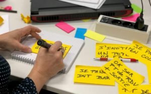
I started the way I start every client project: by watching how the business actually works. I spent a Saturday morning on a stool by the register, notebook in hand, while Nora worked the counter. I wrote down every question customers asked and every time the phone rang. By noon I had four pages of notes and a clear picture.
People were not asking for nationwide shipping or a subscription box. They were asking three things over and over: Is the seeded rye in today? Can you hold two loaves for me? What time do you close? The existing website answered only one of those questions, and even that answer was buried in the footer.
That morning shaped everything that came next. Nora and Ben had assumed they needed a big online store with every product, every option and a shipping calculator. What they needed was a way for people who already loved their bread to stop worrying about missing it.
Pickup first
Most customers wanted to order ahead, not get bread shipped. We built around pickup windows. Instead of a generic checkout asking for a shipping address, the store asks one question first: when would you like to pick this up? Customers choose a thirty-minute window, and each window has a limit so the kitchen is never overwhelmed.
Ben was skeptical about the limits at first. Why turn away orders? But the bakery has two ovens and three people. If forty customers all chose the 8 a.m. window, nobody would get good service. Once the limits were in place, the kitchen could plan its bakes around real numbers instead of guesses, and waste dropped noticeably in the first month.
What the pickup flow includes
- A daily menu that only shows what will actually be baked that day
- Pickup windows in thirty-minute blocks with a set number of slots each
- A cutoff of 6 p.m. the night before for next-morning orders
- A text message when the order is boxed and ready on the pickup shelf
- A simple “I’m running late” link that holds the order until closing
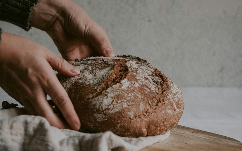
The pickup shelf itself was Nora’s idea. Orders wait in labeled paper bags on a wooden shelf by the door, so online customers can grab their bread without standing in line. It costs nothing, and customers mention it in reviews more than anything on the website.
Build the boring feature your customers ask for every day.
Ava
A checkout with nothing to think about
The original quote from another studio included accounts, loyalty points, gift wrapping and a blog. We cut almost all of it. The checkout has one page, four fields and two payment buttons. Customers do not need to create an account to order. If they want to save their details, they can do it after their first purchase, when they already trust the bakery.
Every extra field in a checkout is a small reason to leave. For a five-dollar loaf of bread, the reasons should be close to zero. On a phone, the whole order takes under a minute from the menu to the confirmation screen. I timed it with Nora’s mother, who does not consider herself good with technology. She finished in fifty-two seconds and asked if she could order a pie, too.
Planning for the holidays
The real test came in late November. Thanksgiving pies, holiday stollen and dinner rolls by the dozen used to mean a paper sign-up sheet taped to the register and a lot of crossed-out names. This year, holiday items opened for preorder two weeks ahead, each with its own limit, and the pickup windows on Wednesday before Thanksgiving were stretched from thirty minutes to fifteen so the line kept moving.
When a product sold out, it simply disappeared from the menu with a polite note instead of a confusing error. Ben printed the order list the night before, sorted by pickup time, and the team packed bags in that order. Nora told me it was the first holiday in nine years that she did not end the day in tears. For a small business, that kind of result matters more than any conversion chart.
Photos that sell
The old site used stock photos of bread from somewhere else. Customers noticed. We replaced every image with photos taken in the bakery on a single morning, using window light and a plain wooden board. No fancy studio, no props they did not already own. The crumb of the sourdough, the shine on the cinnamon knots and the steam coming off a fresh tray did the selling.
I gave Nora a one-page photo guide so she could keep the menu fresh on her own: shoot near the front window before 10 a.m., always from the same angle, always on the same board, and never use the phone’s flash. Seasonal items now get photographed the morning they launch, and the menu stays honest.

Two-tap reorder
Regulars can repeat last week’s order in two taps. That one feature drives a third of sales. It came straight from my Saturday on the stool. I noticed that the same faces ordered the same things every week: two baguettes and a rye, a dozen morning buns for an office, one sourdough and a jar of jam.
Now, after the first order, customers get a link in their confirmation text. Tap it, pick a pickup window, tap again to confirm. That is the entire flow. For families who build their week around Friday bread, it removed the last bit of friction between wanting something and getting it.
Key takeaway: the most profitable feature on a small business site is often the one that saves loyal customers a minute, not the one that impresses new visitors.
What changed, and what I learned
Three months after launch, Bloom & Barley takes roughly twice as many orders per week as before, the phone rings a fraction as often and the Friday rush is calm enough that Ben jokes about being bored. Waste is down because they bake to the order count. Most importantly, Nora tells me she finally gets to talk to customers at the counter instead of scribbling names on sticky notes.
A few lessons I am carrying into every small shop project:
- Watch the business in person before opening a design tool.
- Design around how customers already buy, not how online stores usually work.
- Limit choices on purpose, especially pickup times and checkout fields.
- Use real photos, even simple ones, over polished stock images.
- Make the second order easier than the first.
If you run a bakery, cafe or any small shop and your phone is doing the job a website should, I would love to hear about it. Sometimes the best project is not the flashiest one. It is the one where a quiet feature, built carefully, gives a busy family their mornings back.
Ava Mitchell
Ava designs and builds fast Elementor websites for small businesses — Top Rated Plus on Upwork.


2 Comments
Thanks for explaining this so clearly.
Great reporting — please keep following this story.