Your First UX Design Portfolio: What to Include
Three projects, real process, clear outcomes.
 Leo Martinez7 min read

Leo Martinez
Leo designs every SkillForge course.
Hiring managers spend minutes, not hours, on a portfolio. That single fact should shape every decision you make about your first UX design portfolio, from the projects you choose to the way you write your opening sentence. A recruiter in Austin or a design lead in Chicago may have forty applications open in browser tabs on a Tuesday afternoon. Yours needs to be the one that makes sense in the first ninety seconds and still rewards the person who decides to read every word.
Make every project easy to understand. That is the whole job of a portfolio, and it is harder than it sounds. At SkillForge Academy we review hundreds of student portfolios every year in our design cohorts, and the ones that land interviews are rarely the flashiest. They are the clearest. They tell a reviewer what the problem was, what the designer did about it and what changed as a result, in plain language and in a logical order.
Start with the reader, not the work
Before you open a design tool or pick a template, think about who will look at your portfolio and what they need to decide. Most first-round reviewers are trying to answer three questions quickly. Can this person think through a problem? Can they communicate their decisions? Will they be pleasant and useful to work with on a real team?
Notice that none of those questions is “Can this person make beautiful screens?” Visual polish matters, but it is the price of entry rather than the deciding factor. A junior designer who shows careful thinking and honest reflection will almost always beat one who shows glossy mockups with no explanation of how they got there.
So put the most important information where a skimmer will see it. Each project should open with a short summary block: the problem in one sentence, your role, the timeline, the tools you used and the outcome. Someone who reads only that block should still understand the project. Someone who keeps scrolling should find the full story underneath.

Show the process
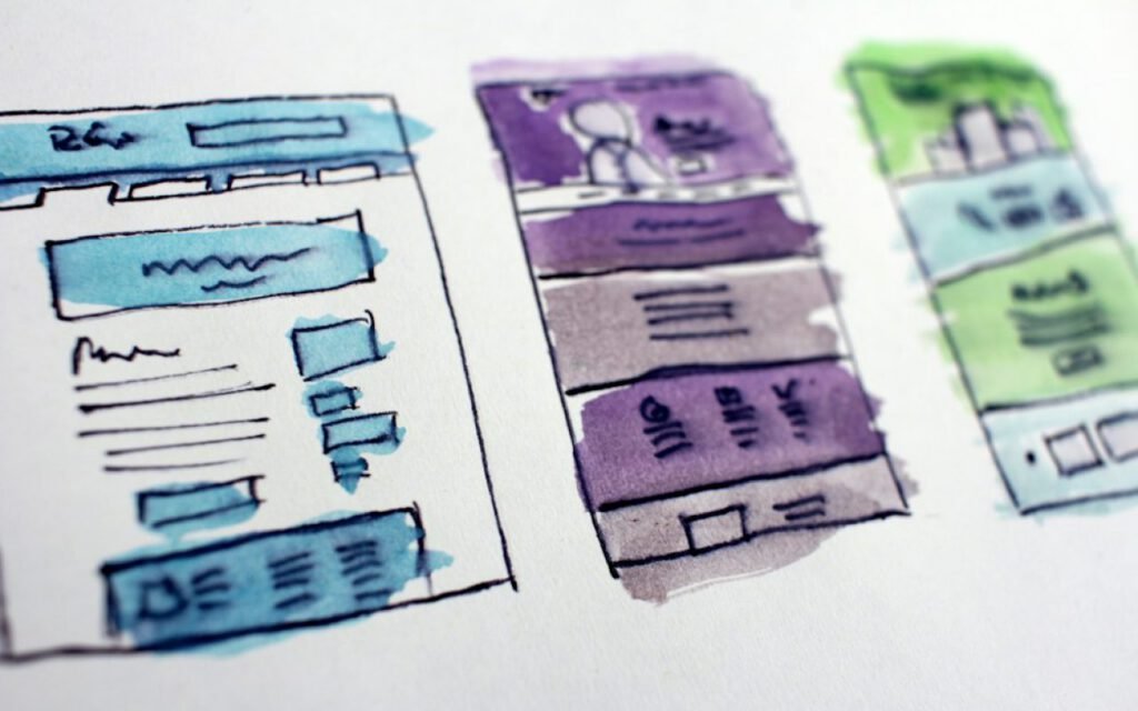
Problem, research, sketches, testing, final design — in that order. This sequence is the backbone of a strong case study, and following it makes your work easy to scan because reviewers already expect it. Here is what each stage should include.
- Problem. Describe who was struggling and why it mattered. “Users of a local food bank’s website could not find pickup hours on mobile” is far stronger than “I redesigned a website.”
- Research. Show what you learned and how. Five short interviews, a quick survey or a review of support emails all count. Include one or two direct quotes from the people you spoke to.
- Sketches. Paper sketches and rough wireframes prove you explored options before committing. Show at least two directions you considered and explain why you chose one.
- Testing. Describe how you put the design in front of real people, what surprised you and what you changed. Even three usability sessions with friends of friends are worth documenting.
- Final design. Now show the polished screens, with short annotations that connect each decision back to something you learned earlier.
Many beginners skip straight to the final design because it feels like the impressive part. Resist that urge. A reviewer who sees only finished screens has no way to tell whether you made thoughtful choices or simply copied a pattern you liked. The process is the evidence.
Be honest about what went wrong
One of the most underrated sections in any case study is the one where something did not work. Maybe your first navigation idea confused every tester. Maybe you misread the research and had to backtrack. Writing about that openly signals maturity. Real design work is messy, and hiring managers know it. They are looking for people who notice problems and adjust, not people who claim everything went perfectly.
Write like you are explaining it to a friend, not an award jury.
Leo, SkillForge Academy design mentor
Three is enough
Three strong case studies beat ten thin ones. It is tempting to include every class assignment, every daily UI challenge and every redesign you tried on a weekend. But a long list of shallow projects tells a reviewer that you have not yet learned to edit, and editing is one of the core skills of the job.
Choose three projects that together show range. A good mix for a first portfolio might look like this: one project with substantial user research, one that focuses on interaction or flow design for a mobile app, and one that shows you working with constraints such as an existing brand, a tight deadline or a real client. If one of your projects involved collaboration with developers or other designers, that is a bonus worth highlighting.
If you have more work you are proud of, you can add a small “Other work” section at the bottom with thumbnails and one-line descriptions. Just keep the spotlight on your top three.
Real projects beat invented ones
Speculative redesigns of well-known apps are common in beginner portfolios, and they are fine for practice. But a project with a real person on the other side is far more convincing. Offer to help a neighborhood bakery, a youth soccer league or a small nonprofit with its website or booking flow. You will face real constraints, gather real feedback and end up with a story no one else can tell.
Write clear, short case studies
Your writing is part of your design work. A case study that rambles makes a reviewer wonder whether your interfaces will ramble too. Aim for short paragraphs, plain words and headings that describe what each section contains. Read your case study out loud before you publish it. If you stumble over a sentence, rewrite it.
Here are a few habits our mentors recommend to every student in the design track:
- Lead each section with the point, then add the detail.
- Replace jargon with plain words wherever possible. “We tested the checkout with five people” beats “We conducted moderated usability evaluations.”
- Use captions on every image to explain what the reviewer is looking at.
- Say “I” when describing your own contribution and “we” only when a team truly shared the work.
- Keep each case study to a length someone can read in five to seven minutes.
Outcomes deserve special care. If you can point to a measurable change, such as fewer support emails or more completed sign-ups, include it and be clear about how you know. If the project never launched, say what you would measure and what you learned. Honesty is always more persuasive than inflated numbers.
Key takeaway: clarity wins. A reviewer should be able to explain your project to a colleague after one quick read.
Make the portfolio itself easy to use
Your portfolio site is, in a sense, a fourth case study. It shows how you handle navigation, hierarchy and accessibility. Keep the structure simple: a short introduction on the home page, your three projects, an about page and a clear way to contact you. Avoid clever navigation that forces people to hunt for your work.
Check the basics before you send a single link. Make sure the site loads quickly on a phone, that text has enough contrast to read comfortably and that images have descriptive alt text. Test every link. Ask two friends to find your contact information without help, and watch where they get stuck.

Your about page matters more than many beginners think. Write a few warm, specific sentences about who you are, what kind of problems you enjoy and what you did before design. Career changers in particular should lean into their background. A former teacher understands how people learn. A former retail manager understands customers under pressure. That experience is an asset, so name it.
Ship it, then keep improving
The perfect portfolio does not exist, and waiting for it is one of the most common ways new designers lose months. Publish a solid version with three clear case studies, start applying and treat every piece of feedback as a chance to revise. Many of our graduates rewrite their case studies three or four times during a job search, tightening the story each round.
Remember the simple rules. Show the process in order. Choose three strong projects over ten thin ones. Write the way you talk. Make every project easy to understand in a few minutes. Do those things well and your first UX design portfolio will do exactly what it needs to do: earn you the conversation where you get to explain the rest in person.
Leo Martinez
Leo designs every SkillForge course.



Start the conversation