Inside a Brand Kit: From Sketch to Files
What a small business actually receives.
 Maya Brooks6 min read

Maya Brooks
Maya is a certified strength coach who believes everyone should own one kettlebell and one good playlist.



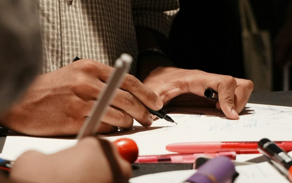
Every brand kit starts the same way: a page of ugly sketches. I mean truly ugly. Lopsided letters, circles that are not quite circles, arrows pointing at nothing. If a client ever saw that first page, they would probably ask for a refund. But that page is where all the good ideas begin, and I have learned to love it. Here is everything that happens between that page and the final zip file a small business receives from me. I get asked about my process a lot, especially by new clients who want to know what they are paying for, so I wanted to write it all down in one place, step by step.
Before the pencil: the brief
Before I draw anything, I ask questions. Every new client fills out a short questionnaire, and then we usually have a quick chat by message to fill in the gaps. I want to know:
- What the business does, in one sentence, as if you were telling a neighbor.
- Who the ideal customer is and where they will see the logo first.
- Three words the client wants people to feel when they see the brand.
- Any colors, symbols or styles they love, and any they cannot stand.
- Where the logo needs to live: a storefront sign, a website, a food truck, an embroidered apron.
That last question is the most important. A logo for a bakery that stamps it on paper bags needs to work very differently from a logo for an app that lives mostly on phone screens. Knowing where it will live shapes every decision that follows.
Recently, I worked with a (fictional) bakery in Asheville, North Carolina, called Hazel and Rye. The owner, a former pastry chef named Laura Kim, told me her three words were “warm, simple, honest.” She also told me her budget for printing was small, so most things would be printed in one color. That single detail ended up guiding the whole project.
Sketch fast, choose slowly
Forty thumbnails in an hour, then a day away from them before I pick three. That is the rhythm I have followed for years, and it has never let me down.
The fast part matters because speed keeps me from getting attached. When I only have ninety seconds per sketch, I cannot polish anything, so I am free to try strange ideas. A wheat stalk shaped like an H. A loaf of bread inside a circle. The letters H and R leaning against each other like old friends. Most of them are bad. A few are interesting. One or two make me sit up a little straighter.
The slow part matters even more. After a day away, I look at the page with fresh eyes, and the weak ideas are suddenly obvious. The ones that still feel exciting are the ones worth developing. For Hazel and Rye, three sketches survived: a simple wheat stalk, a hand-drawn monogram and a little round loaf with a steam curl above it.
If it works in black and white, it works everywhere.
Maya
Why I start in black and white
All of my early work happens in black and white, with no color at all. Color is powerful, but it can hide weak shapes. A logo that only works in a specific shade of teal will struggle on a fax, a rubber stamp or a one-color receipt. If the shape is strong in plain black on white, it will be strong in any color later. For a client like Laura, whose budget meant most printing would be one color, this step was not optional. It was the whole point.
From sketch to screen
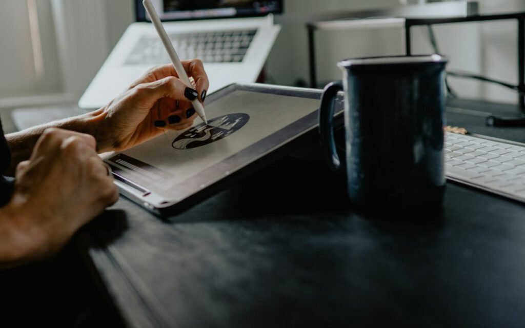
Once I have three strong sketches, I move them into vector software and start refining. This is where the real craft happens. I adjust curves, balance the weight of each line, test letter spacing and check how the mark looks at different sizes.
Size testing is something many new designers skip. I shrink every logo down to the size of a social media profile picture and a favicon, the tiny icon in a browser tab, and I enlarge it to the size of a shop window. Details that look lovely at full size can turn into a smudge when they are small. For Hazel and Rye, the steam curl above the loaf disappeared at small sizes, so I made a simpler version without it for tiny uses.
Then I present three refined directions to the client, each shown on a simple, realistic mockup. Laura chose the round loaf. After two rounds of small revisions, mostly adjusting the thickness of the lines, we had a final mark.
Files for real life
This is the part clients care about most, even if they do not realize it yet. A beautiful logo is not much use if the printer cannot open the file. So every brand kit I deliver includes logo files for print, web and social, a one-page style sheet and a version that works in black and white.
Here is what is inside a typical zip file:
- Print files: vector files that can be scaled to any size, for signs, menus and packaging.
- Web files: transparent PNG files in several sizes, ready for a website or email signature.
- Social files: square and circle-cropped versions sized for profile pictures.
- Color variations: full color, one color, black, and white for dark backgrounds.
- A one-page style sheet: the logo, the brand colors with their codes, the fonts and a few simple rules for spacing.
Each folder is clearly labeled, and I include a short “start here” note explaining which file to send to which kind of vendor. Laura told me later that this note saved her an hour on the phone with her sign maker, and that alone made the whole kit feel worth it.
The style sheet
I keep the style sheet to one page on purpose. A forty-page brand book looks impressive, but small business owners rarely have time to read it. One page, with the essentials, is something they will actually tape to the wall next to the printer.
Key takeaway: A brand kit is not just a logo. It is a set of tools that lets a small business look consistent everywhere, without needing to call a designer every time.
What happens after delivery
My work does not quite end with the zip file. I always check in about two weeks later to see how the logo is working out in real life. Sometimes a printer needs a special file format, or a client realizes they need a horizontal version for a long sign. Small requests like that are part of the job, and I am always happy to help.
A few months after we finished, Laura sent me a photo of her new paper bags, printed in one simple brown ink, stacked by the register at Hazel and Rye. The little loaf looked exactly the way I had hoped. That photo is now one of the real samples in my gallery, and it reminds me every day why the ugly first page of sketches matters so much.
Maya Brooks
Maya is a certified strength coach who believes everyone should own one kettlebell and one good playlist.


Start the conversation