Packaging Design for a Small Candle Brand
Three scents, one label system.
 Maya Brooks7 min read
A two-person candle company asked for one label. They got a label system. The founders, a pair of sisters who pour soy candles in a converted garage outside Asheville, North Carolina, sent me a Fiverr order for a single design for their first scent, a cedar and orange blend. Three weeks later they had a complete kit: one grid, one type pairing, a small illustration style and a simple rule for color. Now every new scent takes ten minutes to design.
This post walks through how that happened, because I think small brands often believe design systems are something only big companies can afford. They aren’t. A system is just a set of decisions you make once so you never have to make them again.
The brief that turned into something bigger
The original request was simple. The sisters, who I will call Jen and Callie because that is what they call each other, wanted a label for an eight-ounce amber jar. They planned to sell at two farmers markets and a holiday craft fair, with an online shop later.
During my usual questions before the order, I asked how many scents they planned to carry in the first year. Jen said three. Callie said “probably twelve.” They both laughed, and that was the moment I knew a single label was not what they needed. If I designed one beautiful one-off, they would be back in a month asking for a second that matched, then a third, and each would drift a little further from the first.
I suggested a small upgrade to the order: instead of one label, we would build a template that any scent could drop into. They agreed, mostly because they were tired of the handwritten stickers they had been using at markets.
One grid, many scents
Same layout, same type; only the illustration and one accent change per scent. That sentence became the whole system. Here is what stays fixed on every label:
- The grid. A tall rectangle split into three bands: brand name at the top, illustration in the middle, scent name and details at the bottom.
- The typefaces. One classic serif for the scent name and one clean sans-serif for the small print, both free for commercial use.
- The brand mark. A tiny flame inside a circle, always in the same top-center spot and always in black.
- The details block. Net weight, burn time, safety warning and the company’s city, in the same order and size every time.
- The border. A thin black rule with rounded corners that frames the whole label.
And here is what changes per scent: one hand-drawn illustration in black ink, and one accent color used only for the scent name. Cedar and orange got a small pine branch and a burnt orange name. Lavender and sage got a sprig of lavender and a dusty purple. Sea salt got a single wave and a soft blue.
Design systems are for small brands too.
Maya
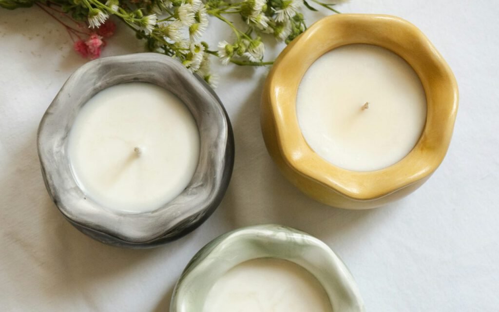
On a market table, the three jars look unmistakably related. A customer who loved the cedar candle last month spots the brand from across the aisle and then picks a new scent by its illustration. That kind of recognition is exactly what bigger brands pay agencies to build.
Drawing the illustrations
The illustrations needed to be simple enough that I could draw a new one quickly, but warm enough to feel handmade. I set myself three rules: one subject per scent, black ink only, and no detail smaller than a grain of rice at actual print size.
I drew each one with a brush pen on paper, scanned it and cleaned it up as a vector. Because every illustration follows the same rules, they sit happily next to each other even though the subjects are completely different. A cinnamon stick, a lemon slice and a pine branch all feel like they came from the same hand, because they did, using the same limits.

Choosing accent colors
For the accent colors, I built a small swatch sheet of twelve options, each tested on kraft paper so the sisters could see exactly how they would print. Kraft paper shifts colors toward brown and dulls anything pale, so a few of my first choices were dropped right away. Whenever they launch a new scent, they pick the next unused swatch from the sheet. No guessing, no late-night debates.
Printed on a home printer
Everything works on kraft paper from an ordinary printer. No minimum orders. This was a hard requirement from the start. The sisters didn’t have the budget or the storage space for thousands of pre-printed labels, and they wanted to be able to test a seasonal scent with a run of twenty jars.
That shaped many of my decisions. Here is how we made the labels printer-friendly:
- All artwork is set up on a standard US letter-size sheet of label paper, with eight labels per page.
- Fine lines are at least half a point thick, so a home inkjet prints them cleanly.
- Large areas of solid color are avoided, which saves ink and prevents smudging on textured paper.
- The template includes a quarter-inch safe margin, because home printers rarely line up perfectly.
- Every file has a black-only version for when the color cartridge runs dry the night before a market.
I also delivered the template in a free, browser-based design tool they already used, plus print-ready PDFs. Adding a scent now means swapping the illustration, typing the new name and choosing the next color on the swatch sheet. Callie timed it the first time she did it alone: nine minutes and change.

A one-page guide
Along with the files, I wrote a single-page guide in plain language. It explains which parts of the label must never move, how to place a new illustration so it sits in the center band, and what to do if a scent name is too long for one line. I also included three examples of common mistakes, like stretching the illustration or swapping in a different font, with a quick note on why each one breaks the family look. The sisters taped the guide to the wall above their printer, which is exactly where it belongs.
What happened next
Six months after delivery, the sisters sent me a photo of their market table with nine scents lined up in a neat row. I hadn’t designed six of them. They had done it themselves, using the system, and every one looked like it belonged. That photo is my favorite piece of feedback I have ever received.
They have since added a gift box and a small tin candle. Both use the same grid, shrunk or stretched to fit, and both took less than an hour to design. The system scaled without me, which is exactly the point.
Key takeaway: if you sell more than one version of a product, ask your designer for a template instead of a single label. You will pay a little more once and save time on every launch after that.
Small brand, real system
The word “system” can sound intimidating, like a thick brand manual for a national chain. For a two-person candle company, it was a single page: one grid, two typefaces, one mark, one illustration rule and a swatch sheet. That is all it takes to look consistent, professional and recognizable on a crowded market table.
If you are a small maker, start by writing down the parts of your packaging that should never change. Then decide on the one or two parts that will change with each product. Those two lists are the beginning of your system, and they will make every future launch faster, calmer and a lot more fun.
Maya is a certified strength coach who believes everyone should own one kettlebell and one good playlist.

Maya Brooks
Maya is a certified strength coach who believes everyone should own one kettlebell and one good playlist.