Sketch First, Pixels Later
Why my projects start with pens, not software.
 Owen Clarke6 min read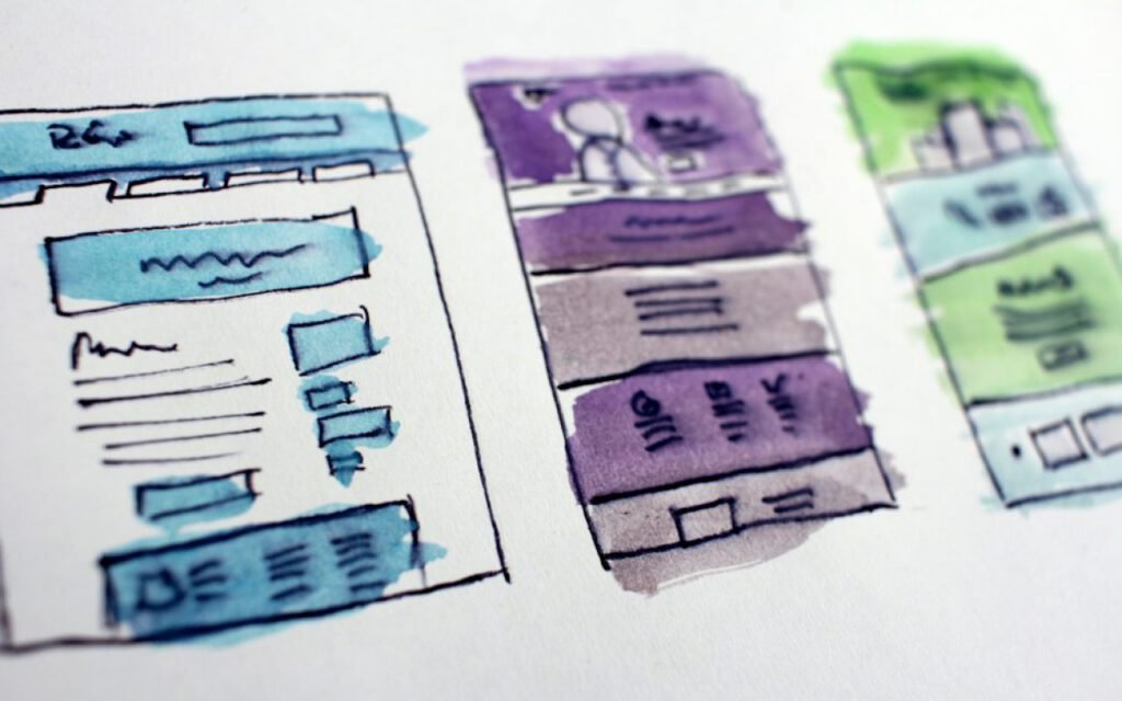
I don’t open design software for the first week of a project. I sketch. Clients sometimes find this strange. They hired a product designer and expected polished screens by Friday, and instead they get a stack of rough drawings in black marker on cheap printer paper. By the end of the first week, though, almost every one of them agrees that those drawings saved the project more time than anything else we did.
Paper is fast, cheap and impossible to fall in love with too early. That is the whole argument in one sentence. But since I get asked about it so often, here is how my sketching week actually works, why I stick to it, and how I decide when it is finally time to move to pixels.
Why paper wins early
Design software is wonderful, and I spend most of my working life in it. The problem is that it is too good too soon. The moment you open a blank file, the tool invites you to pick a font, set a grid, choose a color and line up every edge perfectly. Within an hour, you have something that looks finished, and finished-looking work is incredibly hard to throw away.
That is the trap. Early in a project, you should be throwing away most of what you make. You do not yet know enough about the users, the content or the constraints to be precious about anything. Paper keeps you honest. A marker sketch looks like a question, not an answer, and people respond to it that way.
It also changes the conversations I have with clients and developers. When I show a polished mockup, the feedback is usually about details: the shade of blue, the size of a heading. When I show a rough sketch, the feedback is about the idea itself. Is this the right flow? Is this information in the right order? Those are the questions that matter in week one.
Ten bad ideas
I sketch ten versions of every screen. Nine are bad. That’s the point.
The first idea anyone has is usually the obvious one, and the obvious one is usually what every competitor has already built. Forcing myself to draw ten variations pushes me past the first few safe answers into stranger, more interesting territory. Version six might be ridiculous. Version eight might combine part of version two with part of version six into something genuinely new.
I do this with a simple exercise many designers will recognize. I fold a sheet of paper into eight panels, set a timer for eight minutes and draw one idea per panel, one minute each. Then I do it again. There is no time to judge or polish. The pressure of the clock squeezes out ideas I would never have reached by staring at a blank screen.
Sketches are cheap. Building the wrong thing is expensive.
Owen
Every product team I have worked with has a story about a feature that took three months to build and turned out to be wrong. A sketch that turns out to be wrong costs one minute and one sheet of paper. If ten minutes of sketching saves even one week of building the wrong thing, it is the best trade in the whole project.
My sketching kit
The tools are deliberately basic. I want nothing that tempts me into detail.
- Plain copy paper, because a fancy notebook makes me nervous about wasting pages
- A thick black marker, so I physically cannot draw small details
- One gray marker for shadows and secondary elements
- One highlighter, used only for the main action on each screen
- Printed phone and browser outlines for when I need a sense of scale
- A roll of tape and a big empty wall
The thick marker is the most important item. With a fine pen, I start drawing tiny icons and perfect text. With a chunky marker, I can only draw boxes, arrows and a few words. That forces me to think about structure and priority, which is exactly what early sketches are for.

Sketching with the team
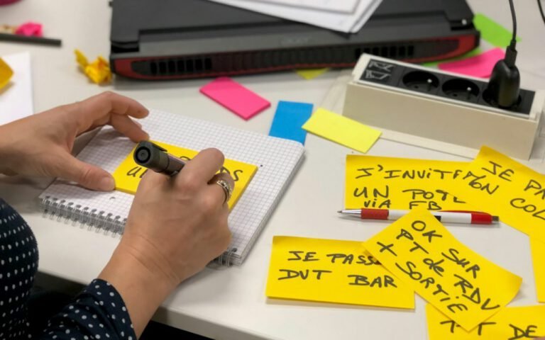
Some of my best sketching sessions happen with people who insist they cannot draw. Engineers, product managers and support leads all know things about the product that I do not, and a sketch is the fastest way to get that knowledge onto the wall.
I make it safe by drawing badly on purpose first. If my stick figures and wobbly boxes are on the wall, nobody worries about theirs. Then we each sketch a few versions of the same screen, stick them up side by side and talk about what we like in each. Often the final design steals one idea from the engineer’s sketch, one from the support lead’s and one from mine.
The sketches also become a shared memory. Weeks later, when someone asks why a screen works the way it does, I can point at the original drawing and the notes scribbled beside it. It is a surprisingly good record of the decisions behind a design.
How I run a quick sketch review
- Everyone tapes their sketches on the wall, no explanations yet
- We walk the wall silently and mark favorite parts with dots
- Each person gets one minute to explain their strongest idea
- We combine the best pieces into one rough direction
Then go digital
Only the strongest idea gets turned into a real wireframe.
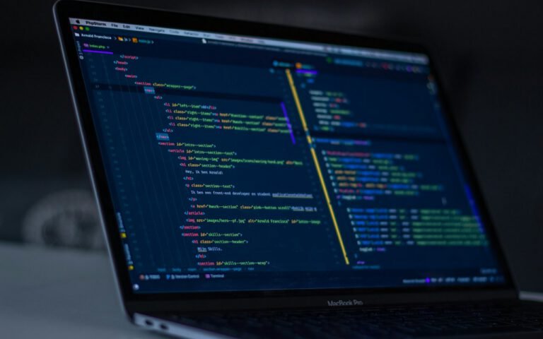
Usually by the end of the first week, the wall has narrowed to one direction, sometimes two. That is when I finally open the design software. Even then, I start in grayscale, with simple boxes and real content, not made-up filler text. Color, type and polish come last, once the structure has survived a few rounds of feedback and ideally a quick test with real users.
Moving to digital too early is still a temptation, especially when a client is eager to see something polished. My rule is simple: if I cannot explain the screen clearly with a marker sketch, I am not ready to design it in pixels. A digital tool will only make the confusion look prettier.
A recent project made the case better than I ever could. A small scheduling startup, Brightfold, came to me wanting a new booking flow for their mobile app. Their own team had already built a polished prototype with seven steps. In our first sketching session, we drew thirty-odd variations on the wall. One of the roughest, a single screen with a calendar and three big buttons, came from their support lead. We tested a paper version with five customers that same week. All five finished the booking without help, and the final app shipped with that one-screen flow almost exactly as it was drawn.
The polished seven-step prototype had taken their team a month. The sketch that replaced it took about ninety seconds. I think about that ratio every time someone asks me to skip straight to high-fidelity screens.
Key takeaway: Use paper to explore and pixels to refine. Sketch more ideas than you need, throw most of them away, and move to software only when one idea has clearly earned it.
Give it a week
You do not need to be good at drawing to work this way. My sketches are honestly pretty rough. What matters is the habit of exploring many ideas cheaply before committing to one expensively.
On your next project, try keeping the laptop closed for the first few days. Grab a marker, fold some paper and draw ten bad versions of your hardest screen. I think you will be surprised how much better the eleventh one looks.

Owen Clarke
Owen designs calm software for complicated work.





Start the conversation