


Owen Clarke
Owen designs calm software for complicated work.



Great designs die in handoff. I have seen it happen more times than I would like to admit, sometimes to my own work. A team spends weeks researching, sketching and refining a feature. The final screens look wonderful. Then they get tossed over the wall to engineering, and a month later what ships is a slightly off, slightly confusing cousin of the design, with the wrong spacing, missing error messages and a loading state nobody ever designed.
I use the same checklist on every project to make sure mine don’t. It takes an hour and saves weeks. It is not complicated or clever. It simply makes sure the questions developers will inevitably ask get answered before they have to ask them, and that design and engineering keep talking after the files are shared.
Why handoff goes wrong
When a design gets lost in translation, it is rarely because developers are careless. In my experience, it is almost always because the designer left gaps. We tend to design the happy path: the screen with perfect data, a short username, a fast connection and no mistakes. Real software spends a lot of its life outside that happy path.
When a developer hits a gap, they have two choices. They can stop, message the designer and wait for an answer, which slows everything down. Or they can make their best guess and keep moving, which is what most busy teams do. Multiply that guess by fifty small decisions across a feature, and you end up with a product that technically matches the mockups but feels nothing like what was intended.
Handoff, done well, closes those gaps in advance. Done badly, it leaves the developer to fill them alone.
Every state
Empty, loading, error, success and “way too much text.”
This is the section of my checklist that catches the most problems. For every screen and every major component, I design each of these states, even if some of them are just a quick note rather than a full mockup.
- Empty: what a brand-new user sees before they have any data, ideally with a helpful next step
- Loading: what appears while data is on its way, and how long before we show a message
- Error: what went wrong, in plain words, and how to fix it
- Success: how the user knows their action worked
- Way too much text: what happens with a forty-character name, a long address or a huge number
That last one is my favorite, because it is the one everybody forgets. Designers love short, tidy sample content like “Jane Doe” and “$24.” Real users are named Alexandra Montgomery-Whitfield, live on streets with very long names and occasionally have balances in the hundreds of thousands. If the layout breaks when text gets long, it will break in production on someone’s first day.
Specs that speak code
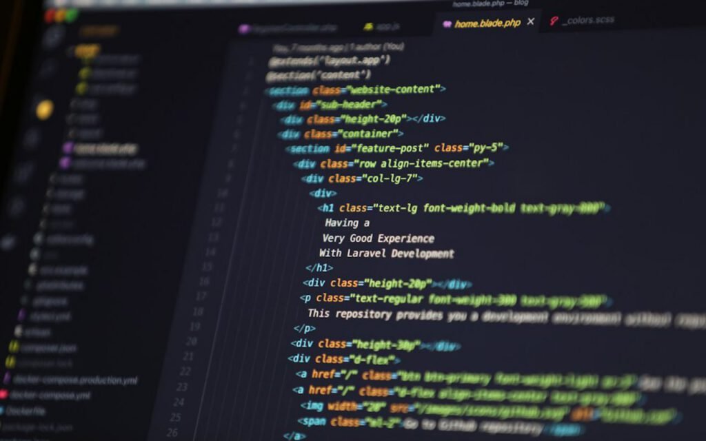
The second part of my checklist is about speaking the same language as engineering. If our team has a design system with tokens for spacing, color and type, I make sure every value in the design uses those tokens. A developer should never have to measure the gap between two cards and wonder whether it is fifteen pixels or sixteen. It should simply be the “medium” spacing token, which already exists in code.
When I truly need a one-off value, I call it out explicitly and explain why. That way, the developer knows it is intentional, not a mistake, and we can decide together whether it deserves to become a new token.
Interactions written down
Static mockups cannot show behavior, so I write it down. What happens when someone taps this button twice? Does this panel slide in or fade in, and how fast? What happens to the form data if the user navigates away? Short, plain notes next to each screen answer these questions far better than an elaborate prototype that nobody can inspect.
Accessibility notes
I also include notes on focus order, labels for icon buttons, alt text for images and how screen readers should announce changes like error messages. Developers often care deeply about accessibility but cannot guess intentions from a picture. Writing it down makes it part of the build instead of a fix after launch.
Handoff isn’t a moment. It’s a conversation.
Owen
Talk, don’t throw
A thirty-minute walkthrough with the developers beats any document.
Even with perfect specs, I never consider a design handed off until I have walked the engineers through it in person or on a video call. I share my screen, tell the story of the feature from the user’s point of view and then hand the floor over to them. Almost every time, someone asks a question that changes the design for the better.
Sometimes the question reveals a technical limitation I did not know about, like an API that cannot return the data in the order I assumed. Sometimes a developer suggests a simpler way to get the same result. Once, a backend engineer pointed out that a three-step flow I had designed could become a single step because the system already had the information. That one comment saved weeks of work and gave users a better experience.

The conversation does not end with the walkthrough, either. I stay available while the feature is being built, review work in progress and test early builds. Small fixes caught in week one take minutes. The same fixes caught after launch take a whole sprint.
The checklist
Here is the full list I run through before any design is marked ready for development. I keep it as a template and copy it into the project tracker for every feature.
- All screen states
- Spacing and type tokens
- Interactions written down
- Accessibility notes
- A walkthrough meeting
In practice, each item expands into a few smaller checks. For screen states, I confirm that empty, loading, error, success and long-content versions exist for every screen. For tokens, I scan the file for any values that do not match the system. For interactions, I make sure every button and gesture has a written behavior. For accessibility, I review labels, focus order and contrast. And for the walkthrough, I book the meeting before I share the files, so it never gets skipped.
Key takeaway: Design every state, use the same language as code, write down behavior and always walk developers through the work. One hour of preparation prevents weeks of rework.
Better handoffs, better products
The funny thing about a good handoff is that it does not feel like a handoff at all. It feels like design and engineering working on the same thing together, which is exactly what it should be. The checklist is just a way to make sure nothing important falls through the gaps between our two disciplines.
If you are a designer, try adding just the “way too much text” state to your next project and see how many problems it uncovers. If you are a developer, ask your designer for a thirty-minute walkthrough before you start building. Either way, I think you will see the difference in what ships.
Owen Clarke
Owen designs calm software for complicated work.


Thanks for explaining this so clearly.
Great reporting — please keep following this story.