

Leo Park
Leo builds fast, accessible web apps with boring, reliable tools.
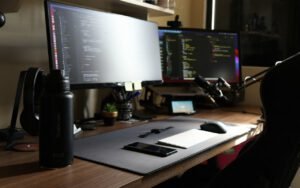

A logistics team works night shifts. Their bright dashboard was giving them headaches. The operations manager, a calm, practical man named Terrence Boyd, described the problem on our first call while sitting in a dim dispatch room outside Memphis, Tennessee: “My people stare at this screen from 10 p.m. to 6 a.m. It’s like looking into a refrigerator light all night. By 3 a.m., half of them have the brightness turned all the way down and they’re squinting at numbers they can barely read.” That is not a design preference. That is a workplace problem.
We rebuilt it dark, carefully. The word carefully matters, because dark interfaces are easy to get wrong in ways that are just as tiring as the bright ones they replace. This build log covers what we changed, what we tested and what I would tell anyone attempting a dark dashboard for people who work while the rest of the city sleeps.
Understanding the night shift
Before touching any colors, I spent two nights in the dispatch room, with the team’s permission, watching how they actually used the dashboard. Eleven dispatchers tracked about 140 trucks across six states. The screen showed a map, a list of active loads, delay alerts, driver hours and a live feed of messages. Most of the room’s light came from the monitors themselves, plus a few overhead fixtures dimmed to about a third of their brightness.
A few things stood out. The dispatchers rarely read long text. They scanned for changes: a status turning amber, a new alert, a number jumping. Their eyes moved constantly between the dashboard, a second screen with email, and a phone. And when an urgent alert came in, the bright red banner at the top of the old design felt, as one dispatcher put it, “like someone flashing a flashlight in my face.”
Not pure #000 everywhere
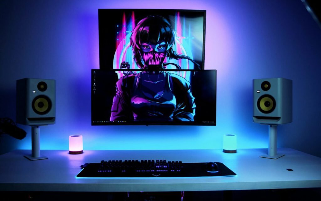
Near-black backgrounds with soft gray text are easier on the eyes. It is tempting to think dark mode means a pure black background with pure white text. That combination actually creates its own strain: the contrast is so extreme that text can seem to shimmer or bleed, especially for people with astigmatism, and bright white letters on a dark room’s only screen still feel harsh.
For this dashboard we used a near-black base for the page, a slightly lighter shade for cards and panels, and a third, lighter step for things that sit on top, like dropdowns and dialogs. Instead of shadows, which barely show up on dark backgrounds, elevation is shown by those gentle steps in lightness. Body text is a soft off-white, and secondary labels a medium gray.
Dark mode is a design problem, not a color swap.
Leo
Inverting the old palette would have been a two-hour job. It would also have produced muddy charts, unreadable status colors and alerts that glowed like neon signs. Every color had to be chosen again, for this specific room and this specific job.
Color that means something
Status colors were the hardest part. On a white background, a saturated red, amber and green look crisp. On near-black, the same colors either vibrate or turn murky. We softened each one, raising their lightness and lowering their saturation, until they read clearly without glowing. Then we made sure color never carried meaning alone: every status also has an icon and a short word, like “Late” or “On time,” for dispatchers who are color-blind or simply tired.
Keep contrast
Every text color still passes accessibility contrast checks. This was a hard rule from the start. A dark interface that looks moody in a screenshot but fails contrast guidelines is not a good dark interface; it is just a dim one. I checked every combination of text and background against the widely used accessibility guidelines, including small labels, chart axes, disabled buttons and placeholder hints.
Some pairings needed several rounds. The medium gray we first chose for secondary labels looked elegant but failed on the card background, so it was lightened a step. Chart gridlines were made subtle enough to fade into the background but kept the axis numbers readable. Links got an underline, not just a color change.
Alerts that do not shout
The old dashboard announced urgent problems with a full-width red banner and a sound. Both were effective at getting attention. Both were also exhausting after the twentieth time in a shift. We redesigned alerts around a simple idea: the more urgent the problem, the more it should stand out, but nothing should be painful to look at.
- Information appears as a small note in the activity feed, with no color highlight.
- Warnings, such as a truck running 30 minutes late, get an amber border and icon on the affected row.
- Urgent alerts, like a missed check-in or an hours-of-service limit, slide in as a card in the corner with a soft red edge and a short, low tone.
- Every alert can be acknowledged with a single keystroke, which dims it and logs who saw it.
Dispatchers told us the new alerts felt calmer but harder to miss, because they were no longer drowning in a sea of red. Fewer things shouting meant the important ones actually stood out. We also added a quiet hour setting for the slowest stretch of the night, when only urgent alerts make a sound and everything else waits in the feed.
Testing in the real room
Design files lie. A palette that looks perfect on my calibrated monitor at noon can look completely different on an older office screen at 3 a.m. So we tested the dashboard on the team’s own monitors, in the dispatch room, during real shifts. Over two weeks, four dispatchers used the new version side by side with the old one and kept short notes.
Their comments shaped the final version. One asked for slightly larger numbers in the load list. Another noticed that the map’s road labels were too faint at the zoom level they used most. A third, a veteran dispatcher named Lorraine Mitchell, simply wrote, “First night in years I didn’t need my glasses by 4 a.m.” I was careful not to treat that as medical evidence, but it was nice to read.
Key takeaway: a good dark interface uses layered near-black surfaces, softened colors that still pass contrast checks, and alerts calm enough to live with all night.
What I would do again
The new dashboard has been running for about four months. Terrence says the team rarely touches the brightness buttons anymore, and new hires get used to it in a shift or two. A few dispatchers on the day shift asked for it too, so we added a simple light theme that uses the same structure and meaning, just with a different set of surfaces.
If you are building a dark interface, my advice is short. Watch the people who will use it, in the place they use it. Avoid pure black and pure white. Check every color pairing for contrast. Never let color carry meaning alone. And remember that the goal is not to look dramatic. The goal is to let someone do their job at 3 a.m. without fighting the screen.
Leo Park
Leo builds fast, accessible web apps with boring, reliable tools.


Thanks for explaining this so clearly.
Great reporting — please keep following this story.